


For day 4 of Dashboard week we had to analyse data from Seattle bike counters at various routes through the city. I produced a summary report kind of dashboard which looked into the difference in bike usage between weekdays and the weekend. Bikes were used much more during the week and this seemed to e due to people using them to commute to work. Some data prep was required today and multiple files had to be joined together. Ellie was able to prep the data and join to it longitude and latitudes for each of the bike counting stations. I hadn’t added the location data so was grateful to use her completed data set. I again tried to supplement that original data set but failed to find something interesting to create a story with.
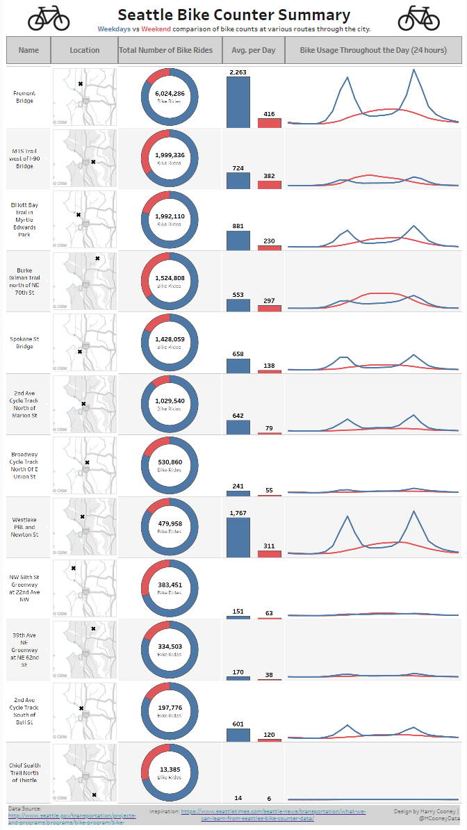
Completed Viz.
I spent a long time joining the data with another data set containing precipitation amounts for each day in Seattle. I was able to combine the data sets using the Alteryx workflow below. However, after wasting even more time playing with the combined data set in Tableau I realised the narrative of people using bikes less when it rains more is extremely mundane and uninteresting. I was unable to find anything less obvious through exploration of the data.
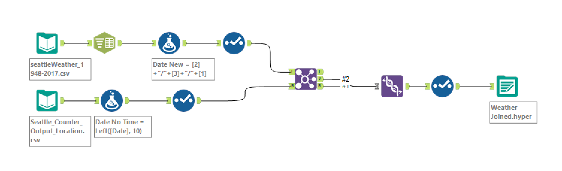
Alteryx Workflow.
I was now back to square one so did some research online for ideas. I considered looking into the adoption of bikes over time and reasons for increases in bike counts. However a visualisation in this article caught my eye instead. Taking inspiration from the formatting of the viz I started building some general charts to fill a report like table. I found that the weekend vs weekday comparison could be an interesting angle due to the different times of use.
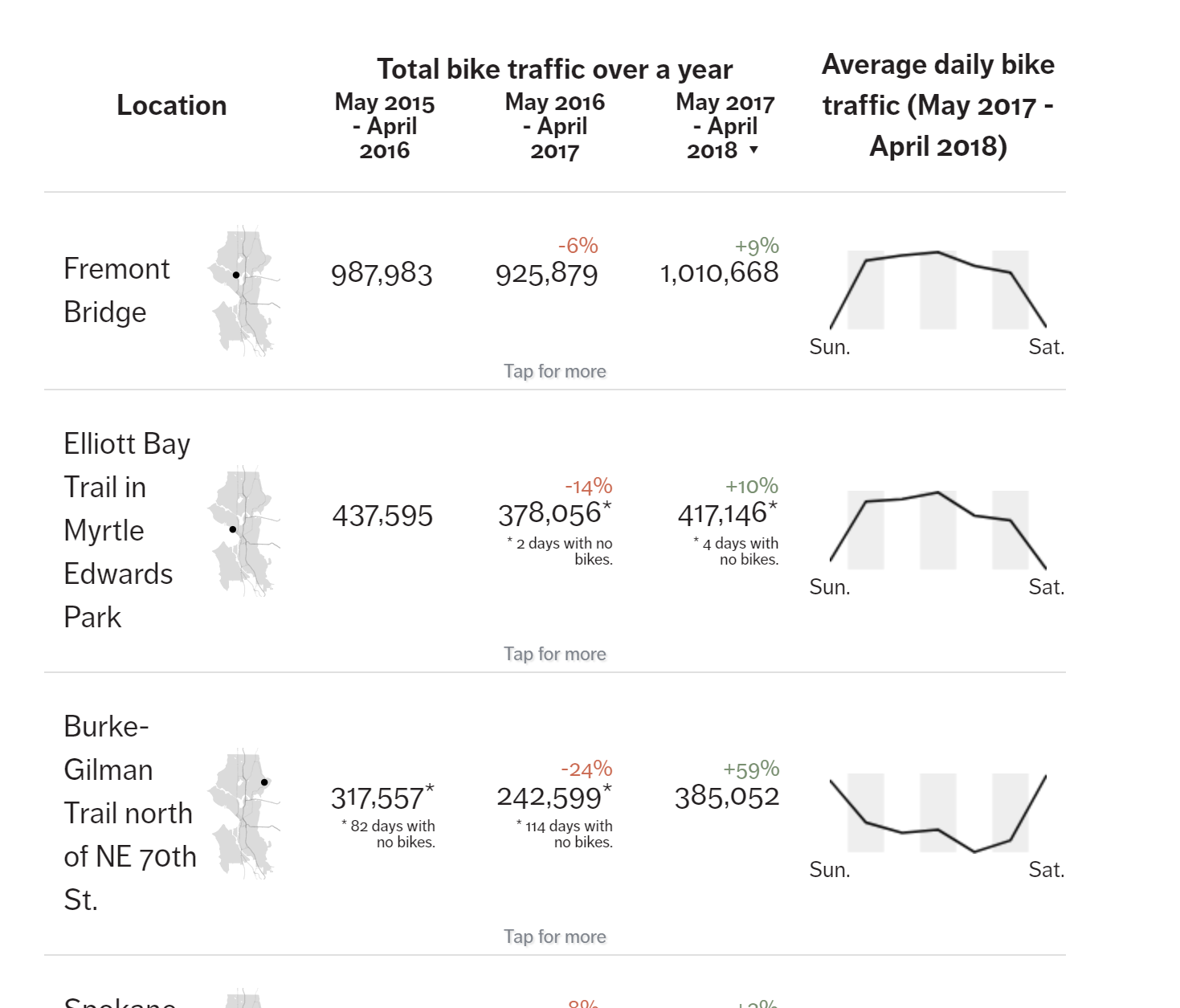
Inspirational.
For the maps I had to create an individual sheet for every location, but for each of the other charts I was able to use one sheet. I gave the rows banding on these other charts so that every other row would be shaded slightly grey. This was to make it easier to read. I also coloured the maps on these rows grey to maintain consistency. For the line chart I was unsure what to do about the axis. The viz would look less clean with the hours along the bottom but it would be easier to understand. In the end I decided to remove it as I thought the header did a good job of describing what the chart showed and the tooltips could be used for further detail.
See my final viz here.