


This week I rebuilt my Tableau Makeover Monday in Power BI. The end goal was the same in both tools: show the largest month to month shocks in gold prices, and let the user control what counts as a shock using a threshold parameter (I used 6%).
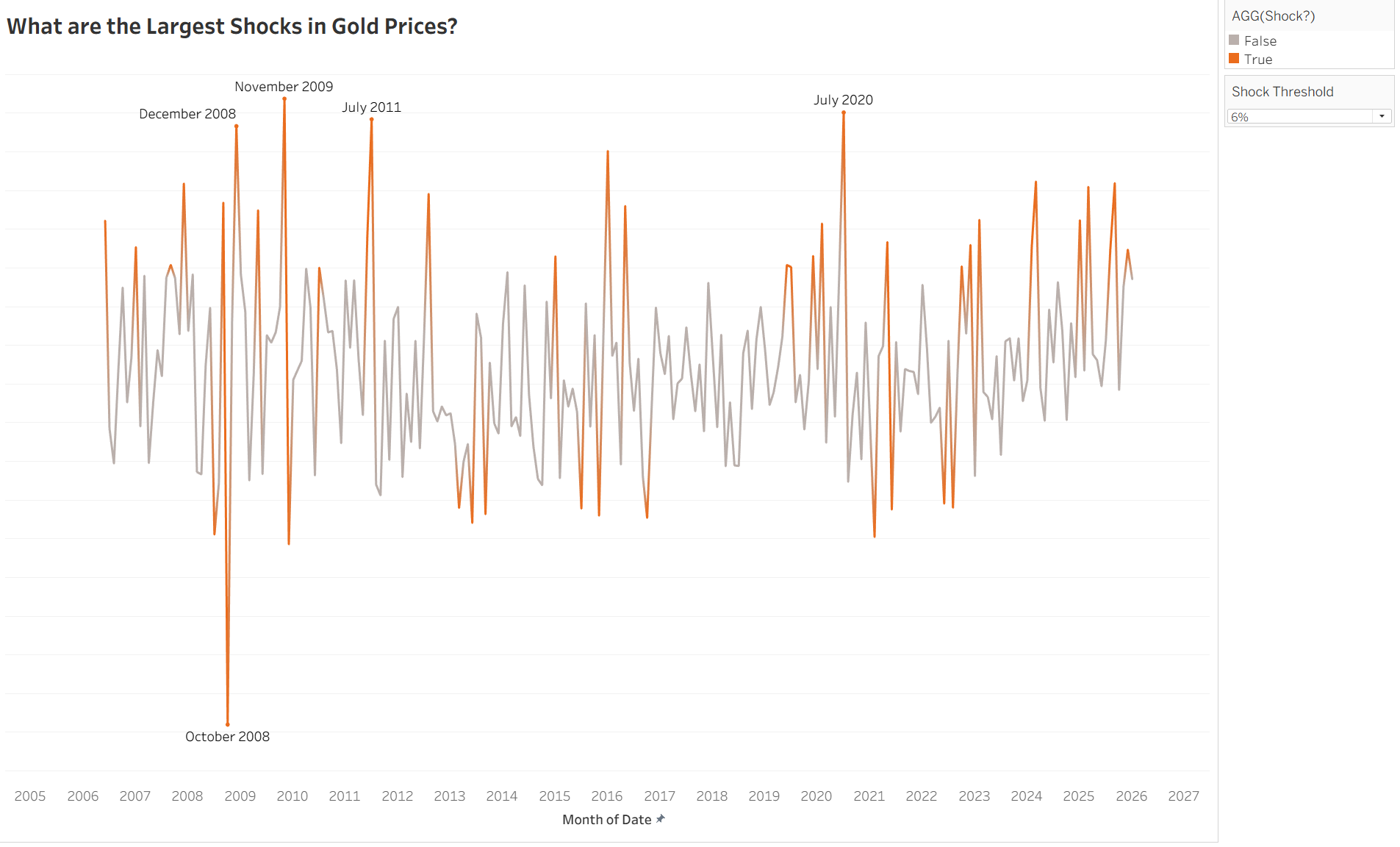
In Tableau, the build was straightforward. I calculated the percent change from the previous month using the Close price, then created a Shock flag based on whether the absolute percent change exceeded the threshold. From there, Tableau made the key design choice easy: keep the full series visible in a muted colour, and highlight only the shock periods in orange. That gave context and emphasis at the same time.
Recreating this in Power BI exposed two main differences: how the calculations work and how highlighting works.
The calculation side was mostly a mindset shift. In Tableau, “previous month” is often handled with a table calculation approach, where you take the current value and look one row back. In Power BI, DAX does not naturally think in “previous row” terms. Instead, measures evaluate within filter context, so you need to be explicit about retrieving the previous period value and then building the percent change off that. Once I split the logic into a small set of measures (current Close, previous Close, percent change, shock flag), the results matched the Tableau version.
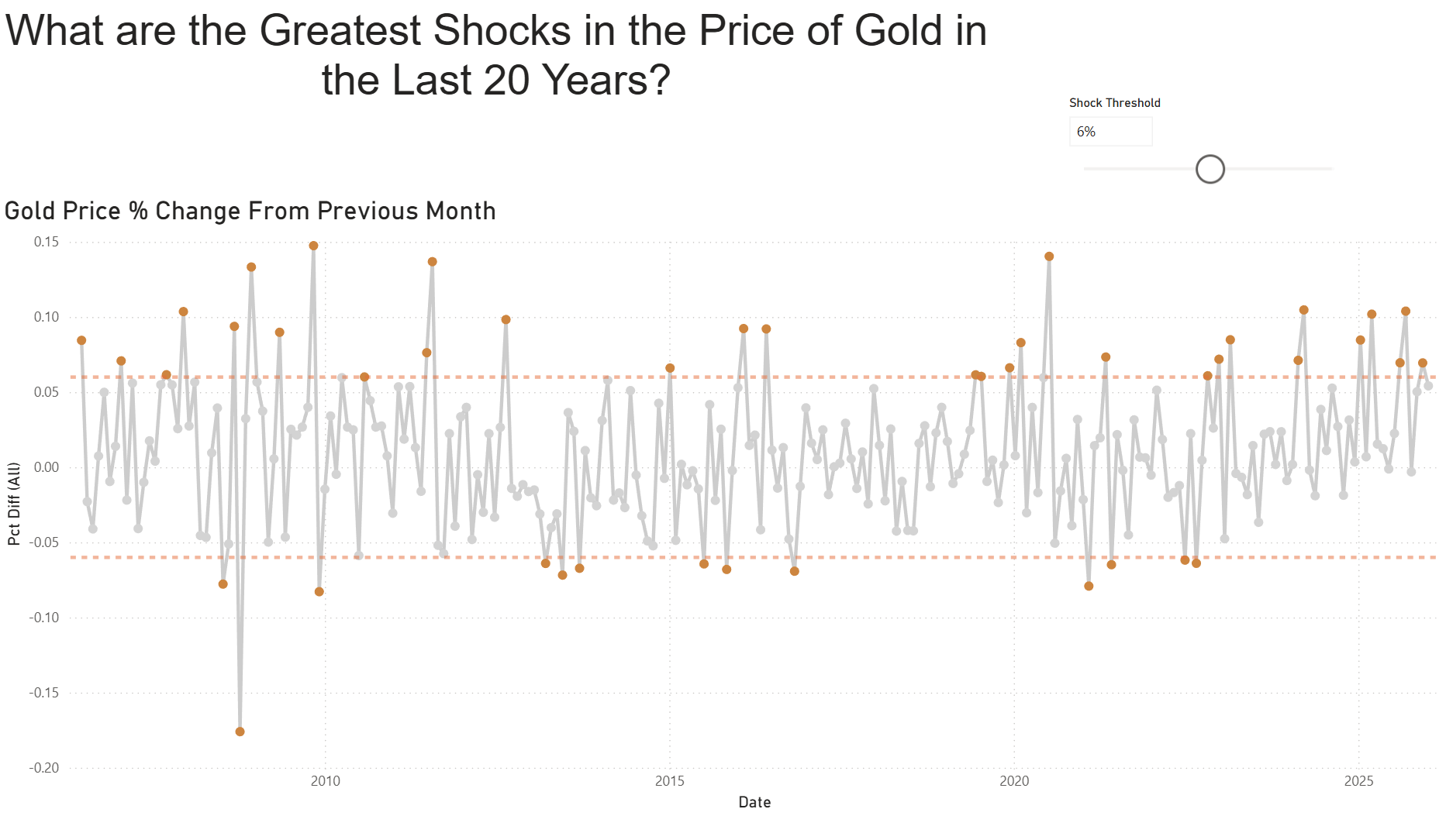
The bigger difference was visual behaviour. Tableau will colour segments of a single line when you drop a flag like 'Shock?' onto Colour. Power BI cannot colour part of a line in the same simple way on a standard line chart. My first instinct was to plot only shock months as a separate series, but that creates a misleading chart because Power BI draws a continuous line between non blank points, effectively connecting shocks across gaps.
The workaround was to build the highlight as a separate layer. I switched the visual to a line and clustered column chart, used the line to show the full percent change series, then used columns to represent only the shock months and applied conditional formatting so the columns respond to the threshold. Once the logic and formatting were behaving, I could make the visual read like the Tableau version: a full context series with shock periods clearly emphasised, without Power BI drawing incorrect connecting lines between shocks.
Overall, the exercise was useful because it forced me to translate what felt like a “simple” Tableau workflow into explicit DAX logic and a different approach to highlighting. The end result is the same story, but the steps to get there are different, and understanding those differences makes it easier to rebuild Tableau style visuals in Power BI without accidentally changing what the chart is communicating.