


For our first day of Dashboard Week, we learnt about accessibility and how we can create and improve visualisation that are accessible to everyone!
My task was to improve a sales dashboard for all current and future staff of a company. One member of the sales team suffers from dyscalculia and struggles to read/use the current sales dashboard.

What is dyscalculia? It is is a specific and persistent difficulty in understanding numbers. We can think of it as the mathematical equivalent of dyslexia, where sufferers have trouble grasping mathematical concepts or interpreting symbols or equations. Adults with dyscalculia find it difficult to keep track of numbers, perform simple calculations, and memorize basic math facts.
This was my plan for the day:
- Orient to task and make a plan for the day: 11-11:15
- Research on dyscalculia and design considerations: 11:15-11:30
- Review dashboard to re-design and identify the most important charts: 11:30-11:45
- Sketch re-design of dashboard: noon - 12:30
- Build dashboard re-design: 13:30 until 14:45
- Presentation: 15:00
Designing for everyone
When sketching the dashboard re-design, we wanted to consider the following:
- More descriptive titles for clarity and to reduce cognitive load
- Instead of stating fractions or percentages, present the meaning in a simpler form (e.g. 'one out of three people' instead of 33%)
- Utilize visual elements such as bars and progress charts to communicate different proportions instead of numbers
- Consider adding pictures in place of - or in addition to - numbers
- Designing the layout such that components are broken up into separate containers so it's easier to navigate
- Simplify KPIs: Reduce the number of digits in KPIs by rounding numbers (e.g., formatting 2.5 million instead of the exact number). Provide exact figures in tooltips when additional precision is needed.
- Contextualizing KPIs, e.g. vs. previous quarters/year
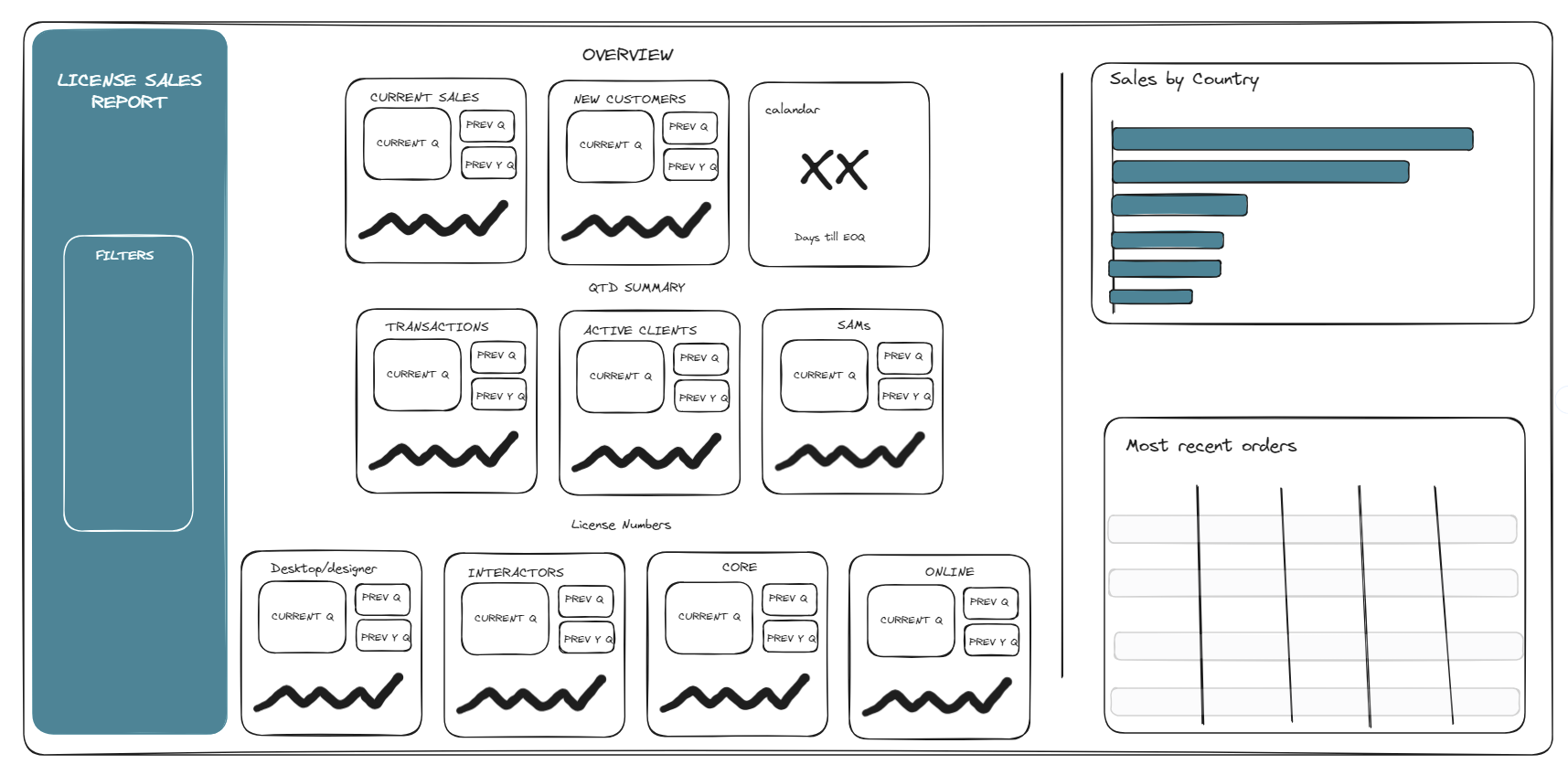
This was our initial sketch idea:
Whilst starting the actual project, I realized we will have to remake a lot of the charts and calculations as they were done differently in the original dashboard. This was very time consuming so I rescoped the project slightly.
Instead of completely redesigning the dashboard, I would get a few of the KPIs done to show a work-in-progress versions which could be built upon in future work.
When presenting, I was able to show how I improved the original dashboard as well as showing how this could be pushed forward in the future.
I received good feedback from my coaches and cohort too. We had some interesting discussions on showing axis on sparklines, when is it applicable to exclude data as well as general formatting tips.
Upon reflection, I felt it was important to constantly rescope and priorities what you want to show and present. When you only have 4 hours to complete a task, it is important to not expect a fully functioning dashboard but showcase the potential of my work and ideas.