


On Tuesday we were tasked with our first Makeover Monday effort at the data school. We went back to Makeover Monday 20 to re-visualise a climate change animation by Ed Hawkins showing the change in global temperatures since 1850. This is the visualisation in question and it uses an animation to convey the time series. It’s fun to watch but its neither possible nor necessary in tableau when a linear time axis works well.
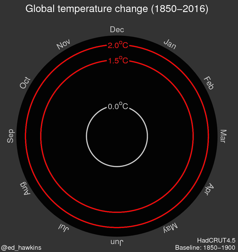
Ed Hawkins’ animated viz
Exploring the source data from the Met Office and watching Hawkins’ animation, I noticed he had shifted the temperature origin from its 1961-1990 median to the first point in the series. This means we are looking at change since 1850 as his viz is set up rather than change relative to the 1960s as per the data set. This made sense to me so I created a calculated field and adjusted the temperature data to reflect this new origin.
As there’s a lot of seasonal and yearly variation in the data I wanted a moving average to be the focus of the viz. I settled on a 10-year moving average and tweaked the adjusted temperature field again to make it relative to the first 10-year average rather than the first month. The gif below shows how to quickly smooth a volatile data set using a moving average to tease out long term trends. You’ll also notice that I had reversed the standard orange-blue colour scale as it feels more intuitive to have orange meaning hot when dealing with temperature data.
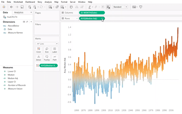
Creating a moving average in Tableau
To depict the volatility in the data behind the moving average I added a dual axis with a faded scatter plot. I like this set up because it gives the viewer the full context to the moving average without detracting from the line’s trends. Finally I added some annotations and polished up my tooltips to give my final dashboard some sheen. In the tooltip is a custom IF formula that calculates whether the rolling average is above or below the origin and converts it into the words “above” and “below” respectively. The formula is too long to display fully within the tooltip editor but you can check it out in the dashboard’s downloadable workbook.
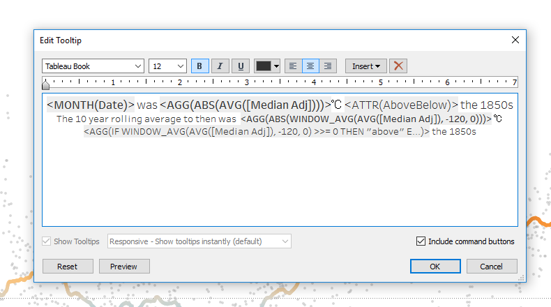
<IF [Formula Length] > [Needed] THEN “Send help” E…>
The Final Dashboard
Here it is all together, as always feedback is greatly appreciated!