


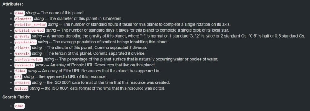
Today marked the first day of dashboard week for DS12 which believe it or not I was looking forward to as a break from client projects (I’ll let you know whether this was the right way to be feeling later on in the week). The challenge today was to connect to the Star Wars API (SWAPI), as there were only six of us here, we each took on one of the resources that could be called from the API, for me this was planets. You can check out my final viz here.
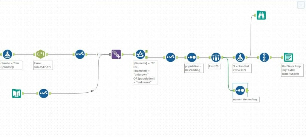
The data from SWAPI was in good shape, so it was easy to parse and prep in Alteryx. There were several pages to call so I used a multi-row formula in order to update the URL and make these calls. The fields that came out of the API gave information on population, diameter and orbital period to name a few, so at this point I started to think about how I wanted to visualise the data.
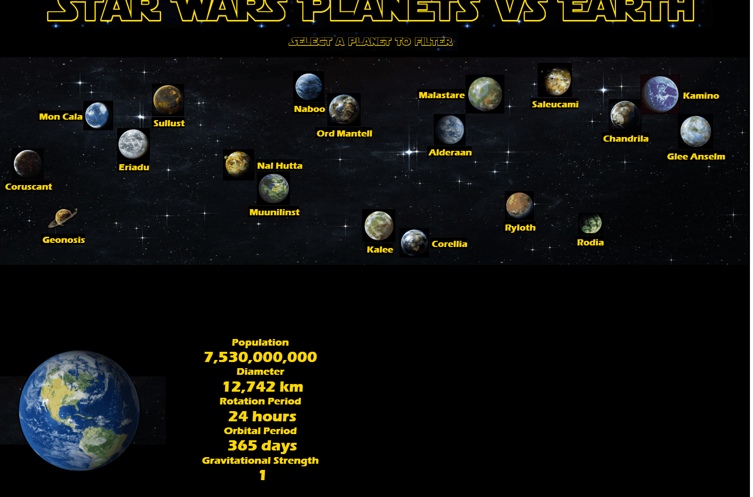
With my visualisation being about planets, I immediately wanted to try and somehow cast these up on a starry sky. As I’ve never used background images before, I saw this as a great opportunity to try one out, so I set about downloading images for the Star Wars planets to use as custom shapes. I quickly realised that a view was going to look very cluttered with 61 planets cast across it, so I reduced the number of planets I was going to look at to the top 20 by population. This also meant that I wouldn’t be trawling google images for pictures of 61 planets. Once I had the images I decided that it might be cool to have a viz that compares the planets from Star Wars to our own home, so I gathered the same information for Earth, added this as a text file to Alteryx and joined to my Star Wars data.
As I wanted to scatter these planets across the sky, I created some values using the random integer function in Alteryx and the Row ID to create X and Y values. I will be honest and say that it took a fair few runs of the workflow to get a random scatter distribution that looked nice and didn’t have planets overlapping, I’m sure there may have been a better way to do this but it was the best I could find from my google searches and it works!
I set to work in Tableau and plotted the Star Wars planets using my X and Y fields and their images as custom shapes. I sized them based on their diameters to try and reflect the difference in sizes between planets. I then used a starry night sky image as a background image to create the effect of planets floating in the sky. My plan had to be to use this view as a filter to compare the Star Wars planets to Earth, which can be seen at the bottom of the viz, whilst using the tooltip to contain the information about the planet’s climate and terrain.
I built out a simple view below for the comparison, using the planet images (Earth vs whichever planet has been selected) and information about population, diameter, rotation period, orbital period and gravitational strength as a text field to compare the two planets. All that was left to do now was some general formatting and dashboard actions. The Star Wars font that I have used are images and you can make the custom font at Font Meme. For the text in the viz I tried to find a font that was similar to the Star Wars font (Eras Bold ITC) which I think works quite well however, it doesn’t show up properly on Tableau Public so I had to change it to Tableau Semibold for the purpose of the upload. I matched up my colours to the hex code to the Star Wars yellow and the job was done!
This wasn’t the most analytical piece I’ve ever done, however I wanted to take the opportunity this week to try out some new looking vizzes. For a while (as my Tableau Public will show) they have all been very similar, and I think I managed to achieve that today so I’m happy with the effort.
One day down, we’ll see what the rest of the week has to bring…