


Finally. The the last day of dashboard week had DS12 looking at interstate traffic flow in the US. Check out what I came up with here. No web scraping or APIs to be called today, but that meant that any data prep that needed to be done, had to happen in Tableau Prep. There were two CSVs to join from the data source, containing information about flow past thousands of traffic detectors throughout the US for every hour of the day for just over a month. My workflow can be seen below.
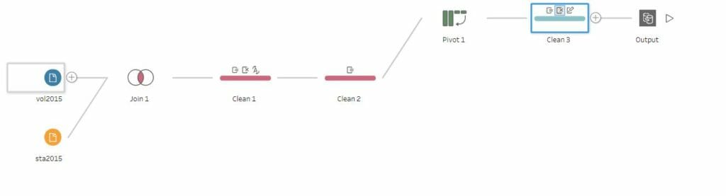
First of all I joined the two datasets based on station ID. The main issue I found with the data, was that the longitude and latitude fields weren’t formatted correctly. Instead of having a decimal, they were just large numbers reaching the millions. This was a simple fix, by dividing the fields by 1,000,000 and multiplying the longitudes by -1, I had the correct positions.
Next came to pivot the ‘hour’ fields, as there was a column for each hour of the day. Once these had been pivoted, I could build out a field that contained, year, month, day and hour, from four different fields. After this was complete, there was only a bit of data clean up to just remove some unnecessary fields that I didn’t want to use in my visualisation.
Once the data was loaded into Desktop and I plotted the latitude and longitudes, there were some scattered all over the map, although the majority were in continental US. I decided to filter out those that weren’t in the mainland, including Alaska and Hawaii. As we were pushed for time today I didn’t want to waste it trying to figure something out when it may have just been a problem with the data set itself.
As the flow of traffic is frequently likened to circulatory systems, I decided to try and visualise this effect using the pages shelf. Of course this wouldn’t work on Tableau Public but I thought it would create a nice looking visual anyway. I plotted the different stations on the map, and sized them by their flow count. I decided to focus on one particular day rather than use the entire data source.
The second chart I used was a bar chart, to show the flow count throughout the day by different states. I synchronized the pages cards so they could work simultaneously and the final viz can be seen below. I feel like it kind of mimics a heart beat, so I got the effect I was going for.
Dashboard week over. All in all, it hasn’t been too bad this week, I’ve actually quite enjoyed it. As I said at the beginning of the week, I thought it would be a nice break to how things have been going and it definitely was. Back to the client projects on Monday.
Bye for now