


Bump Charts: Strengths and Weaknesses
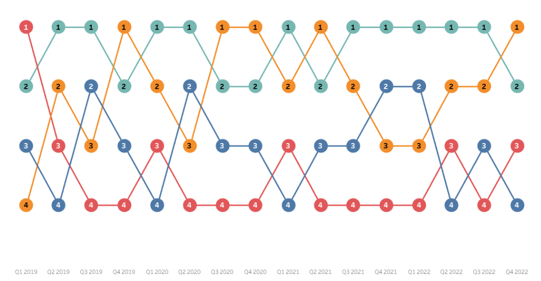
One of my favorite kinds of charts is a bump chart, which allows you to see how rankings have changed and evolved over time. They are simplified line graphs, where instead of plotting measured values vertically, you plot how a certain group ranked. Some of the most common applications I have encountered are comparing countries or sports teams on various metrics. I have included an example bump chart by Megan Harrington from her great tutorial blog below.
One of the key assumptions in this kind of chart design is that the rankings are mutually exclusive so that only one group can represent each rank at each time without any ties. For continuous metrics this is practical, as it is vastly unlikely that metrics with multiple decimal points of precision will end up exactly equal. However, not all ranking metrics avoid ties in this way. Olympic medals can end up shared based on the rules of their sport, leaving two gold medalists and one bronze medalist. College basketball's AP Rankings can end up with ties with multiple teams in the top 25 receiving the same amount of votes.
I even encountered this in my final interview dashboard, with a dataset of all of the #1 songs from the Billboard Hot 100. I wanted to create a bump chart of how different genres ranked in key change prevalence over time. Unfortunately, due to the sample size, I ended up with a bunch of zeroes, giving me a bunch of ties. Reconciling the value of seeing rankings over time with the major problem of ties has been on my mind since, and this blog proposes the "Bubble Bump Chart" as a potential resolution.
A Use Case
As the previous example probably made pretty obvious, one of my passions is sports data, so I looked to sports to try to find an extreme example that would break the old bump chart design and force me to innovate. I settled on the NFL Divisional rankings from the last four years. The NFL is organized into 8 divisions, with the same 4 teams competing in those divisions every year. I thought it might be interesting to see how a team has developed over time. Maybe a team rose from 4th to 1st, or another stayed steady at 2nd for many years.
This use case is full of ties! There is an 8 way "tie" for 1st place, 2nd place, 3rd place, and 4th place in the division. A bump chart definitely does not make sense here, but the idea of seeing how rankings rise and fall over time is still the end goal.
Why Not a Sankey?
My first thought when I came up with this use case was a Sankey chart. Sankey charts show how individual records flow from category to category. The key word here is flow, which is the section that Andy Kriebel placed Sankeys in on his Visual Vocabulary Dashboard (his example is below).
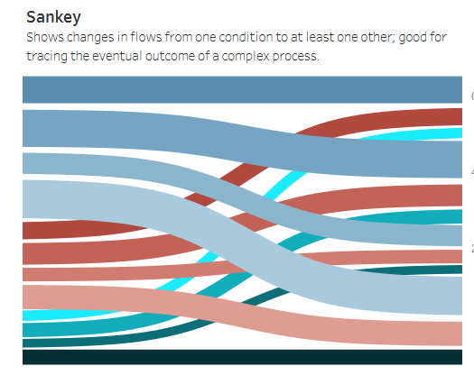
It was possible to make a Sankey chart using my data, so I did, but it looked a bit strange. The default in the Tableau extension was to color ranks 1-4 differently for each year (how is it supposed to know that they mean the same to me?), and sort the rankings by their convenience to the flow, not by their ordinality. These were some early signs that a Sankey was not the right chart type, but what made it clear to me was recalling that Sankey charts are about flow. This chart type would be more appropriate for asking the question "how did 2023 division winners fare across the next two years", or "how did last place teams from 2022 improve over time". The chart is best suited to see how things flow out of one category and into others, it is less appropriate for tracking individual groups over time.
Also, Sankey's with 4 or more categories and 4 or more states can get very busy and hard to parse for a reader, especially one with the goal of following one single strand throughout the full chart.
A Better Bump
After a brief aside with the Sankey chart, I decided that the bump chart model is the closest thing that I could find to the kind of chart I was envisioning. One possible way to reconcile the issue of ties in a bump chart is by placing points side-by-side. If two groups are tied for first place, put them right next to each other and proceed as normal! This works in theory for rare ties, but for sixteen 8-way ties a more robust solution was required.
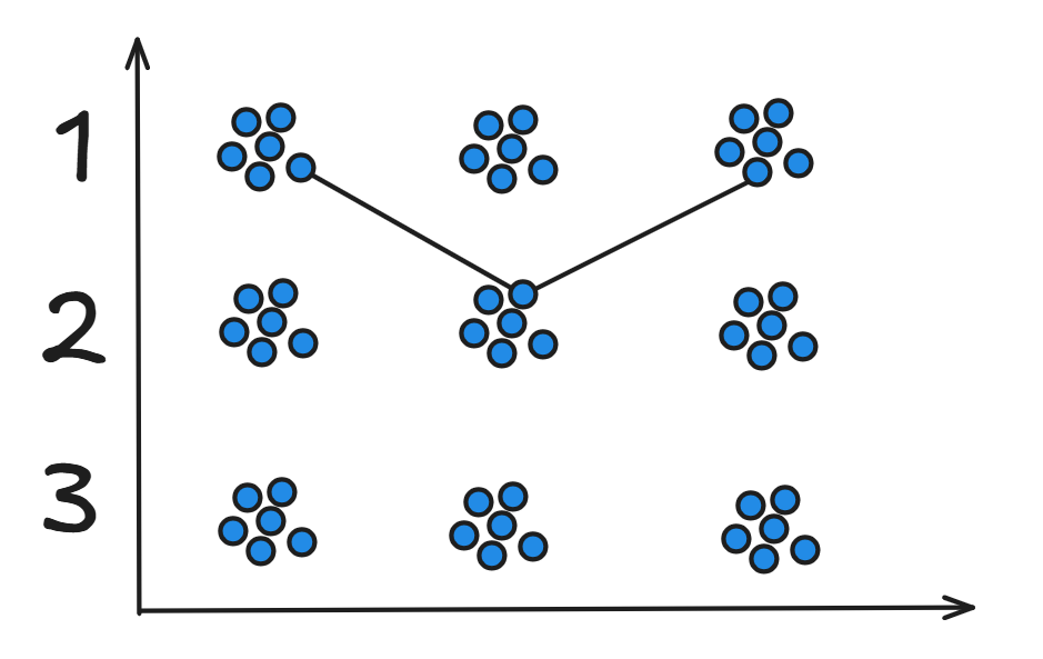
My idea for expanding the idea of side-by-side points to groups of 8 was to create two-dimensional "bubbles" of points for each ranking at each time marker. The shape of the points around the ranking is inspired by Packed Bubble charts, hence the name "Bubble Bump Chart". The sketch below is a pretty good rendering of how the chart looked in my head.
Implementing the Idea
I was able to make a functioning prototype of the idea, which I will walk through, but I am hopeful in the future that I can refine it more into something that looks closer to the sketch above. The way that I decided to create the bubble of points was using a jitter or a small amount of randomness added to each point's coordinate value to spread a close group of points out. Jittering is most commonly used with dense data with point on top of each other. In this case, I used jittering to "shake out" the piles of points at each rank without moving them too far.
The math behind my (very manual) jittering can get a bit thorny, so feel free to skip ahead if you are less interested. My goal was to have a jitter on a grid, so the points would not end up too close to each other and looking disorganized. In combination with the random() function, which I shifted 0.5 units to the left to center it at 0, I used the floor() function to force the random values to specific intervals. The 32 constant is used for scaling – if I wanted the bubbles to be thinner/wider or shorter/taller, I could alter that number.

A nicely packed bubble like I sketched above would look incredible, but jittering was an accessible, math-based solution to get a viable product that resembled my imagined chart idea.
A Working Prototype
After a lot of thinking about dual-axis logic and how to best shape my "bubbles", I came to a functioning version of the chart. As I envisioned, there are groups of points that represent a given ranking in a specific year, and you can trace individual teams' paths over time without losing access to how every other team ranked during those years. I added the circles on top of this screenshot using Excalidraw, but visually grouping the bubbles using circles is something that I would want to capture in Tableau eventually.
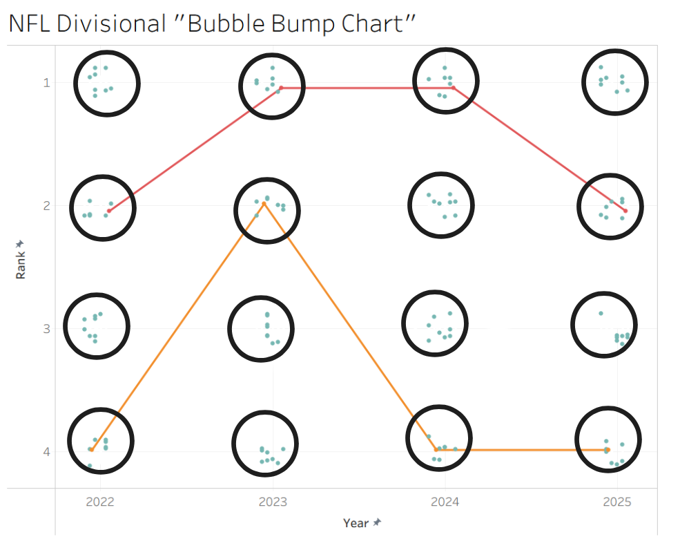
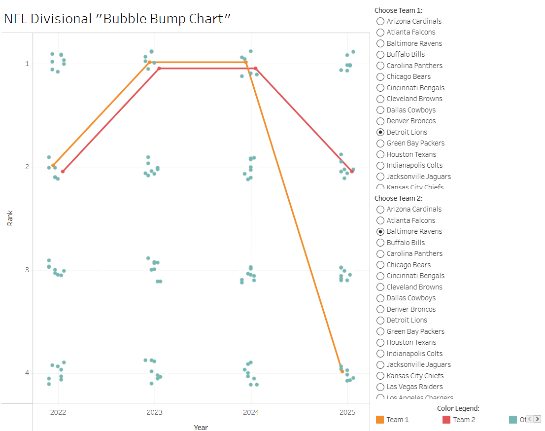
Last, I want to show off the example that I think best demonstrates the value of this new chart design. In this instance, the two selected teams – the Detroit Lions and Baltimore Ravens – have had extremely similar trajectories over the past four years. They both went from 2nd to 1st to 1st, before splitting up in 2025. The original bump chart would have had these lines directly on top of each other, and the Sankey chart would have shown these as one thick connection rather than two distinct teams until the final year. This new chart design shows that although these are two distinct teams, they followed a virtually identical trajectory for 3 years, then split off. One possibly difficulty with introducing this new chart type is making it clear that the exact positioning of the points (whether they are high or low for their bubble) does not matter. The idea here is that points from the same bubble are viewed as essentially the same. I think a clearer bubble shape, as in the sketch, would sell this idea a bit better.
It is not at all perfect, but I would consider my new Bubble Bump Chart another alternative to add to the list of things to think of when dealing with ties in a set of rankings.