


Word clouds are a classic chart type used to quickly summarize the words used in a body of text. In a word cloud, a word's size represents its frequency in the original text, with more common words being displayed larger so that they are emphasized. You can see a prototypical example of a word cloud below:

As pleasing as this visualization looks, it is far from ideal in terms of making it easy to identify insights. It becomes apparent that most questions you might want to ask about this kind of visual are hard/impossible to answer.
What is the second most common word after collaboration?
Which word appeared more, success or project?
What are the top 5 most common words in the text?
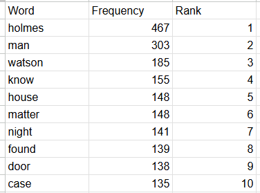
These questions are most easily answered using a frequency table, the data structure that is typically used as the foundation for word clouds. For the purposes of this blog, I have decided to use the Sherlock Holmes short stories as a sample text body. The most common words in the text are holmes, man, and watson.
This word/frequency/rank format optimizes the time it takes to answer the kinds of questions from above, but also loses the aesthetic quality of the original word cloud design. It would be useful if there was some kind of middle ground between the two options which preserved the information about ranking order while also looking better than the simple table.
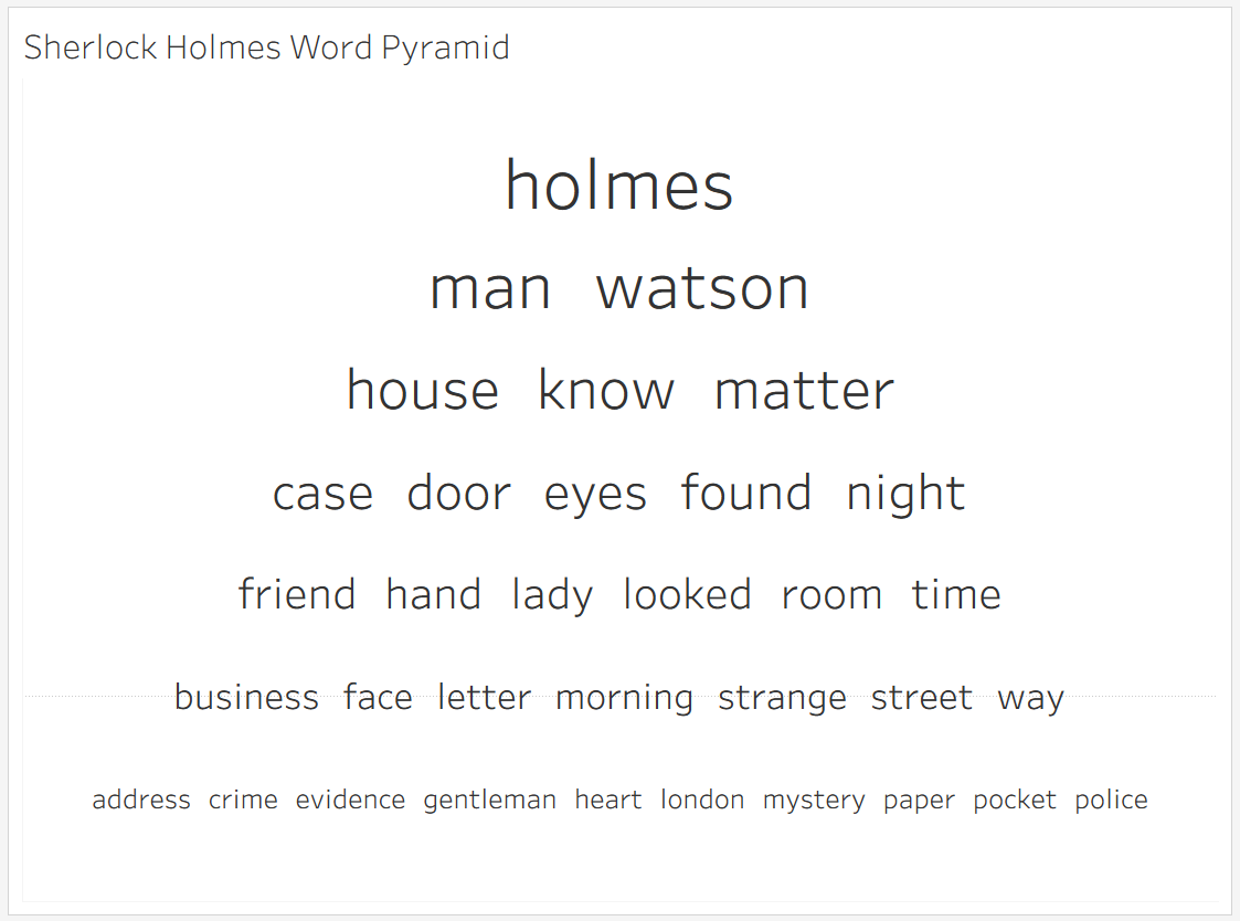
To try to achieve this goal, I have been developing the word pyramid. In a word pyramid, a word's size still represents its frequency, but now these sizes are binned. You can read the pyramid top to bottom and left to right, always moving from words that appear more to words that appear less. In this design, you can always identify the top N most common words and it is always possible to know how two words compare.
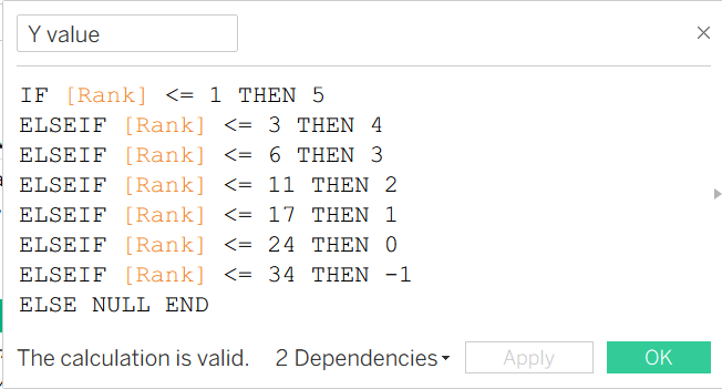
Before I conclude, I wanted to give a look under the hood of the Tableau development behind the chart above in hopes that someone continues to build this project further than I have! The placement of the rows is extremely manual, as well as the sizing in Tableau. To get the vertical placement, I (very manually) wrote this calculation to choose how many words would end up on each row and where they should be placed on the pyramid. I chose how many words were placed on each level using trial-and-error and my own feelings about how it looked. In the future, I could imagine using the amount of characters in each word to make the row assignment dynamic and automated, but I am unsure that could ever match the aesthetic standards of my human trial-and-error.
Arriving at this stage of data visualization development, it is difficult to come up with a novel and useful chart type that nobody has thought of before. I am hoping this, as well as my bubble-bump chart are potentially viable additions to the current body of chart types being used!