


Animated line graph demo!
Time series data is composed of measurements taken at regular intervals over a given time period. The typical chart choice for this kind of data is a line graph which lets you get a broad assessment of how trends have shaped up over time.
Line graphs are ubiquitous and highly informative, but in the context of time series data, I believe they lose a bit of the context of the data generation – that it happened over time. It would be helpful if we could see the line graph develop over time sequentially. Fortunately, Tableau's animation feature allows us to progress through time automatically with a play button! In this blog, I am going to discuss the steps required to build out an animated line graph in Tableau and apply it to a fun use case!
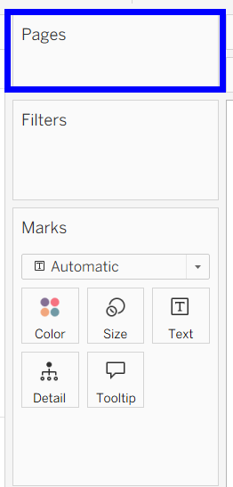
The key to animations in Tableau is the pages shelf, which I had not actually used for a project before this one! It can be found above the filters shelf:
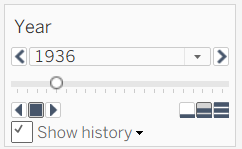
When shown, the pill you place on pages has a similar interface to a parameter or filter set to be a slider, with buttons to move backwards, move forwards, and stop the changes in your field.
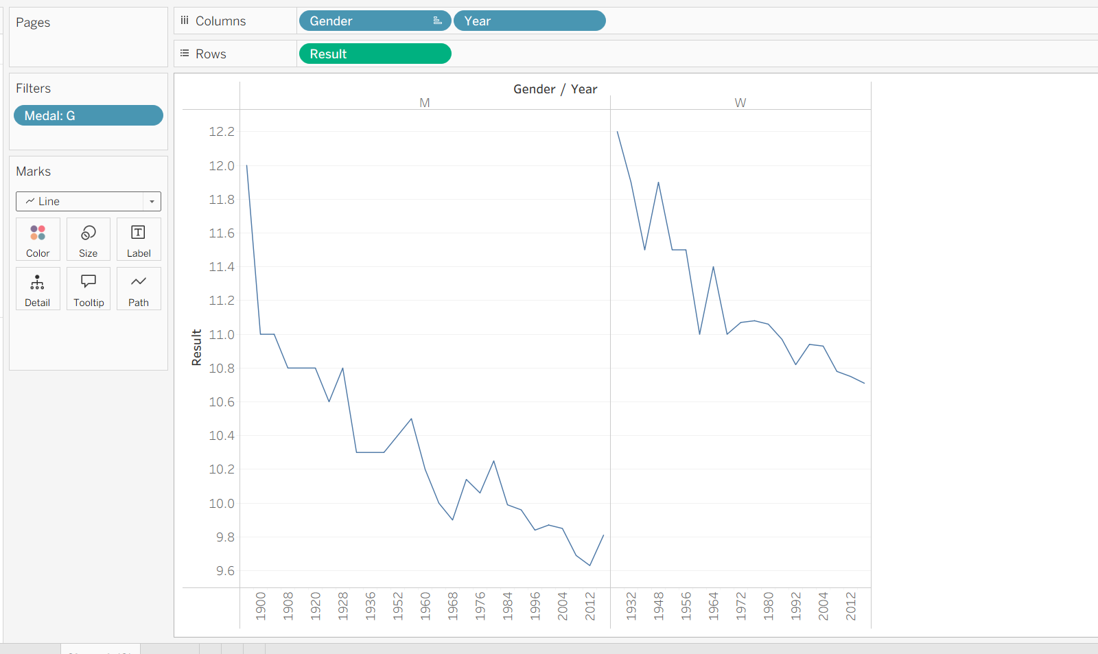
Let's get to the application! I found this interesting dataset of olympic track and field results on Kaggle (largely inspired by the ongoing 2026 Winter Olympics in Milan). It contains the results (times/distances) that won medals in every track and field event at every olympic games since their origins in 1896. I first filtered down to only the men's and women's 100M dashes, and only kept the gold medal winning times.
To get side-by-side line graphs of how the men's and women's winning times have evolved over time, I placed Gender and Year on columns, and the winning times (encoded as 'Result') on rows, to get this visual:
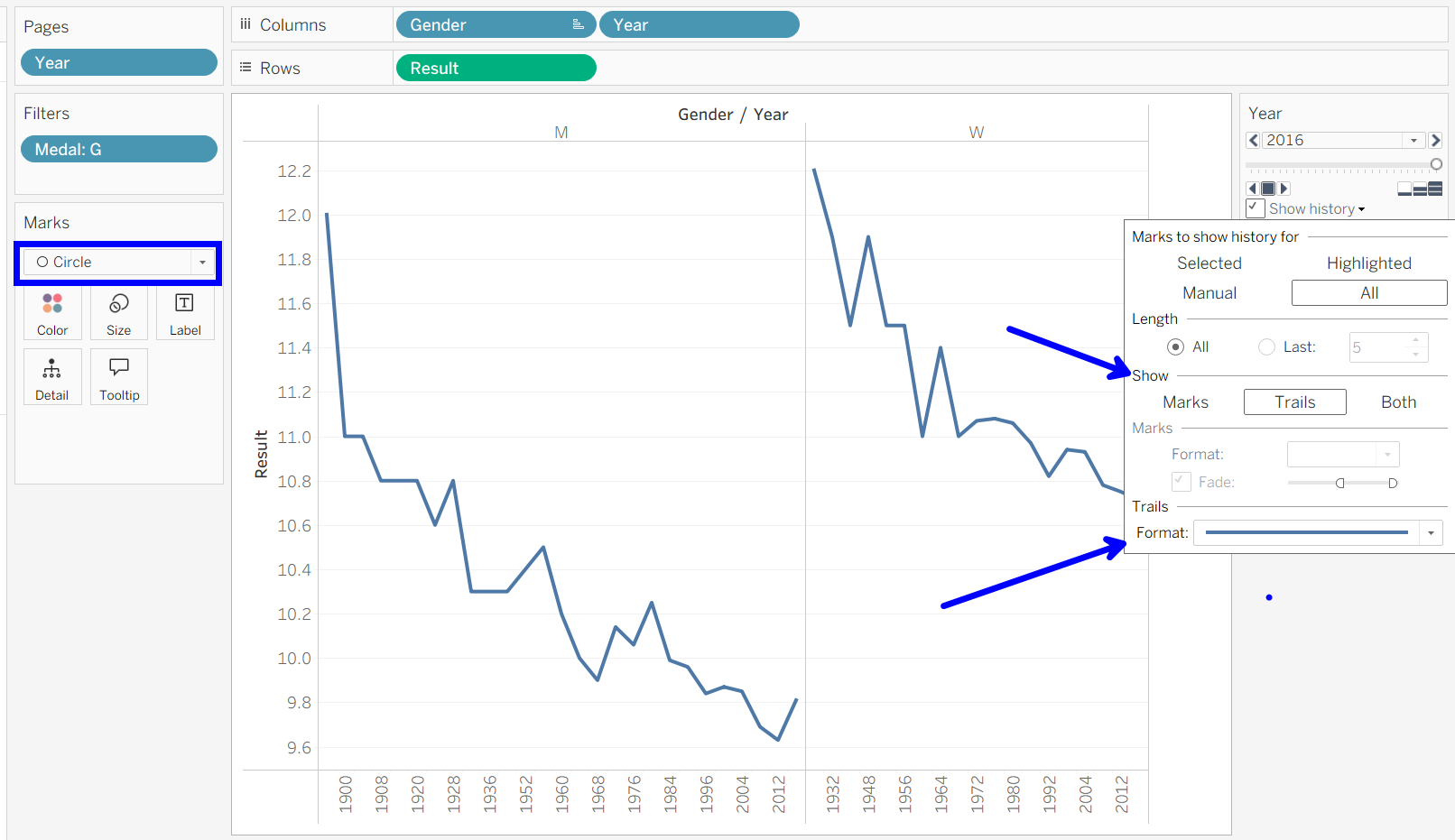
Here is the most important part: when you add Year to pages, you will get appearing and disappearing circles, which is how a line mark is designed to animate in Tableau. The workaround is to switch the mark type to a circle, then add trails behind your marks, in the form of a thin line. Remember to show history for all marks! This picture shows my finished setup:
At this point, you can play around with some of the aesthetics yourself, choosing to animate faster or slower, change colors, or reformat the viz (these lines could be vertically stacked, or even overlayed!). Have fun bringing your time series visualizations to life!