


Oftentimes, when an analyst creates a scatterplot they are searching for some kind of correlation between the variables. Although lesser known, scatterplots also open the door to cluster analysis, a quantitative approach for creating subgroups within a larger group of records.
At its simplest level, clustering can be done using your own eyes. For example, if you were given this example below without the coloring, you could probably get pretty close to this mathematically optimal grouping just by looking at it (image credit to https://en.wikipedia.org/wiki/Cluster_analysis).

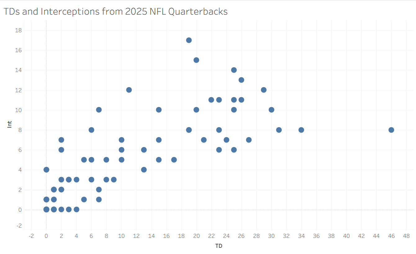
When data gets larger or messier, it becomes harder to know how to group records together. For my application in this blog, I obtained the number of touchdowns and interceptions thrown by each quarterback in the 2025 NFL season from Pro Football Reference. The scatterplot has a vaguely positive trend, but that is not what we are looking for here. Instead, we want to try to get some bunches of similar quarterbacks to learn about what they might have in common. Do you see any obvious way of doing this? I don't! Thankfully, when human intuition reaches its limits, math and statistics can usually fill in the gaps.
Quantifying Clustering
If you were to try to put into words how you clustered the colorful Wikipedia example above, it might sound something like the following: "I noticed that there were some locations with a bunch of points, so I assigned them to be a cluster and included every point that was closer to this bunch than the other bunches". This is essentially what Tableau's clustering algorithm, the K-Means algorithm is doing.
First, it randomly generates a set of centroid points to build clusters around, and assigns each point a cluster based on its closest centroid. Next, the algorithm quantifies how efficient this centroid set up is based on the total distance of all of the points from their centroid. Last, with a bit of randomness and iteration, the algorithm explores many options for different centroid placements and settles on one that is optimal (or close to optimal). If you don't alter the settings, Tableau's clustering function will also automatically choose the number of clusters to optimize the final accuracy, but you can also change that number (the K in K-Means) to create as many clusters as you need for your analysis.
Implementing it for the NFL Data
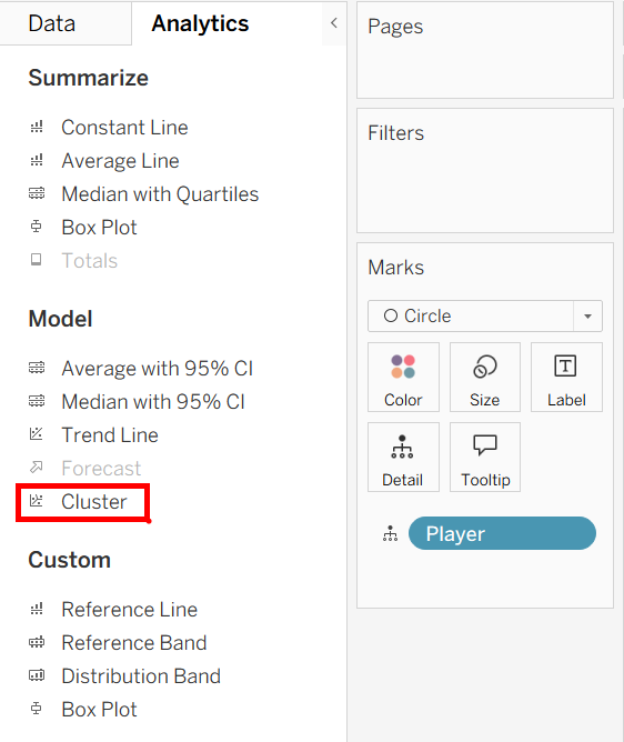
You can find the option to add a cluster analysis to your scatterplot in the Analytics pane, under the Model section. Its implementation works the same as all of the other analytics tools, you can drag it onto your plot, it automatically configures, and you can continue to modify it from there. One thing to note is that it will not work if you have aggregated measures, so make sure to uncheck "aggregate measures" under the analysis dropdown at the top.
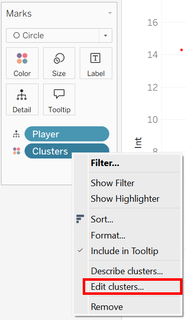
My clustering of NFL quarterbacks automatically chose 2 clusters, which is often optimal, but not so meaningful (most knowledgeable fans could discern a 'good' and 'bad' quarterback from each other). I thought it would be more interesting to have three clusters, so once the clusters were (automatically) placed as a color mark, I right clicked the pill, chose to edit the clusters, and set the number to 3.
At last, Tableau gives us a meaningful clustering of these quarterbacks. Since there is some sort of ordinality here, I conceptualize the clusters as 'bad', 'medium', and 'good'. Sometimes clusters can have other meanings, such as grouping similar species together into larger classes in a biological dataset.
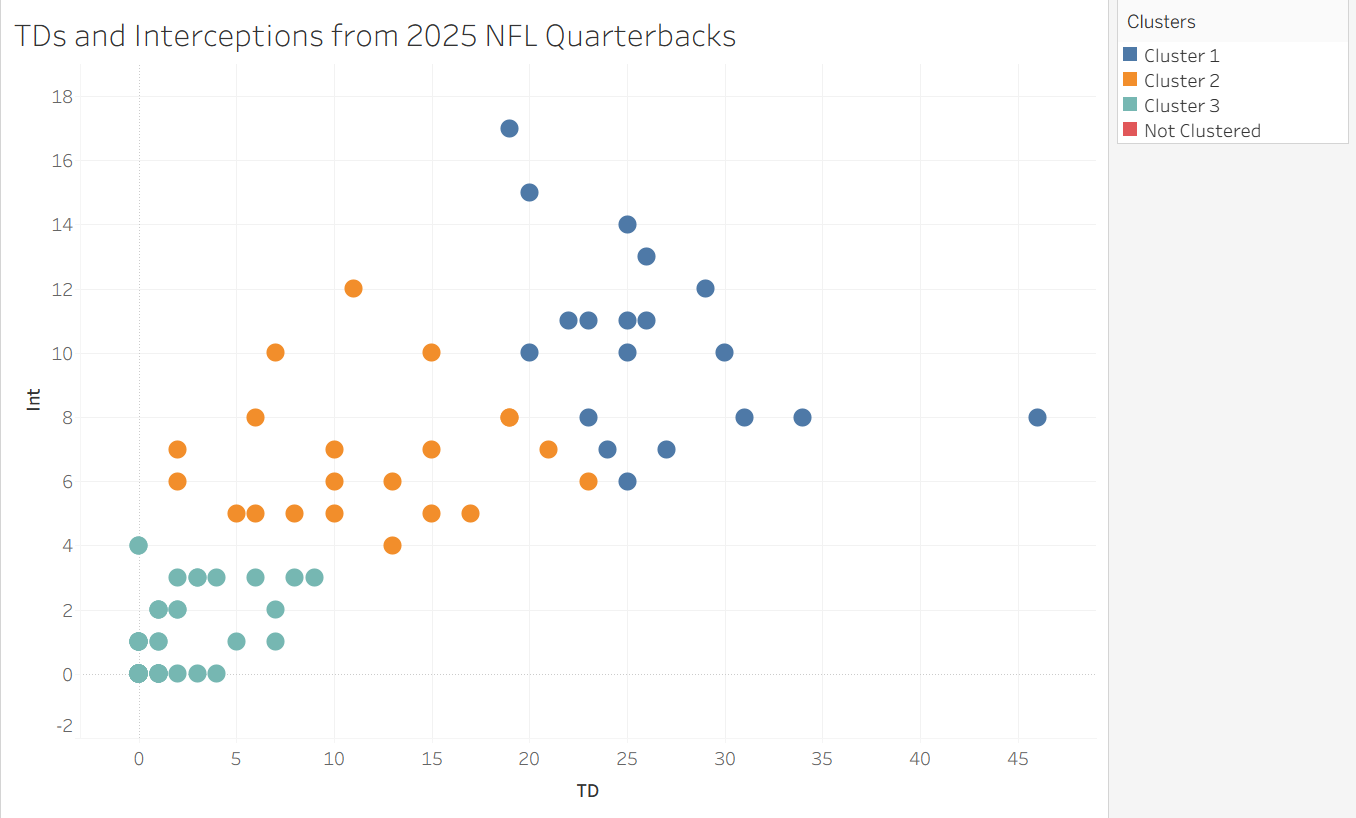
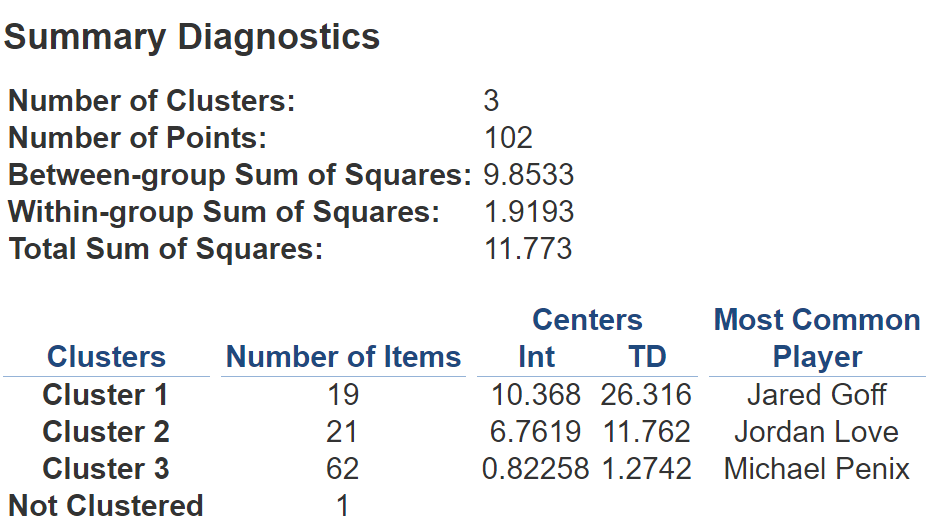
Clicking "Describe Clusters" above gives you some detailed output about the clustering model and how well it works. It also gives you the mode for your detail variable, which is not especially meaningful in this instance (since names are unique) aside from using them as a pretty random sample from each of the clusters. I have included some of this output, but I am most interested in these modes. Based on our rudimentary cluster analysis, we can conclude that an example of a 'good' quarterback is Jared Goff, an example of a 'medium' quarterback is Jordan Love, and an example of a 'bad' quarterback is Michael Penix.
If you wanted to, you could take this one step further, using the provided centroids to find out which quarterback is closest to each of their respective centroids. In doing so, you would be finding the defining example of your cluster – the record that most closely emulates its centroid. For now though, I can explore my plot using tooltips and see where each of the quarterbacks in my dataset fall. I hope this blog serves as an introduction to the idea of cluster analysis as well as a guide to get off the ground with it in Tableau. Happy analyzing!