


When diving into a dataset, it's easy to get lost in the numbers. Analysts rely on summary statistics like averages, standard deviations, minimums, and maximums to make sense of large, messy datasets. More often than not, these metrics are useful shortcuts to understanding the makeup of some data.
As with most statistical tools though, summary stats can be extremely misleading and must be used with caution. As I discussed in a previous blog, range and standard deviation are both vulnerable to outliers. The same is true for most other metrics. Consider this artificial dataset of monthly average temperatures in Miami:
[65, 63, 68, 73, 84, 86, 87, 90, 866, 82, 71, 73]
You may or may not have noticed some error in the data: the September temperature was input as 866! An average temperature of 866 is absurd practically, but can show up in a dataset realistically, due to human or computer error. Fortunately, I showed you the data and gave you a chance to identify that anomaly. What if I hadn't? The summary stats for this dataset would look like:
Average = 142.3°, Maximum = 866°, Range = 803°, Standard Deviation = 228°.
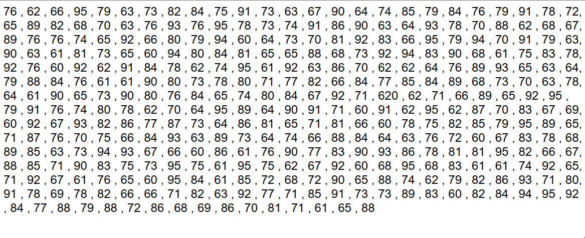
Fortunately, we had a chance to look through the data and identify this error, but it is very possible that we could not have had that chance. In practice, datasets are far larger than 12 points – for example this other artificial dataset of daily temperatures for a full year. There is one outlier in this dataset (I will be impressed if you can find it!), but it is definitely not as immediately clear to the eye. Sometimes your dataset can have millions of rows, giving you no chance to "eyeball" this human error. In those situations, our only alternative to summary statistics is data visualization!
It is nearly impossible for humans to parse thousands of numbers at once, but data visualizations make it possible to find insights from massive amounts of information. If we had plotted a histogram of the previous data, a chart type that places possible input values into bins and shows how many records fall into each bin, we would have been able to quickly identify a problem:
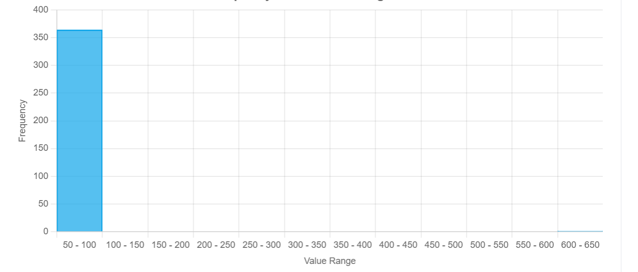
All but 1 of our points are between 50 and 100, but our visualization has expanded to include the 600 to 650 range (a hint for the earlier section), indicating that there is a massive outlier in our data. Summary statistics would have only given us a small, possibly misleading glimpse into what the data looks like, but a histogram lets us lay eyes on all of it!
The Datasaurus 🦖
In 2017, Justin Matejka and George Fitzmaurice published a paper called "Same Stats, Different Graphs: Generating Datasets with Varied Appearance and Identical Statistics through Simulated Annealing", in which they demonstrated how vastly different datasets can all end up with the same summary statistics.
This gif shows it best (original source). Data distributions that look so clearly different to the human eye look exactly the same through the lens of some of the most well-established statistical metrics.
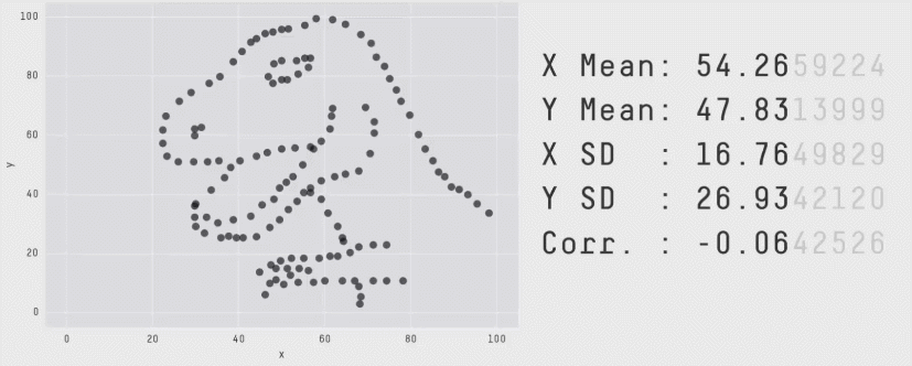
I discovered this outside of the world of the Data School, but it is one of the most compelling arguments for data visualization I have ever found. There are no infallible quantitative metrics, there is always an edge case where the equations end up misleading you on the true behavior the data. The only foolproof way to gain an understanding of how your data is behaving is to look at it yourself, which is where Tableau experts and data analytics consultants become invaluable.