


When you are putting a dashboard together, it is easy to miss the fact that not every element will work well for every person. Accessibility often gets treated as an afterthought, but it should really be part of the process from the beginning. If you want your dashboards to be used and enjoyed by everyone, accessibility needs to be built in as a core principle.
This was the challenge on day 1 of dashboard week at the data school, I was tasked with making a dashboard that a screen reader could navigate, with clear text order, no inaccessible-only content, and helpful keyboard shortcut guidance.
Here's how it went:
The Brief
The task was to build a borough-level dashboard for Transport for London that highlights step-free station access, with filters for features such as toilets, lifts, and proximity to attractions. The dashboard needed to be screen reader–friendly, with clear text order, alt text for maps and KPIs, no inaccessible-only content, and keyboard shortcut guidance, ensuring a screen reader user could navigate and understand the key insights.
Planning
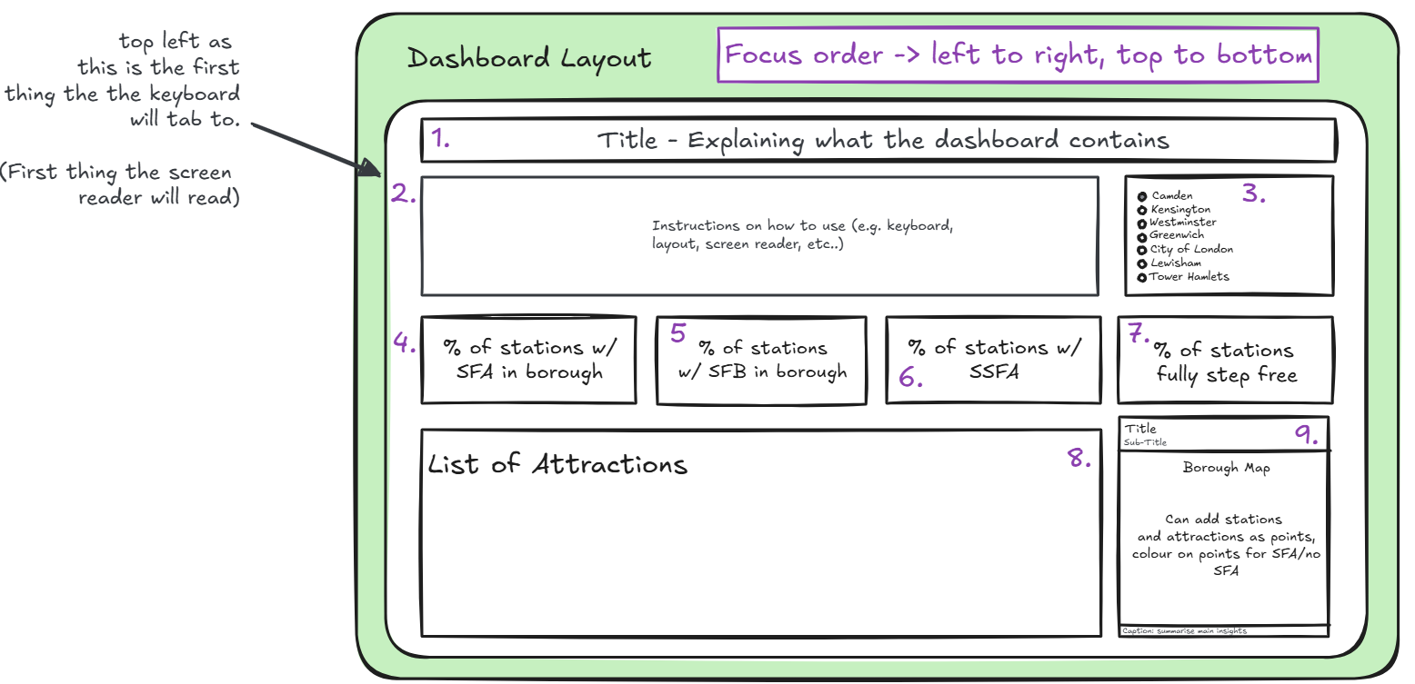
As the dashboard needed to be navigable with a keyboard, I had to think about the order in which I placed my objects. Tableau automatically sets the focus order from left to right and then top to bottom. Using this, I placed the title first and then had a 'About' section, explaining how to use the dashboard with a keyboard. This would allow the user to get information on the dashboard first, before anything else.
All of the other aspects were placed in a logical order to walk the user through the insights in a way that makes sense.
Titles and Captions
As the dashboard had to be screen reader accessible, anything made in a visualisation would not be picked up (including tooltips, text marks, axis labels and headers). This meant that all insights had to be explained within a title or a caption, as these are the only parts of visualisations that will be picked up by a screen reader.
This was, however, easier said than done. Making the captions dynamic was something I found difficult, as when there were multiple marks within a caption, it simply displays 'All'. This meant that any insights that involved multiple marks could not be conveyed properly by a screen reader. Because of this, I had to change my plans slightly.
Outcomes

Planning for a screen reader took a lot longer than I thought and required a lot of rethinking to ensure everything works. Because of this, I didn't quite manage to make everything work (mainly the table and the map).
The first section of the dashboard, which included the KPIs, worked particularly well. It could be navigated entirely with a keyboard, and the screen reader was able to read the insights clearly. The filters functioned smoothly too, allowing the KPIs to update dynamically.