


DS29 have started their final week at the Data School - and as is tradition that means dashboard week. This week also happens to be a three day week because of the Queen's jubilee, although on a daily level that doesn't feel like it has taken any of the pressure off.
The data set today is to do with the Permitting Dashboard, which is an online tool that tracks the US Federal Government's infrastructure projects in an attempt to improve transparency and accountability (I think that after spending the day looking at the data - they've done a fair job at this, but it could be better).
Once we received the brief, it was straight into scoping the project. The website has a number of aids which helped to understand the project quickly, such as an extensive Data Dictionary to help with field interpretation, and even some featured content that uses the data set which was a solid place to start.
In a way, the data set somewhat reminded me of the role I played during our first ever client project for the fictional Allchains company, where I looked at Work Order routing and manufacturing production. As such, the measures I wanted to look at analysing on first scoping were similar to the ones I looked at during that project:
- Costs
- Delays
- Distinct count of IDs
The intention was then that these measures could then be filtered down to their respective project statuses, lead agencies, and possibly even a timeline of events.
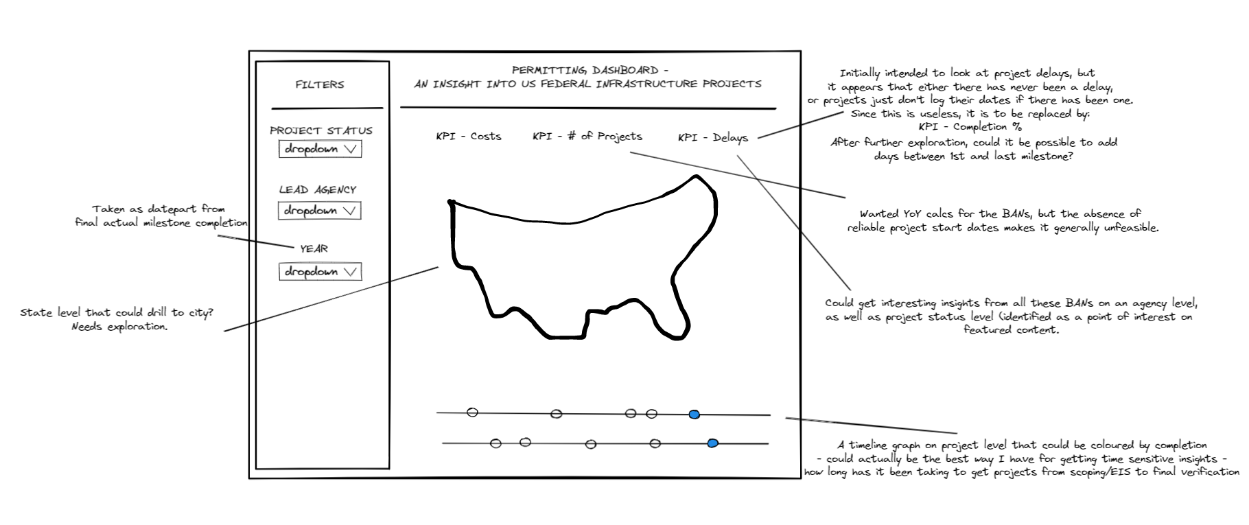
My initial sketch looked like below:
This dataset was very clean, which I was surprised about initially, but in retrospect probably shouldn't have been given that it comes from an official website of the United States Government. This meant that my Alteryx Workflow was kept quite short and sweet.
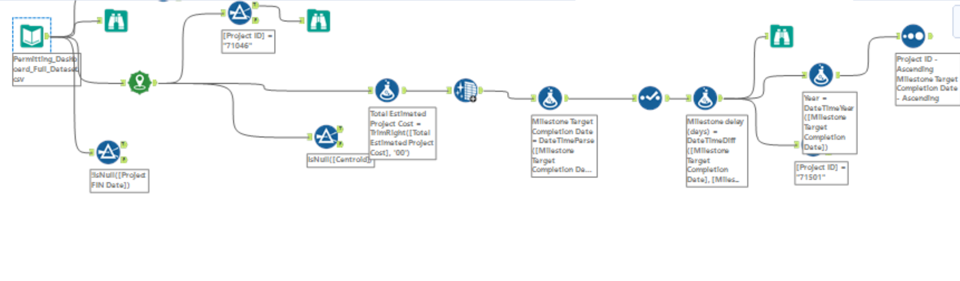
There were a couple of issues I encountered during the initial period in Alteryx - namely some of the latitudes were 'out of range' and so no point was created, and some dates had clearly been manually entered with errors, but neither of these small issues would end up being significant.
I created an output of my Alteryx workflow as a hyper and began to explore in Tableau. I started with looking at costs. When wanting to look at projects on an agency level, I thought it would be interesting to look at how much these projects were set to cost as a % of their overall budget, so I allocated myself a few minutes to see if those numbers were readily available. They weren't, but even if they were, there were other issues in play too such as both milestone dates (which when taking the first one are the closest we have to a start date, and therefore the year we would allocate that cost to the budget of), and the total costs field being almost 40% null! I suspected this could lead to some issues when creating a timeline, but definitely thought it was worth trying out anyway.
During out last Tableau test, I really struggled with LODs and table calculations and had them highlighted as something to get better at - so when I saw that I might need to use them today, I jumped at the challenge. My process when trying to validate and find the answers I'm looking for here is to make sure everything is in a table, and work through it step by step.
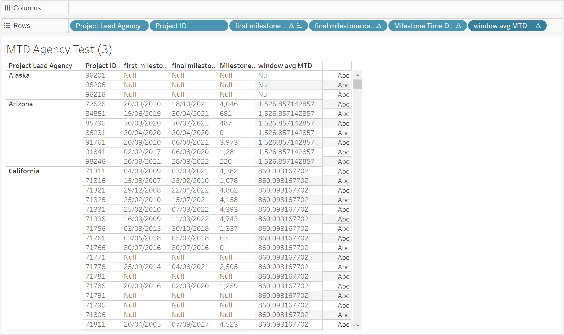
To make matters worse, of my now planned four BANs that would headline my dashboard, three of them had similar problems. As someone who, as it stands, significantly favours Alteryx to Tableau, this just made me further frustrated with myself. All of my difficulties I was having here I could have dealt with in Alteryx, instead of trying to get fancy in Tableau with something I'm not as good at. I did it to make sure I wouldn't spend too much time prepping and not enough time actually analysing, but it actually had the opposite effect. Lesson learned.
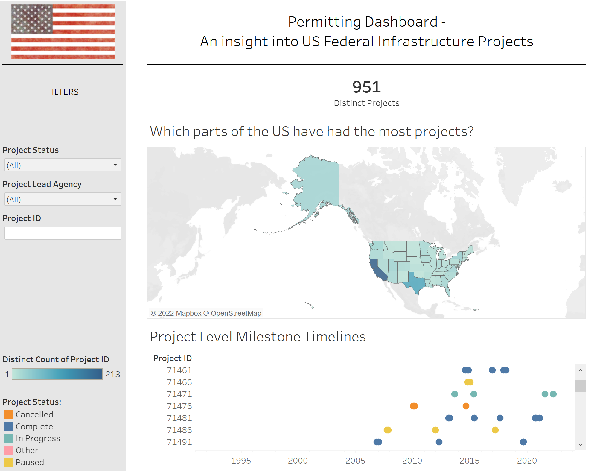
In conclusion, I definitely bit off more than I could chew today, and if you actually read this blog you'll see that I'm not happy with my final product at all. I felt genuine accomplishment at getting some of the calculations to work today that I've previously struggled with, but I felt stupid that I wasted so much time on them instead of getting that solid analysis done in the dashboard. One thing I think I did well today was document all my steps and issues as I went along, which meant I didn't spend that much time on my blog at all. I've learned a lot today in terms of what I can get done in a day, and I really hope to take that knowledge and improve as the rest of dashboard week goes on.