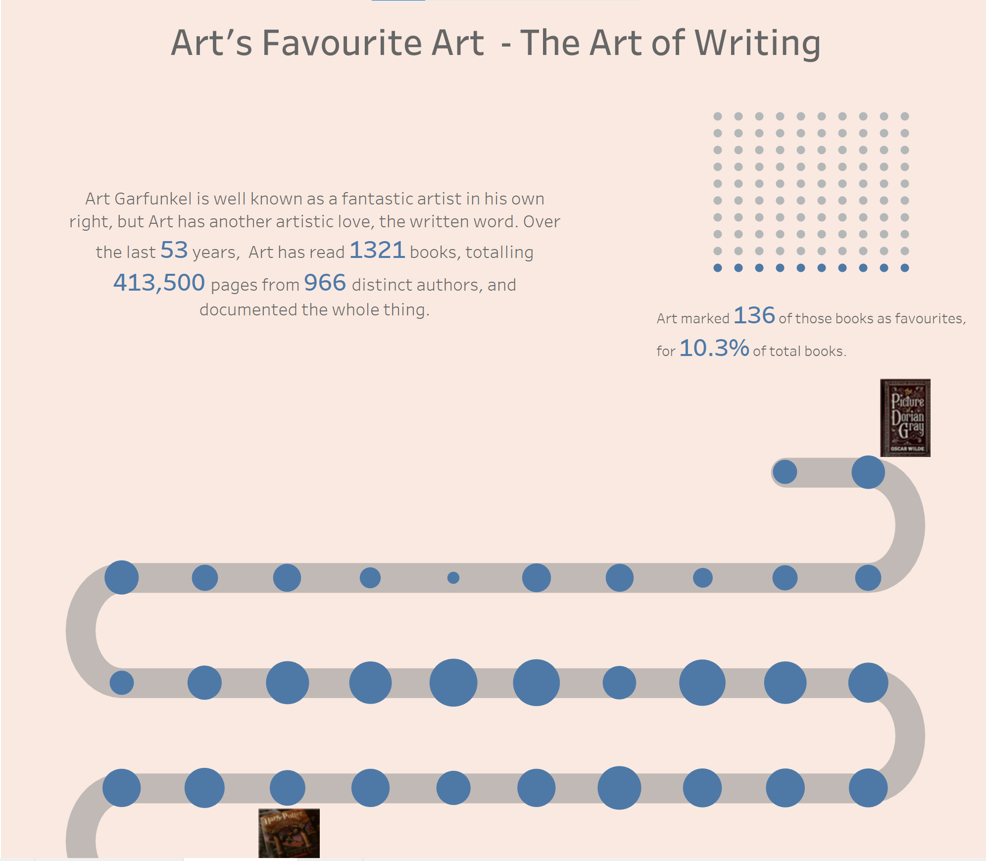
For our final day of diminished dashboard week, our data set was a list of every book Art Garfunkel has ever read, which I actually found interesting on a number of levels. Additionally, our task was to create something 'fancy', which we've been warned off for the last four months! It ended up being a great challenge, and while I failed a couple of times with incredibly extravagant charts, I managed to get one of the fancy ones to work which felt good.
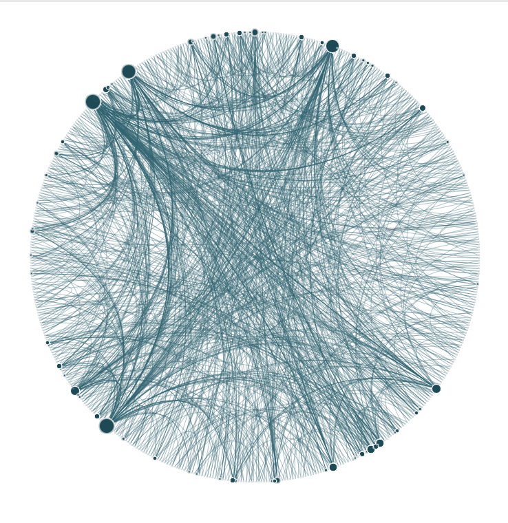
My first idea was some kind of Arc Chart that tracked the time between a book being published and a book being read by Art, but Nathan had the same idea so I branched off to find something different. I've always wanted to build something that resembles a Chord chart so I set my heart on building a somewhat arbitrary chart that would link every book Art has read in an alphabetical circle in chronological order.
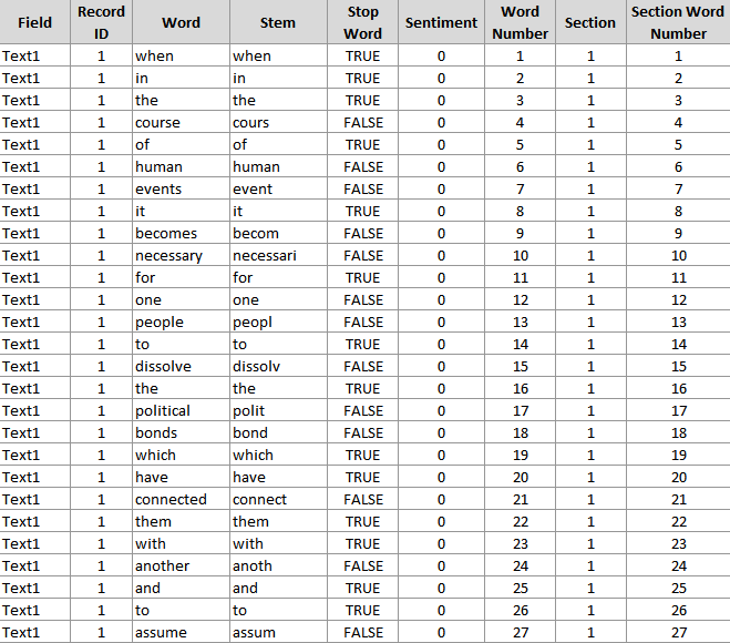
The problem with this chart is that the data set needed to be in a very specific format. An example chart from Ken is in the table below:
Ken provided a Python script which should manage this parse and conversion for me. It's been about 6 years since I've done any Python, but I think I might understand enough of the set up to navigate. Unfortunately, for not the first time this week, I was wrong. I ended up spending a number of hours trying to get this chart to work unsuccessfully. However, whenever the script was running or a package was installing, I was working on building some other chart in Tableau such that if I failed, I wouldn't have been completely wasting my time.
I ended up going for a curvy timeline, which happened to also be a creation of Ken Flerlage. I tried to understand the logic behind it, but by this point I was a little short for time so just elected to get my data in the correct format this time using his excel template, and then replacing the data source in Tableau to my Art Garfunkel one.
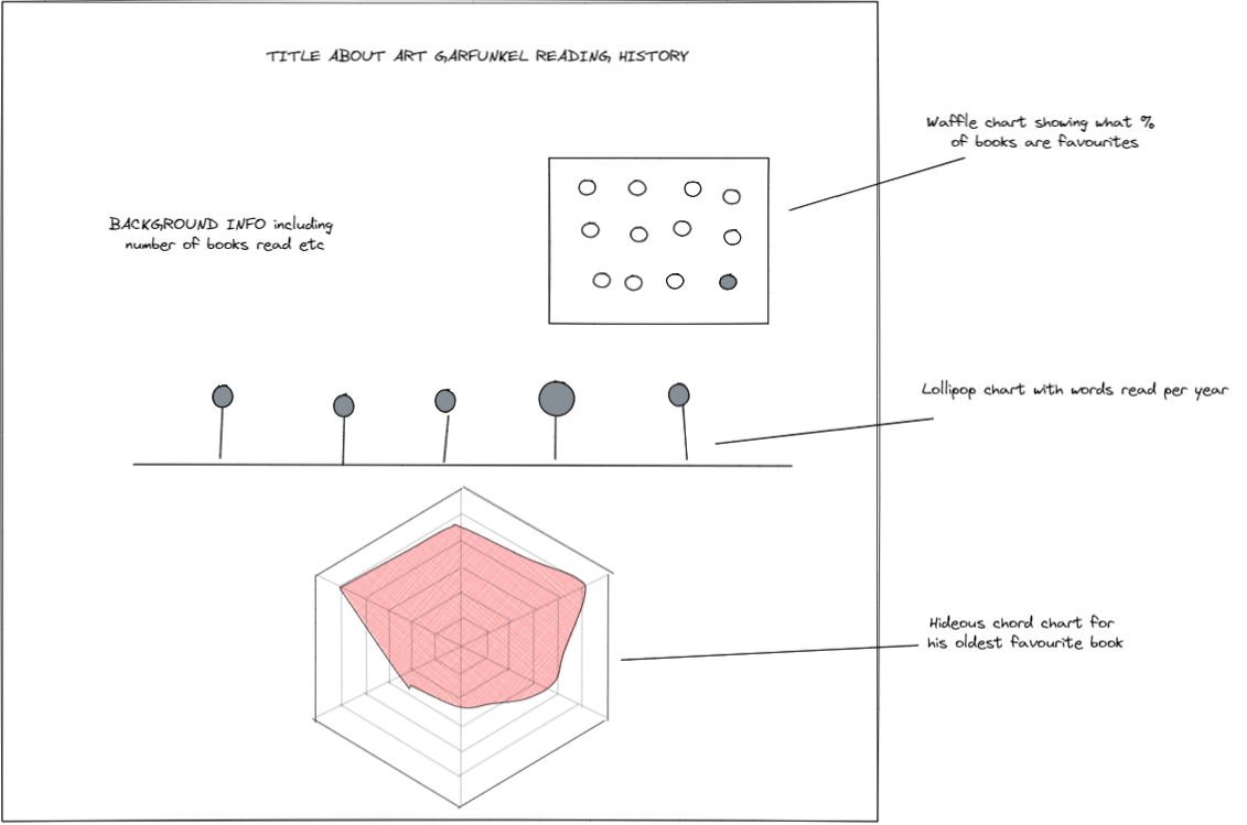
It was disappointing to not get what I wanted done again, but I don't think my output today was terrible. I certainly learned a lot about the capabilities of Tableau and the work that goes into creating some of the fancy views that tend to do well if you want a Tableau Viz of the Day.
My dashboard as of 3:15pm looked like this: