


For todays task, we started with a 2 hour talk on Dashboard accessibility and the considerations that should be made when thinking about your audience. This was very interesting as it opened up some new discussions on how to avoid creating problems for people who are impaired in different ways. Data visualisation is tricky to adapt to this due to the lack of tools that can help read visual elements, however there are some key points to combat this. While they may go against certain best practices, using methods such as double encoding and showing trend lines can help account for this. Check out the Funkify chrome add on to see how certain elements may look to different people.
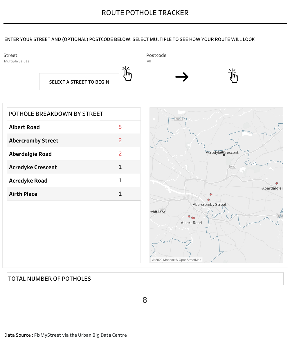
For the challenge today, we were tasked with building a dashboard around Glasgow's pothole data. The data was fairly straight forward and contained spacial mapping for the location of each pothole. The simplicity did end up taking a few of us down a spacial rabbit hole however, as some of the things we wanted to implement such as path mapping required further data. I initially wanted to find out the cycle paths in Glasgow and calculate the number of potholes along the route. The data proved very difficult to find, and I ended up with an XML format that would have taken a while to parse out the parts I needed. To focus this down, I decided to allow the user to select the streets on their route manually, and then explore the potholes on their selection.
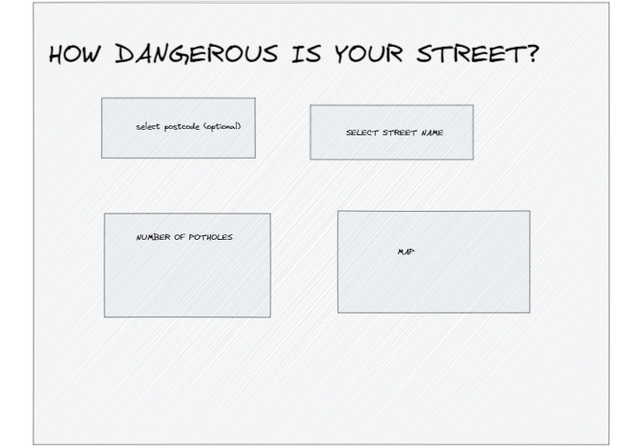
My initial plan was very simple to start with due to the time constraints, although when I started to build this out I found a few more points to add.
I was quite happy with what I managed to do in the time limit, but would have benefited from some of the time lost at the beginning searching for extra spacial data. This would have given me some more time to apply some more features that could benefit someone with an impairment, such as a download data button. I would also liked to have added some more explanation around how to use the dashboard. Overall, this was an interesting project and changed how I will look at designing dashboards in the future to take into account the accessibility of it for the audience.
https://public.tableau.com/app/profile/james.driver/viz/DashboardPotholes/Dashboard1