


Dashboard Week's day 2 pushed me beyond aesthetics and into the domain of data accessibility. The challenge was to create a public infrastructure map focused on tube stations and attractions, ensuring compatibility with screen readers.
Brief
The goal was to create a summary report using a dataset of London attractions and tube stations, whilst meeting technical accessibility requirements for users relying on assistive technologies:
- Logical Flow (Semantic Ordering): Ensuring the sequence in which information is read aloud follows a logical path (e.g., Overview → Filters → Key → Data → Map).
- Accessible Context (Alt Text): Providing meaningful alternative text for all visualisations, especially maps and Key Performance Indicators (KPIs).
- Keyboard Navigation: Ensuring all components are navigable using standard hotkeys, with documentation in the "About" section.
- Screen Reader Integrity: Avoiding design elements that screen readers cannot parse (e.g., tooltips).
🎯 Key Requirement:
Demonstrate how a screen reader user can move through all dashboard components and understand key takeaways.
Plan
The project required meticulous planning to ensure the accessibility requirements were met from the initial phase, not addressed as afterthought. Consequently, a heavy emphasis was placed on the planning, researching and sketching phase as below.
Rough Time Plan:
11:00-11:30 Brief & Plan
11:30-12:30 Research & Sketch
12:30-13:30 Lunch
13:30-15:00 Build
15:00-15:30 Test & Iterate
Sketch
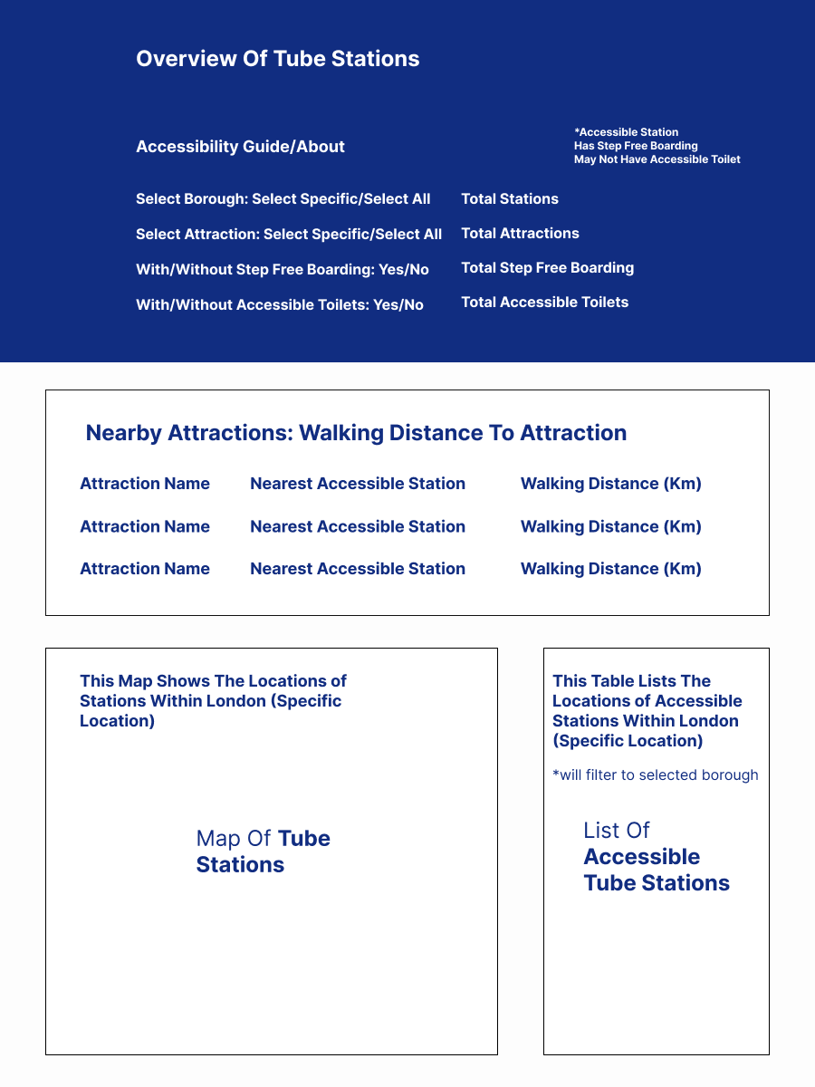
The design process began with a sketch focused on semantic ordering—the sequence in which a screen reader would logically navigate the elements. This was crucial for accessibility, ensuring users received the most important information first.
The sketch below features the following considerations:
- Front-Loaded Interaction: Positioning the about information and user interactive features at the start of the layout, ensuring these important functional elements were the first thing the screen reader encountered.
- Simplified Navigation: Making a conscious decision to avoid overcomplicating charts to ensure simple navigation and interpretation.
- Data Redundancy: Placing key information in accessible tables alongside the map. These tables provided the same, or additional, data that could be easily consumed by a screen reader, compensating for the limitations of a complex map visual.
Outcome
Challenges
1. Prioritize User Testing—Especially Accessibility Testing
The biggest challenge was sticking to the time plan, which meant being unable to test as a user would interact. Attempting to navigate the final report using only hotkeys was difficult.
- Key Takeaway: You cannot assume accessibility simply by following a checklist. User testing with the actual assistive technology (a screen reader) is mandatory. Ideally, the design and build phase should include active conversation with end users to understand their needs, requirements, and interests before deployment.
2. The Disconnect Between Data and Insight
While the technical design was a focus, there was a disconnect between the data elements: tube stations and tourist attractions.
- The Technical Gap: The report needed sophisticated spatial data calculations to be truly useful—for example, indicating the nearest accessible tube stations to each attraction, not just plotting tube stations. The final report lacked this crucial contextual analysis, reducing its practical utility.
- General Lesson: Always be mindful of your end user. A focused approach to understanding your specific user and requirements is necessary and can be applied beyond accessibility.
3. Inclusive Design is Universal
The key lesson from this brief can be summarised with a quote from Kat Holmes, former Principal Designer of Inclusive Design at Microsoft:
"Participation doesn’t require a particular design. But a particular design can prohibit participation."
Ensuring a dashboard or report is user-friendly is a complex task. By focusing on the requirements of accessibility, the entire design process benefits, resulting in a cleaner, more logically structured, and less cluttered product for all users.