


Today's challenge was focused on persuasion using an infographic-style dashboard. We took on The Data Lab Data Visualisation Competition 2025 brief, tasked with communicating the co-benefits of climate action using the UK Co-Benefits Atlas dataset. The goal was clear: create a compelling visual story focused on convincing a specific, skeptical audience.
1. The Plan: Strategy and Timing
The project emphasized persuasion and required a focused approach to audience and narrative. The time plan was disciplined, allocating significant time to understanding the data before jumping into the build phase.
| Activity | Duration |
| Brief & Research | 30 minutes |
| Data Exploration & User Story | 60 minutes |
| Sketch | 30 minutes |
| Build | 210 minutes (with lunch break) |
| Prep (for blog/submission) | 30 minutes |
2. Research, User Story & Sketch
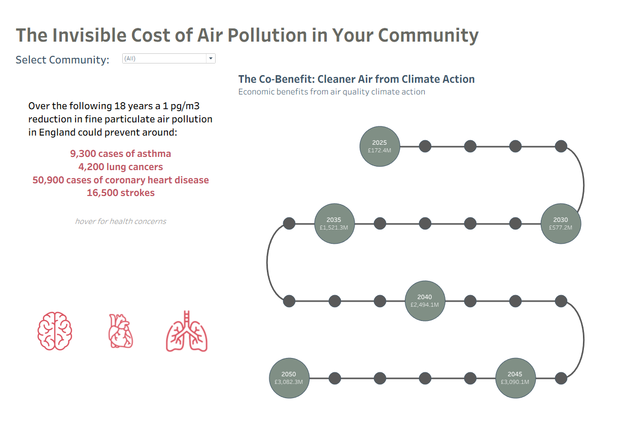
The first step was defining the core concept of co-benefits—the additional, positive social and economic outcomes resulting from climate action.
- Audience: Climate Skeptics (approached via a Local Government/Agency voice).
- Co-Benefit Category: Air Quality. This was chosen for its immediate, personal relevance, as it directly impacts health and is modeled through reduced building damages.
- User Story (The Goal): To persuade skeptics on the immediate, localised benefits of cleaner air by analysing the impacts of poor air quality and the distributed economic benefits across the UK.
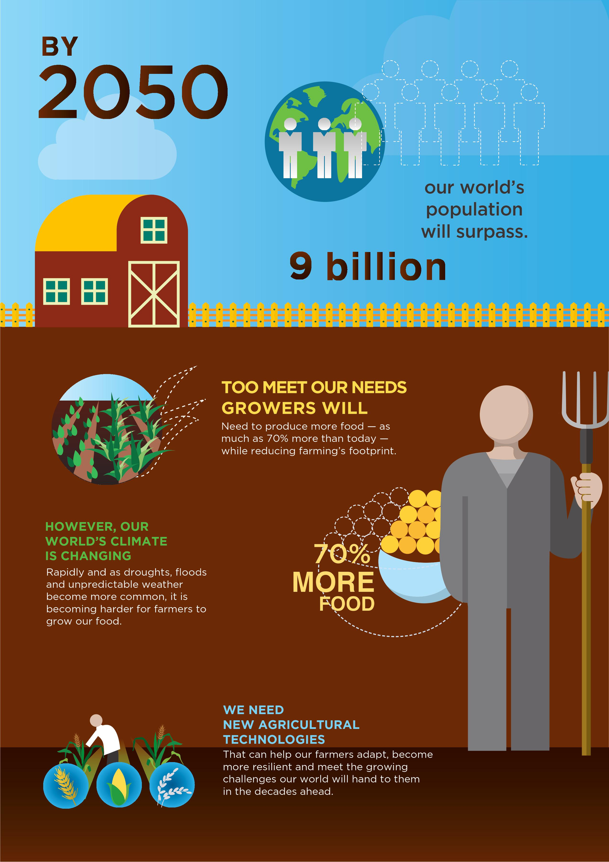
- See inspiration images below
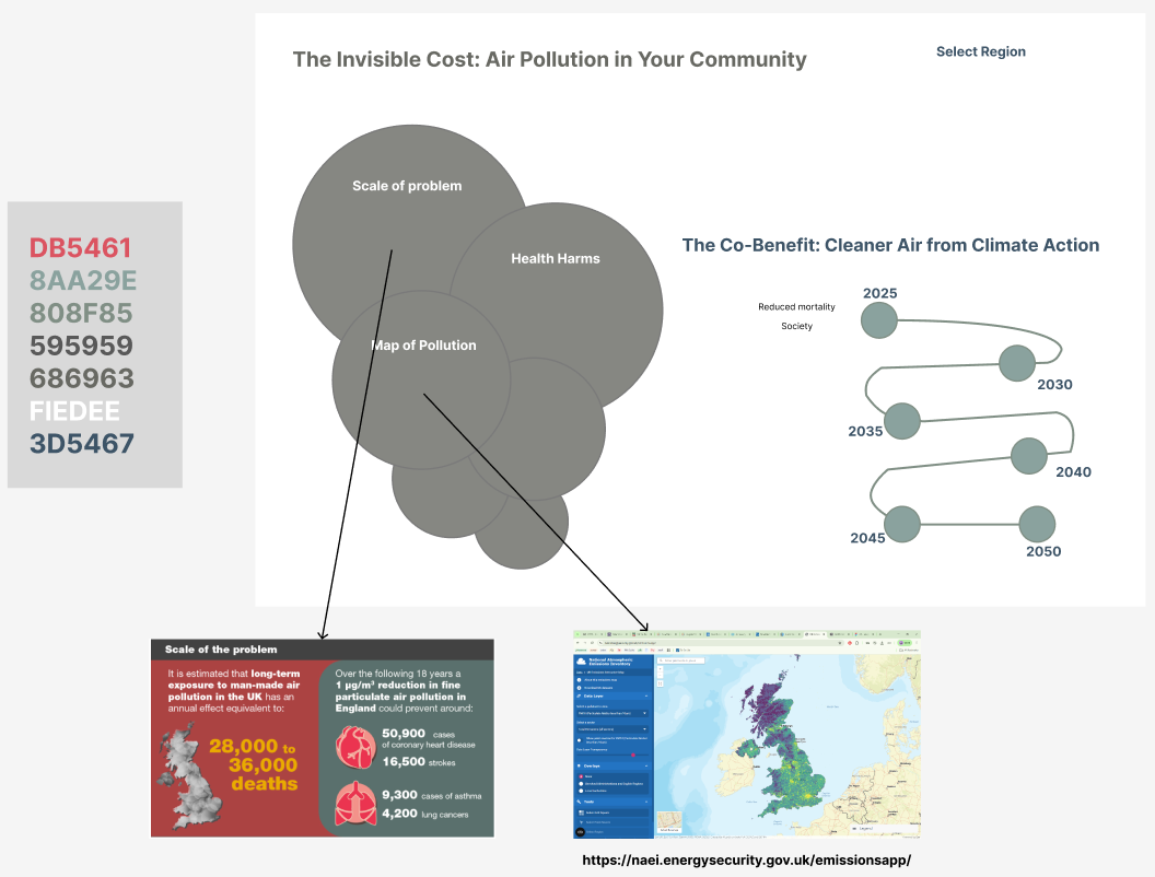
Sketch
The Sketch focused on adressing:
- Scale of the Problem: Presenting immediate, dramatic health harms (e.g., strokes, lung cancer).
- The Co-Benefit Timeline: Using a custom Curvy Timeline to visualize the increasing economic value of improved air quality over time (2025 to 2050).
- Local Context: Incorporating a filter to allow the user to select their Community to personalize the data.
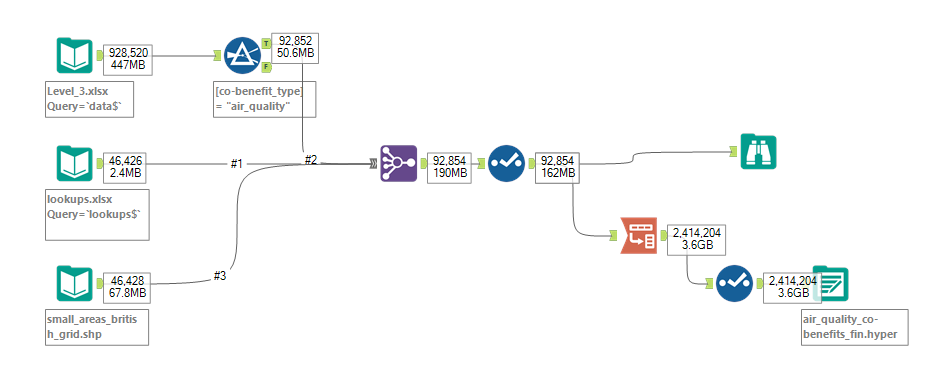
3. Data Preparation: Filtering with Alteryx
Before building, the large dataset required some preparation. Alteryx was used to filter and shape the data, ensuring only the relevant 'air_quality' co-benefit type was passed through for analysis.
The Alteryx flow involved:
- Filtering the main data file (
Level_3.xlsx) for the specific 'air_quality' co-benefit type. - Joining this filtered data with lookups and spatial files (
lookups.xlsxandsmall_areas_british_grid.shp). - Outputting the final data set to a Tableau Hyper file (
air_quality_co-benefits_fin.hyper) ready for analysis.
Outcome
The final dashboard aimed to create a persuasive story about the cost of inaction and the reward of mitigation.
- The Problem (Left): Prominent figures highlight the preventable cases of asthma, heart disease, and strokes over the next 18 years, making the data personal and alarming.
- The Solution (Right): The Co-Benefit Timeline visualises the economic benefit (in millions of pounds) derived from cleaner air, providing a financial justification for climate action.
Personal Reflection: Innovation vs. Scope
The main constraint on the day was the complexity of the Curvy Timeline. Choosing to create this visually complex chart (following the technique developed by The Flerlage Twins) consumed a significant portion of the allocated time.
While the innovative visualisation showed the progression of economic benefits over time, it limited the ability to fully develop the story as desired. Ideally, the final dashboard would have included:
- A Map: Incorporating a map showing the geographical distribution of pollution across the UK alongside the health icons to provide local context.
- Polished Design: Further developing the background and overall design aesthetic in Figma for a truly polished infographic look.
The choice to build a visually unique element was a success in demonstration but highlighted the crucial lesson that technical ambition must be balanced against the project's overall narrative scope and time constraints.