


For day 3 of dashboard week, Andy gave us the challenge of creating a transport dashboard in relation to a City. As we were not allowed to viz on New York or London, the initial challenge was to find a City that had data granular enough to build an insightful viz.
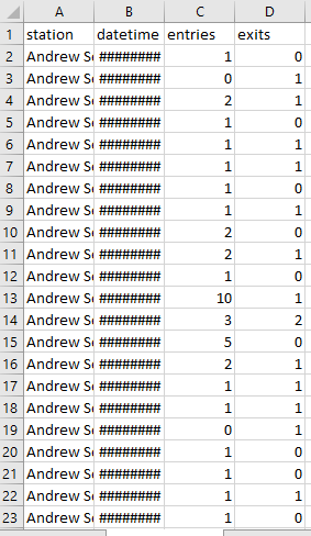
After searching through many American cities, I eventually landed on Boston’s mbta data courtesy of https://github.com/mbtaviz/mbtaviz.github.io. The data had every passenger entry and exit on the red, blue and orange metro line stations for February 2013. This data was perfect as it had over 1.5 million entries. It logged the exact time each entry or exit occurred. Here’s a preview of the data below.
The data provided although very granular, lacked depth, so my main task of the day was to bring the data to life by adding station and line geographical information. For the stations, I took the latitude and longitude data from google and created a point. The line information proved to be more difficult, but eventually I found a shape file that contained the lines and filtered out the lines that were not featured. I then made a union of the two datasets.
This union proved to be tricky, as the geometric points for each station were creating a dataset over 2gb, which is the limit for a shape file. To solve this issue, I used a buffer tool to make the points 1000x smaller than at creation. After this step, I was left with a usable shape file for tableau that looked as below on a map. Note, the stations are difficult to see due to the extreme buffer required.

Now I had a detailed map of the metro lines and stations, I needed to make use of the entry and exit data in tableau. I initially thought of creating heat maps, detailing the busiest days and hours per station. However, a quick play around with the data confirmed that commuting hours in the city were extremely busy during commuting times.
Instead, I opted for an interactive dashboard where the user could see if the metro would be the optimal mode of transport. To do this the user selects a time of day and their station, which creates a dynamic weekday calendar. The calendar displays, through colour, how busy the station is expected to be compared to the average across all stations and days. Below is a link where you can use it for yourself.
https://public.tableau.com/profile/jamie.gough#!/vizhome/ShouldITakeTheBostonMetro/ShouldITakeTheBostonMetro