


To conclude the first week of DS6 we presented makeovers to a piece of our previous work.
The visualisation I chose to edit was my first ever tableau publication, a breakdown of the statistics behind Leicester’s title win. The intention was to try and show a variety of visualisation best practices, while also providing valuable insight. Despite the clear premise, the final piece had a scattergun approach and failed in providing straightforward insight to the potential audience. Here are 3 of the key mistakes I made followed by a screenshot of the initial visualisation and one my new infographic below:
- No clear question was being answered by the data.
- Lack of context provided for Leicester’s performance.
- Overuse of tables, graphs and text may leave the interactor bored by the end.
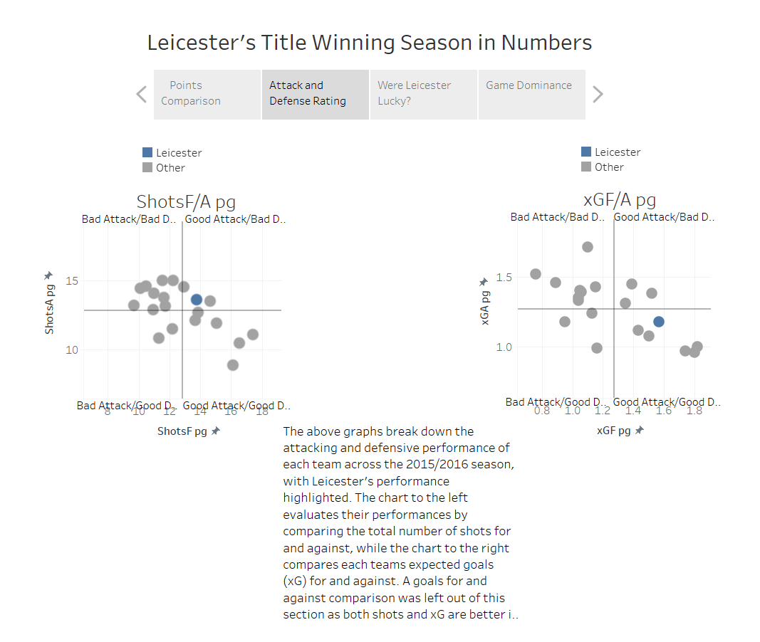
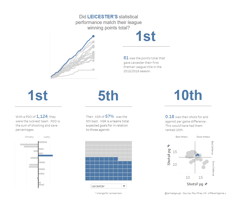
As you can see I stuck with the original colour scheme as the blue was used as a representation of Leicester’s club colours and contrasted very well with the grey. Also, I kept all 3 chart variations as they analysed and contextualised the data effectively.
Yet, numerous changes were made to turn the story into a creatively simple yet effective infographic. These included:
- The title became a question to provide immediate context to the data sets.
- The text and BAN’s (Big Ass Numbers) provide context prior to the user exploring the visualisations.
- The number of graphs and text have been significantly cut down to prevent information overload and potential confusion.
- A drop down that highlights Leicester’s two closest challengers and the bottom two teams to provide further context to Leicester’s performance.
Overall, I feel like it was a solid first attempt at a makeover. Compared to the original, the new effort was easily digestible as it was clearer and more concise. The only issues I was left with were down to the time constraint. With further time, I would have like to add a drop-down menu to show all 20 teams. Equally, I could have added parameters to make the graphs larger.