


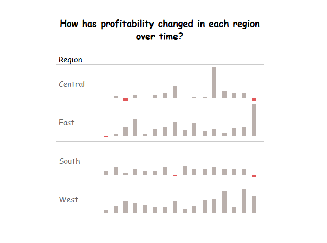
Similar to Sparkline charts, Sparkbar charts are small, lightweight charts that typically do not have axis. They’re a quick and amazing way of visualising your data, without needing the complexity of a full blown chart.
They can be created in 5 easy steps!
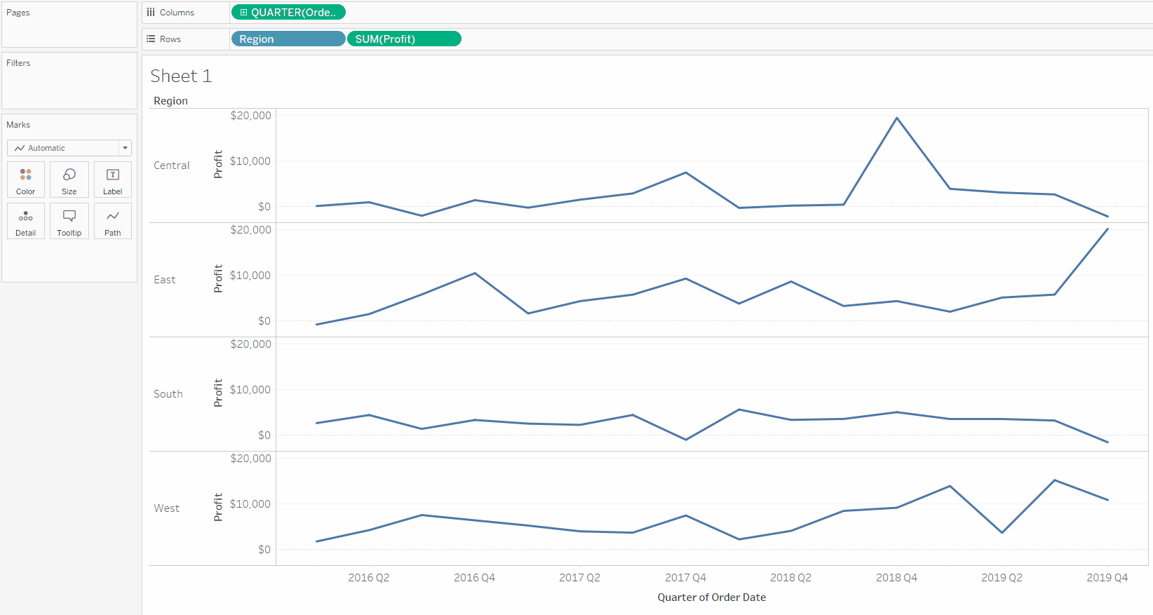
Step 1 | Drag the fields you want into the view.

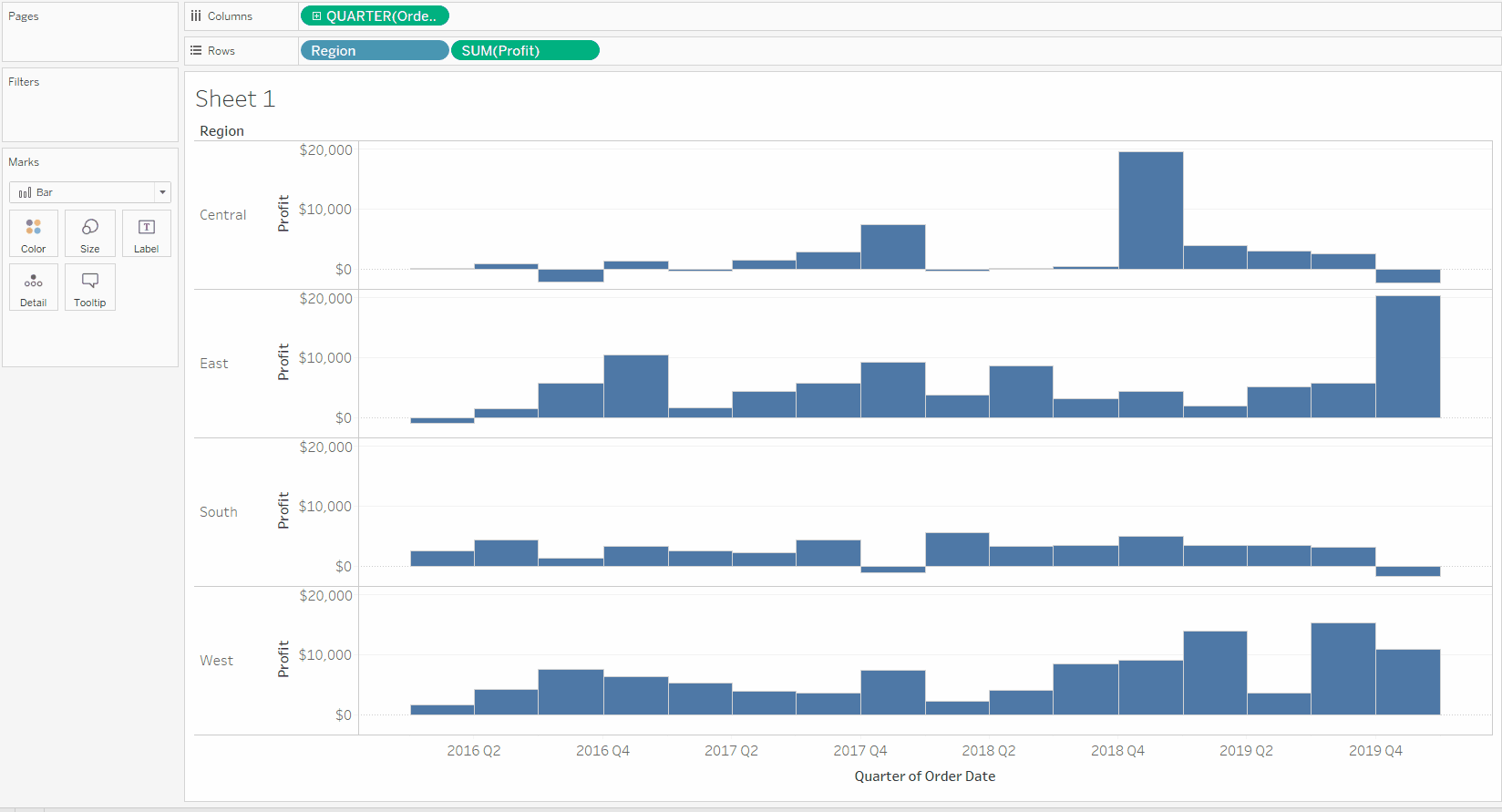
Step 2 | Change the chart type to be ‘Bar’ in the Marks Card
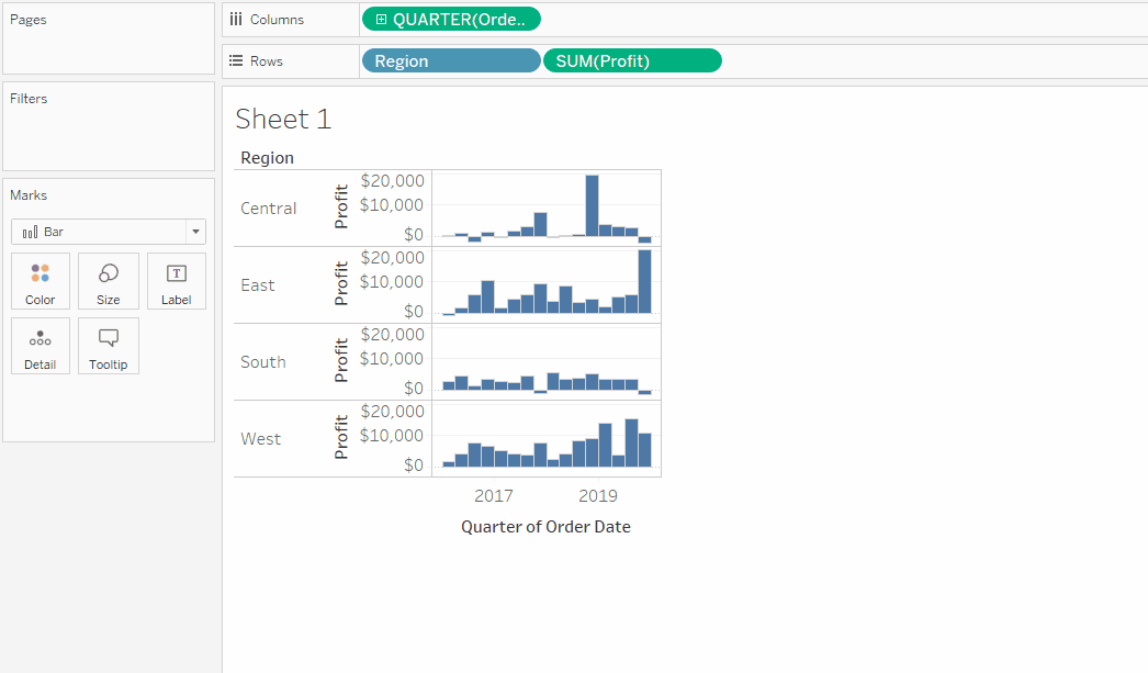
Step 3 | Resize the charts to make them smaller
Step 4 | Remove the axis headers
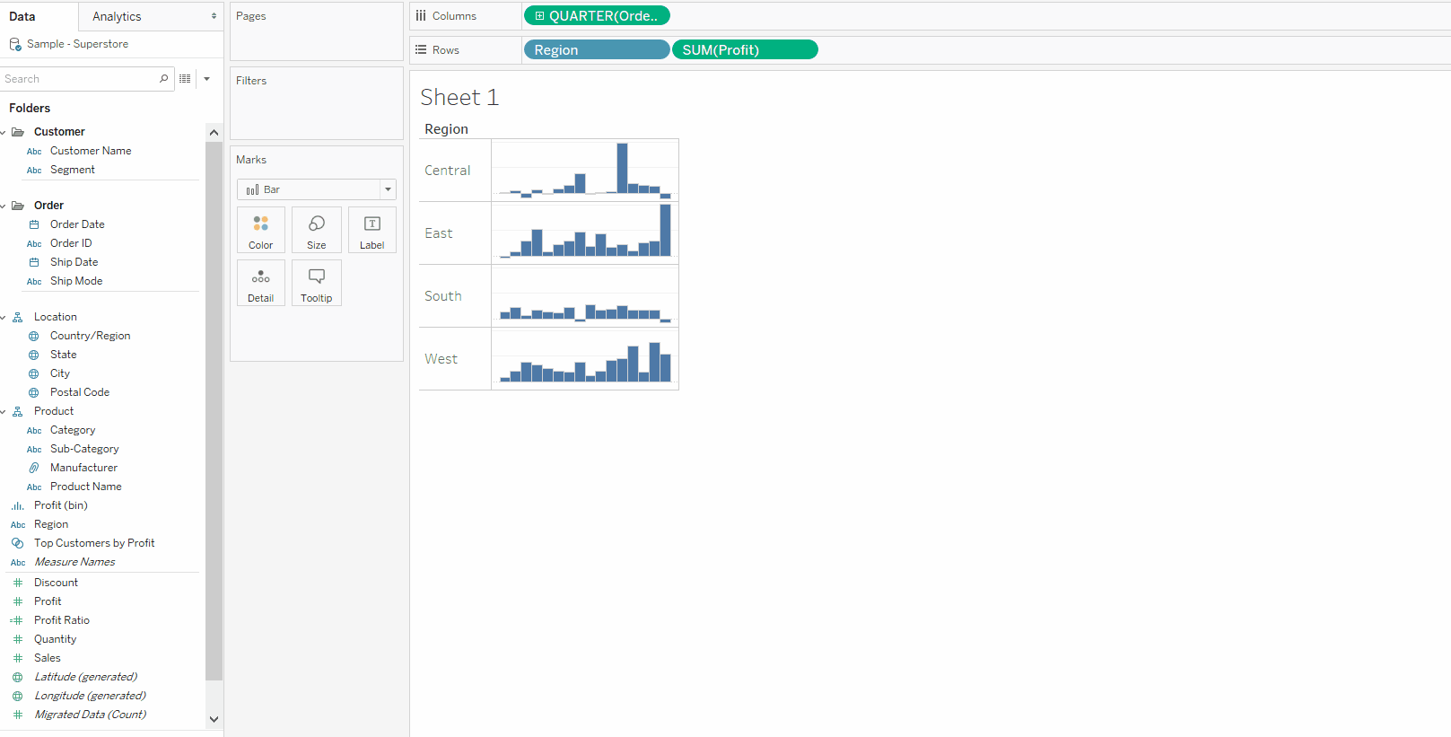
Step 5 | Colour by your desired field
Step 6 | Format your chart to look pretty 🙂
Hope this was helpful!
If you liked this, you can also check out Brandon’s post on how to “spark interest” with Sparkline charts