


In the world of data visualization, and really, any creative field, the line between what's possible and what's practical often blurs. We're equipped with incredibly versatile tools like Tableau, capable of turning the most complex data into visual masterpieces. But it's crucial to remember: just because you can, doesn't mean you should.
Take, for example, the discussion around radial charts—a variant of the doughnut chart, where values spread out from the centre, each representing a percentage of the total.
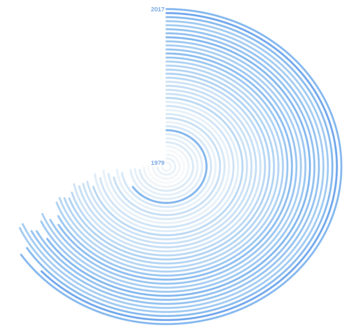
The catch? Values further from the centre appear artificially longer, distorting their actual contribution when compared to a straightforward bar chart. Inspired to fix this visual discrepancy, I envisioned creating a "length-accurate" radial chart, dreaming of accolades from the Tableau community.
However, this vision quickly became a lesson in practicality. Attempting to curve a bar chart, I found myself tangled in complex scaling and calculations, only to realise I was complicating a task that a simple bar chart accomplishes with ease. The time and effort spent could have been directed towards refining my skills in more beneficial areas.
Your time is indeed a precious commodity. In your quest to push boundaries and innovate, take a moment to consider the practicality of your endeavours. Are you using your tools and time wisely? Sometimes, the simplest solution is not only the most effective but also the most elegant.