


Hi, my name’s Jeremy, and today was my first day in the Data School. I found smart people, a lively atmosphere and an interesting challenge.
The Day 1 task was to take part in Makeover Monday. We were given an hour to analyse a dataset, visualise it, and present when time was up. Our data showed the percentage change in GDP each quarter for all the G7 countries since 2009.
Having looked at the Financial Times’s graph of the data (see this week’s Makeover Monday) and read their article, I assessed my options.
Clearly, this wasn’t going to be an easy dataset to draw conclusions from in an hour. The dataset’s only measure was the percentage change in GDP from the previous period, which would be hard to craft into an interesting story without further information. I quickly decided that I would identify a major trend in the data and explain it with further research – that way I could provide insight into the numbers and tell a compelling tale.
To start with, I threw together a line graph of % change since the previous period by country, looking for any startling trend.
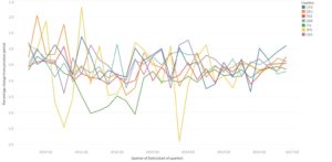
To me, the first thing that jumps out from this graph is Japan’s performance. There are huge peaks and troughs in that line: if a trend changes that drastically, then there’s a pretty good chance of an underlying story. Even if I couldn’t pin down a cause, it gave me reason to believe that someone else would have noticed and investigated the same trend, giving me something to work with.
My hunch was right. There were many online articles about Japan’s fluctuating GDP since 2010. In particular, I found numerous thinkpieces about the effects of Japanese Prime Minister Shinzo Abe’s economic policies since he took office in December 2012. The story had a beginning – Abe coming to power with a clearly-defined strategy for growth; a middle – fluctuations in GDP due to the twists and turns of Abe’s policies; and an apparent end – sustained economic growth in recent quarters. Perfect material for a story, then.
Here’s the viz. I kept it simple, as I’d only managed to do enough research for a straightforward narrative. It just shows the percentage change from the previous period by quarter, and the only country included is Japan.
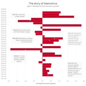
I finished the viz by playing with the colours a little: the red should be (hopefully) the exact red on Japan’s flag, setting the scene. I annotated the marks by right-clicking on them, selecting ‘Annotate’ and writing the text. You can customise the lines by right-clicking on them and choosing from the options available.
All in all, a great challenge. I’m looking forward to tomorrow. You can also find my dashboard on my Tableau Public profile here.