


It’s possible to show a year-on-year trend within a table calculation.
As an example, I’m going to use Superstore to create a graph showing how different business segments contribute to total sales, and how each segment is doing relative to last year. Here’s how to do it in Superstore, but the method will generalise to your own data set: I recently used this technique to good effect in a real-life business scenario, so it may be useful to you too.
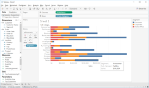
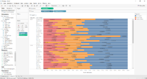
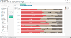
- Drag Sales to Columns, Sub-Category to Rows and Segment to Colour, like so. This chart breaks up Sales per sub-category by segment.
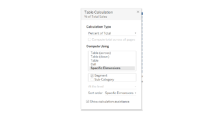
- You want to show the percent of total for each sub-category. Turn your SUM(Sales) pill into a Quick Table Calculation calculating the Percent of Total. Then edit the table calculation so that it finds the percent of total for each sub-category by segment, as below.
- You now have your table calculation. But what if we want to show only the most recent year, and arrows to indicate whether each segment’s share has increased or decreased since the previous year? Firstly, drag your date field (Order Date, in this case) to Columns, putting it before the pill that’s already in there. Make it a discrete year.
- Now you need some calculated fields. First, create a calculated field to give you the percent of total for each segment: divide the sum of sales by the total sum of sales, as follows. This will compute as a table calculation (make sure it’s calculating by Table Across).
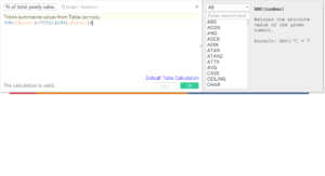
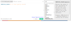
- Now you need to create a calculation that will find the previous value of the calculation you just did. Use the PREVIOUS_VALUE function, as below.
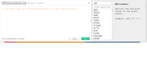
- Create a third calculation to find the difference between the current value of yearly sales and the previous value.
- Drag your Difference calculation (the third one you just made) onto the labels shelf. Allow labels to overlap other marks.
- Click on the drop-down menu of the Difference calculation pill on the Marks card (the one on Labels). Select Format and, on the left-hand side of the screen, select Numbers > Custom.
- Google ‘unicode characters’ or similar. You should be able to find little Unicode icons for down and up arrows. Copy those arrows into the Number > Custom text space, so that it looks like ▲;▼. Everything before the semi-colon will format the positive numbers, everything after will format the negative ones.
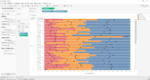
- Now just hide all previous years: you can either do this manually, or with a table calculation on the Filter shelf. Format your chart as you wish, and that’s it.
Let’s recap. To create your arrows for each segment:
- Create your percent-of-total chart, with years in the rows as well.
- Create a calculation for the % of total for each segment.
- Create a second calculation to look up the previous value.
- Create a third calculation to calculate the difference between the current value and the previous value.
- Drag to labels and format the numbers with unicode shapes.