Today was DS43’s first dashboard week challenge, aimed at testing our SQL and PowerBI skills.
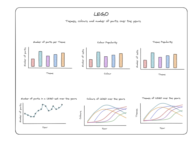
We used a Lego dataset stored in snowflake. First, I looked through the different tables and wrote out which fields each contained. Following this, I started to think about the story I wanted to tell with the data so that I’d know which tables and fields to join. I drew a rough schema out and sketched the dashboard I wanted to create on excalidraw.
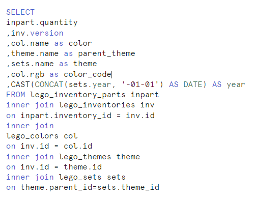
To create this dashboard, I needed 5 out of 7 of the tables from snowflake. The part that took the longest here was working out the right syntax to turn my year into a date variable. A quick look at my SQL code:
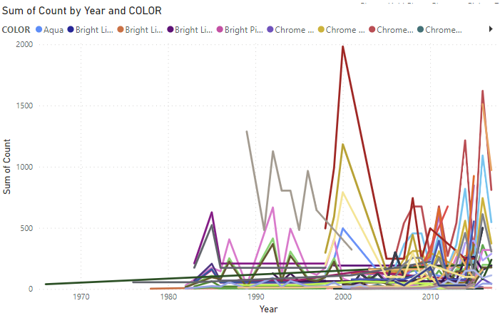
It took me around an hour and a half to complete these preparation stages. I was then ready to download my data as a csv and import it into PowerQuery. Having opened my data in PowerQuery, I realised there were a number of extra steps I’d need to take to create the charts I wanted. When I tried to make the colours and themes over the years charts I had sketched out, they looked like this:
I realised I'd need a different visualisation to show this data. I decided a dumbell chart would be a good alternative. Unfortunately, it's not that straightforward to build a dumbbell chart in PowerBI. I read Patrick's blog on making one (https://www.thedataschool.co.uk/patrick-maguire/how-to-create-a-dumbbell-chart-in-power-bi/), however this add on wouldn't let me have the lego themes on the y axis and the years on the x-axis like I wanted. I then spent far too long trying to make the dumbell chart I wanted...
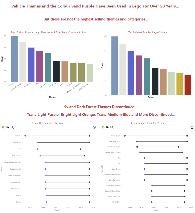
An hour or two later, I had made my dumbell chart but was running out of time. Here's what my final report ended up looking like: