


Dumbbell charts aren’t an embedded visual in PowerBI and they’re not as easy to create as they are in Tableau. Here are the different ways I’ve explored making them using imported visual tools.
Dumbbell chart by Nova Silva:
This visual works well if you have a continuous variable on one axis and a categorical variable on the other. For example, you want to see the difference in sales between one year and another over a range of categories.
Dumbbell chart by MAQ software:
This requires R to be installed on your laptop. It won’t work for data with more than 150,000 rows.
PB Viz Edit Dumbbell chart:
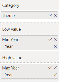
This was the only dumbbell chart visual I could find that allowed me to put a date on my x-axis, categories on my y-axis and have min and max date as the circles of the chart - the graph that I needed for my LEGO analysis during dashboard week. I created columns for a min date and max date in PowerQuery and these went in the ‘low’/’high’ value options.
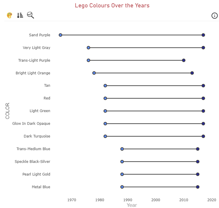
(Note: I used a 30 day free trial to create this chart)