


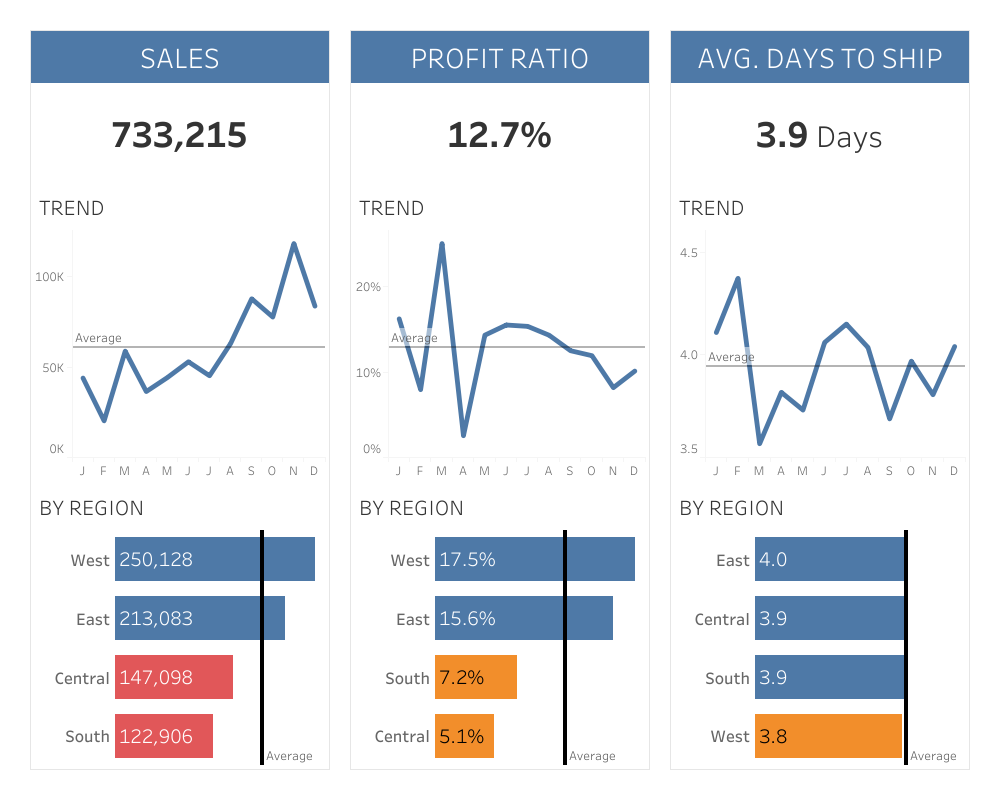
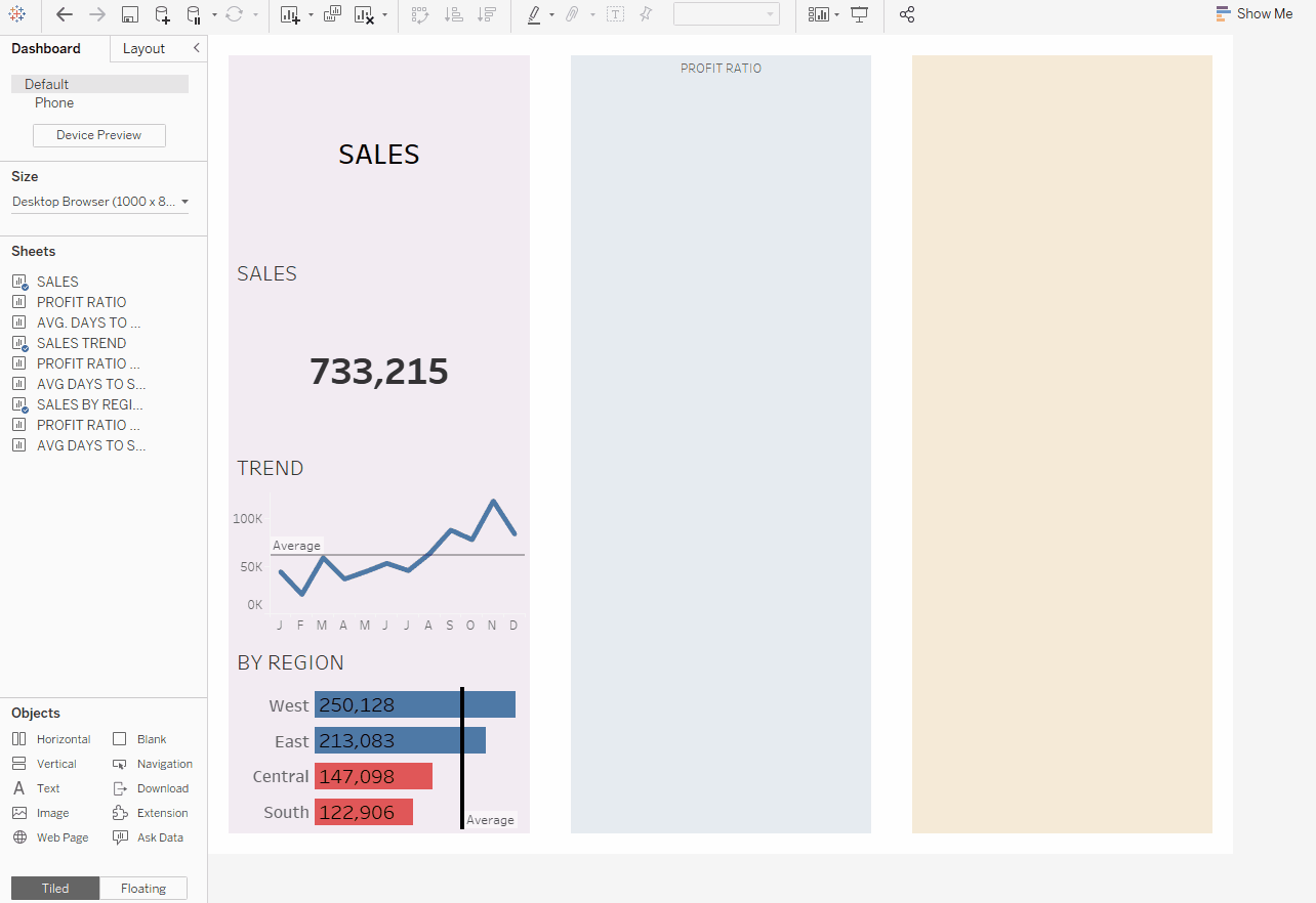
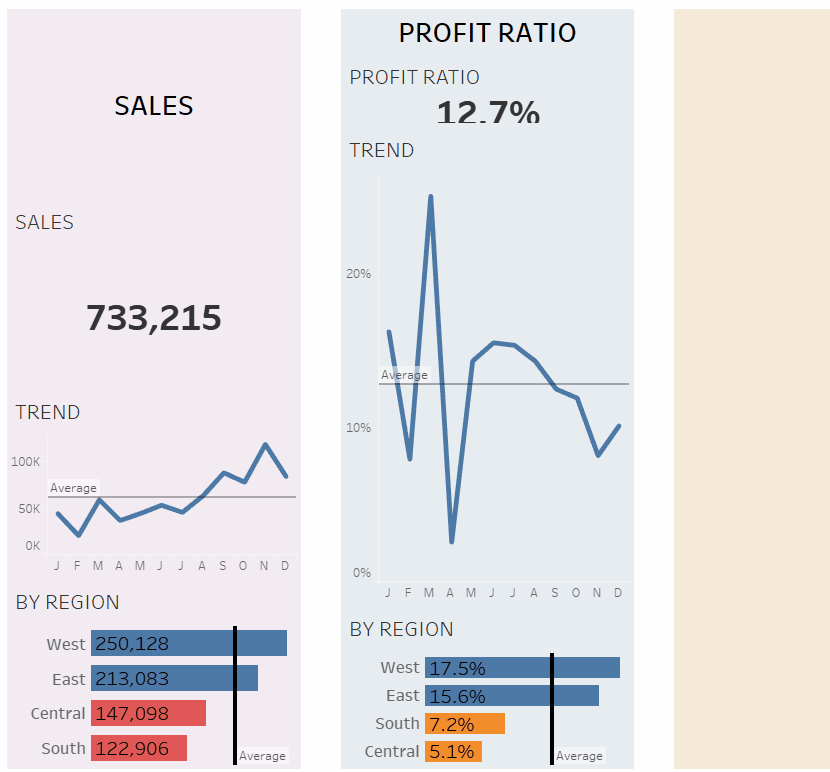
This blog outlines how to use containers in dashboards properly to make your visualisation stand out, neat and more organised. One example has been used for guidance in this blog using Superstore data: 2021 Superstore KPIs.
2021 Superstore KPIs
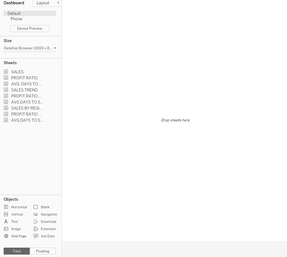
To build the example above in a dashboard using containers we will first start by sketching the dashboard structure with horizontal and vertical rectangles (see below).

The second step will consist of producing the chart types with the corresponding data to illustrate:
- All 'Chart 1' are centred-aligned labelled charts for the current year. To obtain the value for the current year create a calculated field using the following formula: YEAR([Order Date]) = {MAX(YEAR([Order Date]))}, and add it to filters. Apply this filter to be used in all worksheets using this data source.
- 'Chart 2' are line charts against time (in months for the current year), which also include an average line for the entire table.
- 'Chart 3' are bar charts by region with average line for the entire table and colour indicators for values below the average. The formula to identify if the values are below average is the following: SUM([Sales]) < WINDOW_AVG(SUM([Sales])). Remember to replace [Sales] with the corresponding measure value to measure.
The third step will be to start creating the dashboard using containers! Follow these steps:
1. Drag a floating horizontal object to the dashboard canvas and adjust its position and size in the 'Layout' tab.
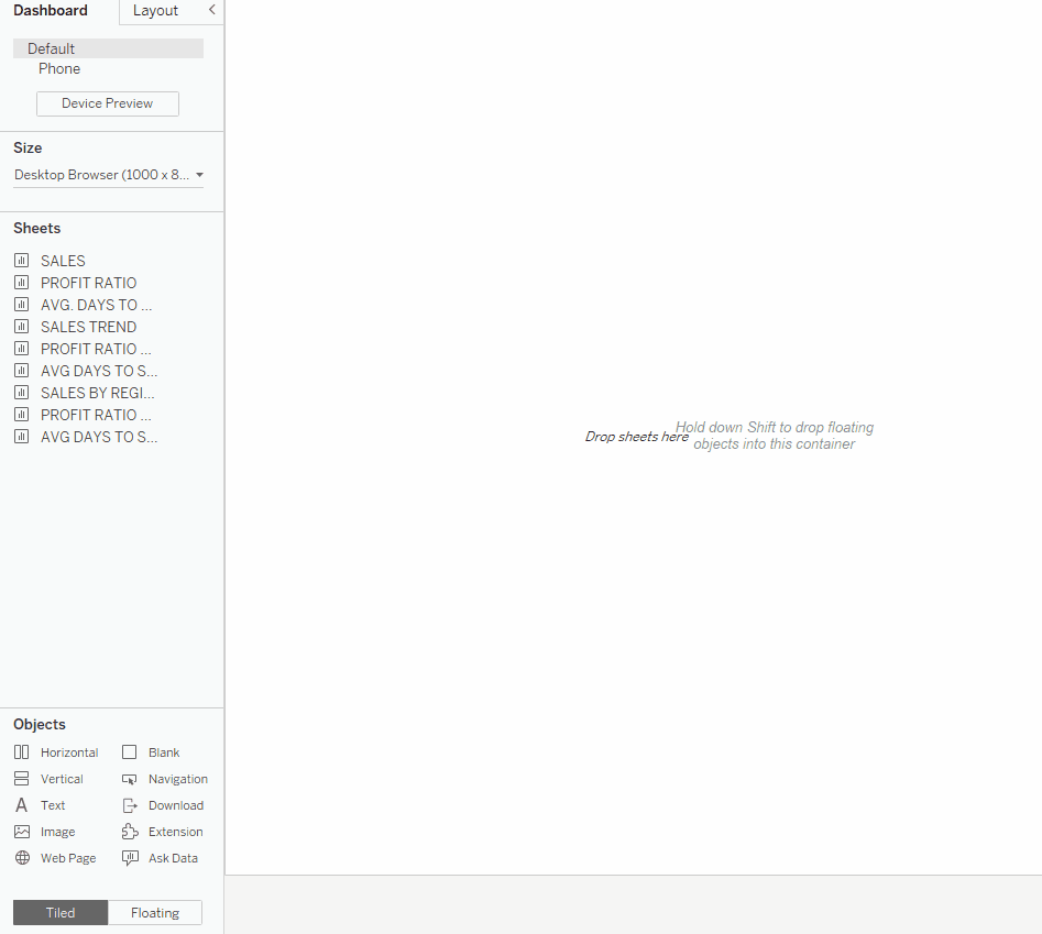
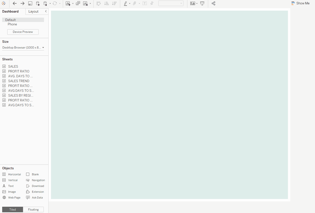
2. Drag a tiled Blank object inside this floating object. Adjust the padding and add a background colour which will be help to know when other objects are being dragged in.
3. Start adding the object containers following the structure sketch shown previously. In this case, add vertical tiled objects at one side of the blank > click on 'distribute contents evenly' in the object options menu (do this for every object container, e.g. horizontal and vertical objects). You can track the item hierarchy at the bottom of the 'Layout' tab to adjust it or event select a specific container. Similarly to the blank in the previous step, in the 'Layout' tab adjust the padding and add a background colour to the container to easily identify each container and known when an item is dropped in.
4. Start dragging titles and charts to each container. Do not forget to format them!
5. You can adjust and pin certain containers size so that they remain unchanged when the dashboard dimensions are changed. Note that this option is only visible in containers which contents have not been distributed evenly (in this case, the second container in the previous example). You can now choose to have objects being distributed evenly automatically (e.g. vertical container on the left) or to fix the objects' dimensions manually (e.g. vertical container in the middle).
Format each chart and container as you wish. You may even wish to keep the background for each container to obtain a similar result to the Superstores KPIs dashboard shown at the beginning of this example.