


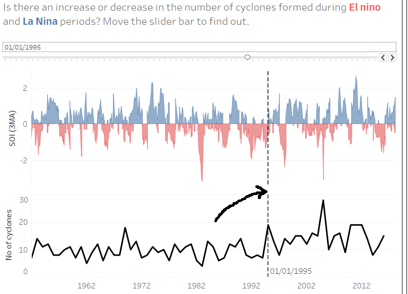
Whilst building my dashboard for my second day of dashboard week, I came across a neat trick which helped the look of my line charts. I wanted the reference line seem like it was part of both charts (assuming the x-axes are the same time range), therefore I wanted to remove the gap between the two charts indicated by the black arrow in the picture below:
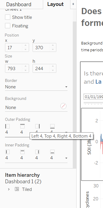
The gap is due to the padding each worksheet receives when inserted into a dashboard. To remove this padding, click on one of the charts on the dashboard and select the Layout pane on the left of your screen.
At this point you can reduce the inner and outer padding by selecting the drop down arrow and changing the amount of padding on all sides of the chart:
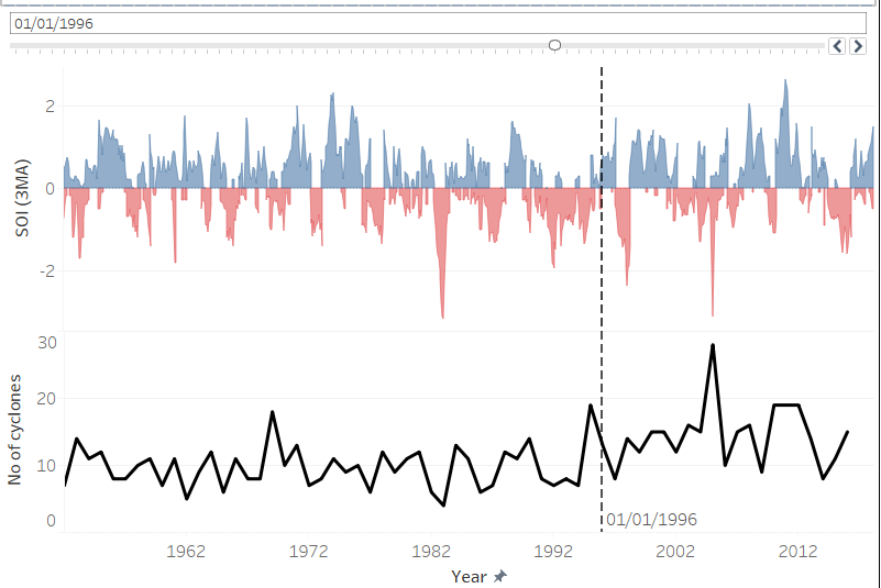
Do the same for the other chart and now you’ve got a reference line which looks like it is part of both charts!
Let me know on my twitter or Linkedin if you have anything to say.