


When creating data visualisations, we always have something we wish to convey to the user whether it be to a client with a business problem or just a passer-by viewing your viz on Tableau Public gallery. Most likely the user will not want to spend a lot of effort and time in figuring out what the visualisation is showing. So how do we reduce the time and effort? This blog will explain a practice which helps achieve this.
Preattentive what??
One of the training days we had taught by Luke Stoughton which I found really interesting was understanding the psychology behind taking in visual information and how we can use it to create effective data visualisations. I learnt that the eye processes certain pieces of information quicker than others. The technical term for this is called Preattentive visual processing. Sounds like a mouthful, but what it basically means is that when a preattentive visual attribute is used effectively, it requires no conscious effort from the end user to understand what is going on. And that’s exactly what we data visualisationers want to aim for. An example will help show this. Imagine you wanted to show which months had sales greater than $5,000. You could create a normal bar chart to show this:
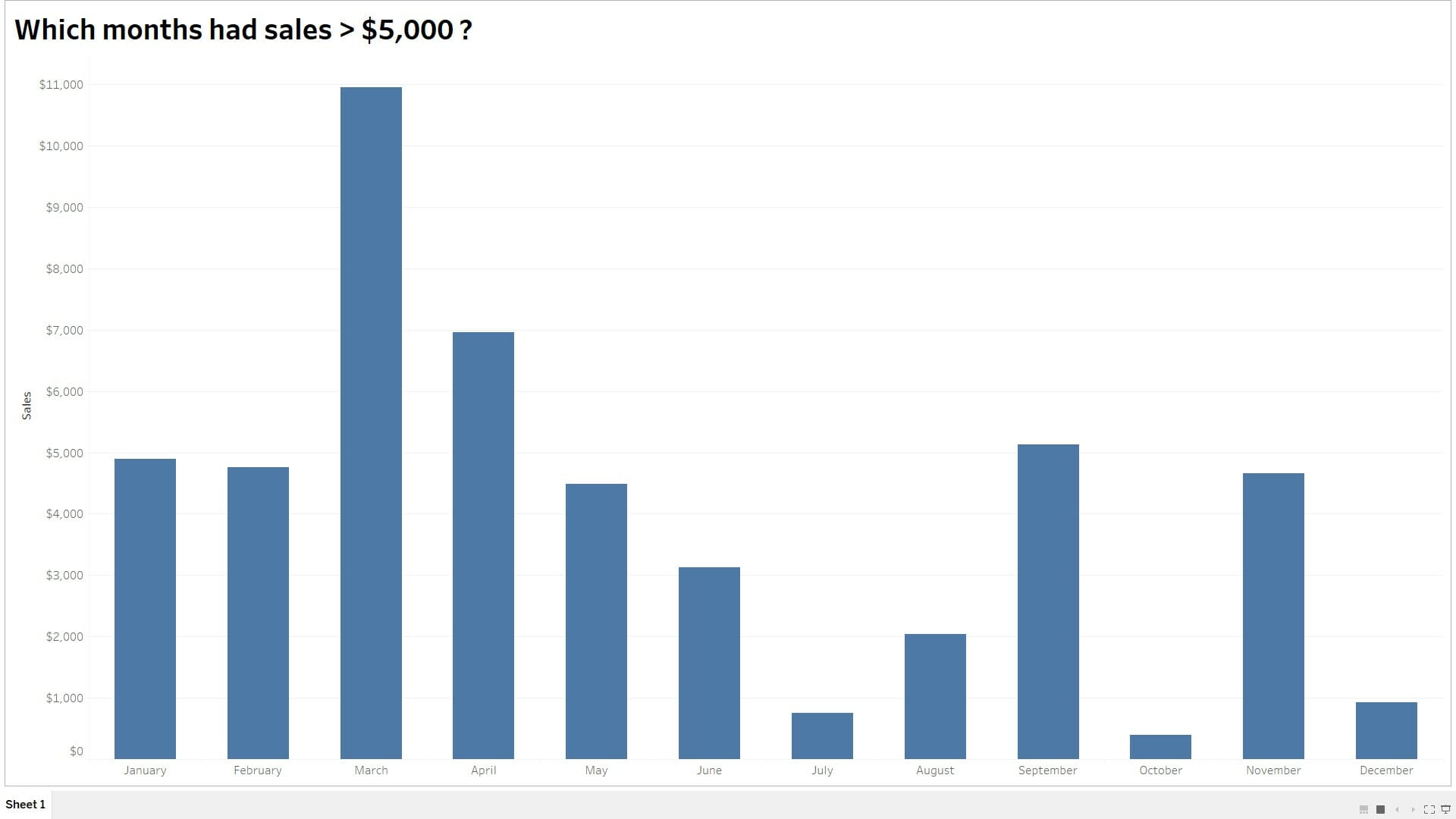
Where someone must look for $5,000 on the axis and go through each month to see if it clears it. Or you could show it like this where colour is used to distinguish the months which exceed $5,000:
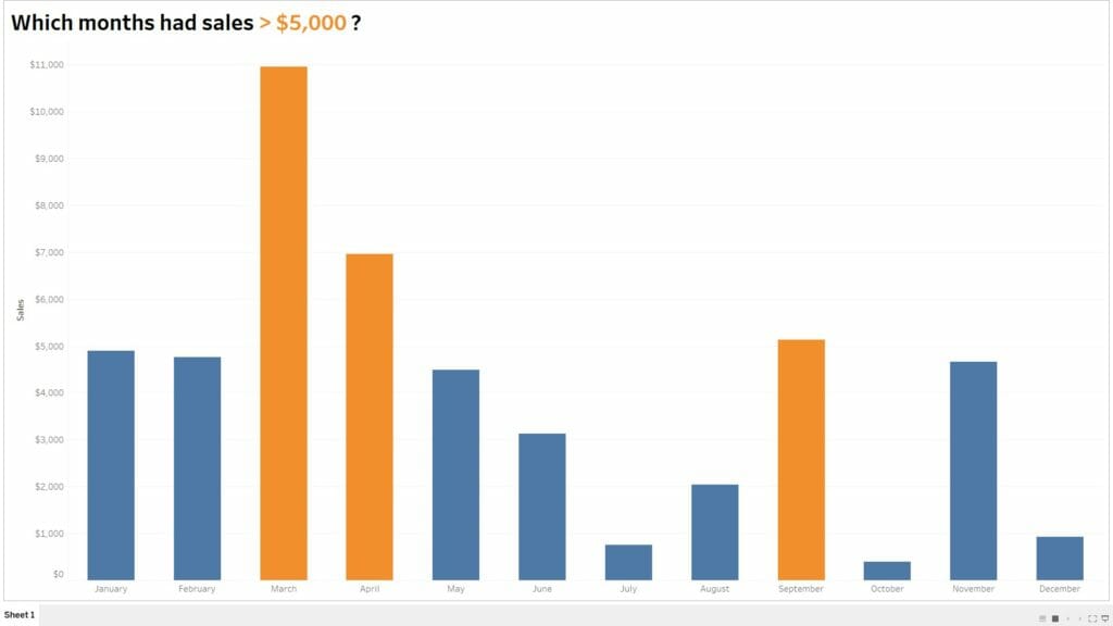
You can see that the coloured chart will grab the attention of the user to the months without their effort and thinking. This is essentially what we want. There’s also the added bonus of using colours to make it look nicer, but that’s just my opinion! Preattentive attributes isn’t only limited to colour. Other attributes such as
- Shape
- Size
- Spatial grouping
- Enclosure
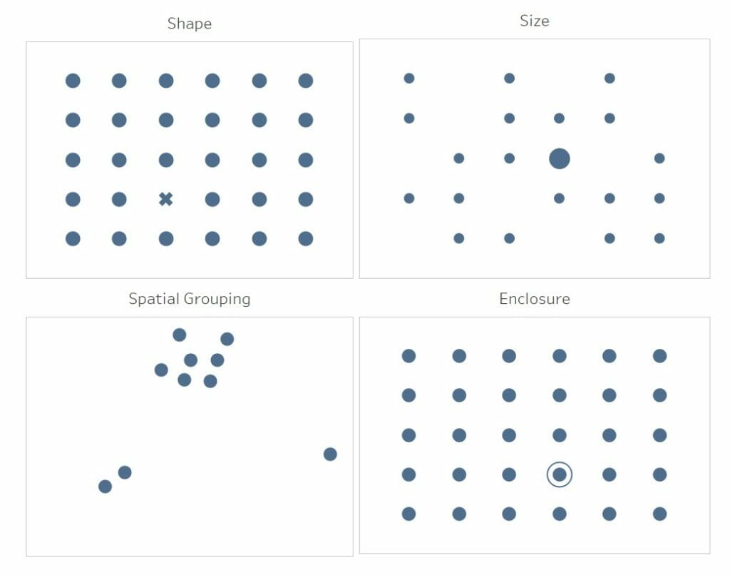
used effectively, each one will draw the user to a specific part of the chart. When looking at the charts above you probably didn’t realise you needed to think to see the differences! This way of attracting the user to see something you want to show is very powerful and I feel that it should be considered in all data visualisations.
Summary
I’m glad I’ve got something else to think about when creating a data visualisation. I appreciate how effective these simple changes can make to a visualisation. So hopefully I’ve also got you thinking about using preattentive visual attributes in your data vizzes as well, so be sure to let me know here @JevonDaCosta and Linkedin and if I have!