


Today’s challenge was different from the first three days of Dashboard Week in two ways. 1. We had to use Tableau Prep over Alteryx, 2. We were not allowed to use Tableau Desktop as our visualisation tool. The data was from the Federal Communications Commission who handle a database of customer complaints relating to cold calls in the U.S.
Getting the data:
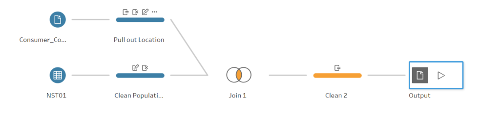
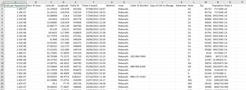
Opening the raw data in Tableau Prep was a relief as there wasn’t a lot of fields to play around with meaning choosing a story was much easier than yesterday’s 160 question survey data monster. Firstly, I wanted to pull out latitude and longitude from a messy location field. This was easy enough using Tableau Prep’s Split and Clean functions as was pulling out Time of Day ready for Power BI which can’t handle Date & Time data types at more granular than Day (I think after trying it out?).
Secondly, whenever looking at State breakdown for U.S data, it is always worth bearing in mind that Texas and California have very high populations and so, in this case, would likely have very high numbers of complaints. Therefore, to compare states, it would be necessary to show number of complaints per population. So I joined in a population table that I had from Iron Viz. Dividing 1 by the state population for each complaint meant that I could see the complaints/population by summing up 1/Population across every row.
My workflow and output:
Visualisation:
Working with Power BI was…interesting. Overall, it is a very different tool to Tableau in terms of viewpoint.
Tableau focusses on allowing users complete control of the visualisation process, the caveat is it is much more complex to get to grips with, but ultimately almost any chart design is possible.
From my (very limited) experience with Power BI, it is simpler to build a much smaller range of charts. You can turn out some simple visualisations without being a real expert but trying to build fully interactive vizzes that you would expect from a Tableau dashboard is much harder. This is especially true for functionality that is possible with Calculated Fields and Parameters.
Perhaps obviously, I prefer Tableau, but is there anything that I would incorporate from Power BI? Firstly, I like the idea of building a dashboard up from a blank canvas (all charts are constructed directly on the dashboard canvas rather than in worksheets which are then dragged onto a dashboard). A second feature is the formatting of design based aspects such as background colours, axis labels etc. Power BI seemed much more straightforward to get to grips with whereas Tableau’s endless options can sometimes leave you clicking around to find what you want to change the design of.
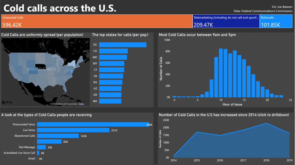
My final viz looked like this:
I missed not being able to build up interactivity despite Power BI’s ‘instant highlighting’ capability where clicking a mark highlights it across all charts.
Overall, today was an interesting experience of the pro’s and con’s of alternative data visualisation tools but I can’t wait to get back to Tableau already.
See you tomorrow!