


Two weeks ago marked one year since I posted my first Viz to Tableau Public. Looking back over my old work, I always think ‘this could have been more insightful’; ‘this could have used something I’ve learnt since’ or ‘what was I even thinking?!’. So, I decided to reviz my old work ‘one-year-on’.
Every week, I will take a viz (oldest first). My challenge is:
- Write down my initial thoughts
- Ask the community for feedback
- Remake my old viz using the ideas I have received
Obviously, there’s a hashtag so follow along or get involved on #justrevizit.
So here goes…
My first ever viz (let me know your thoughts):
Of course, my first viz was from Makeover Monday. The data looked at female representatives in the House of Commons:
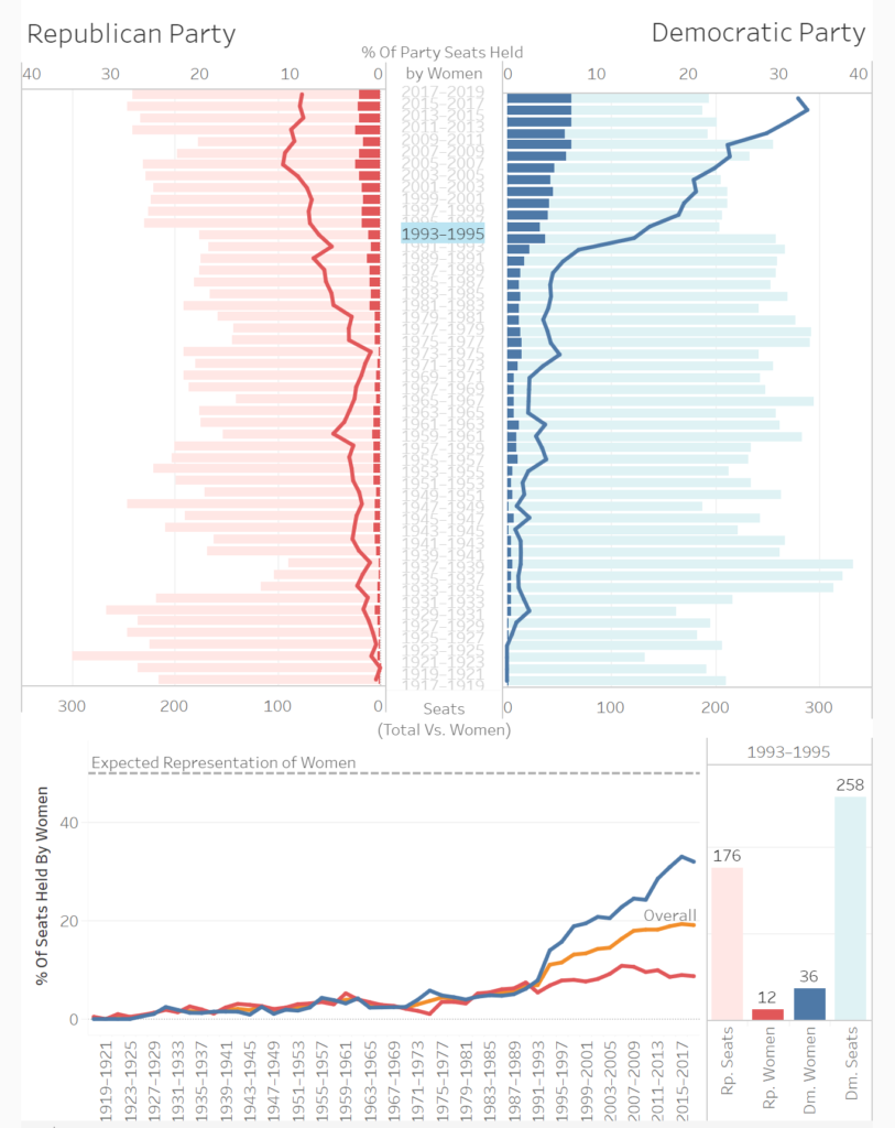
My initial thoughts:
- Where’s the title, JOE?
- The three charts show almost exactly the same information
- There is a lack of storytelling. The take home messages are clear so I would prefer an explanatory viz in this case.
- The dual axis chart (top) could be a bit tricky to interpret although this is a better use case than many for this chart type
- The tornado chart makes it hard to compare the two parties directly
- The filter action is unclear to the user
- Gridlines everywhere (!), as are chart borders
So, what about something like this?
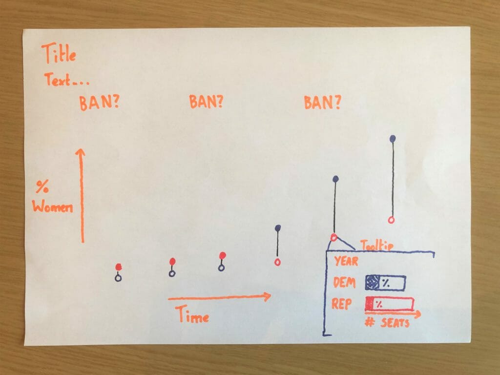
What could be added/taken away? Is there a better chart type to show the data? What do you think of the BAN’s? Let me know!
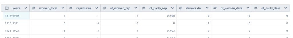
The initial data looked liked this:
See you soon!
Joe (@Joe_Tableau)