


On Monday, we had our brief from Carl that we were all to create an entry for the Iron Viz competition. The data provided was on the origin, religion and settling city of refugees coming to the US. We were free to add any relevant data to our viz.
My Final Submission:
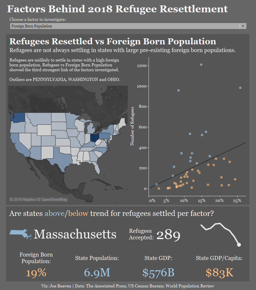
I looked at investigating the potential factors influencing where refugees settle in the US. My Viz looked first at whether more refugees settle in areas with high pre-exisiting foreign born population however this showed a week link. Having read that Texas accepts more refugees that average because of its huge size, I then looked into the link between refugees and state population as a whole – this delivered a much stronger correlation and a more concrete story to tell. Economic factors could also drive refugee resettlement so I looked at state GDP (strong correlation), then GDP/Capita (much weaker correlation).
This left me with some interesting stories to tell – using parameters to switch between views allowed me to present this on a single dashboard whilst also adding a bit of interactivity.
The second half of the view allows users to focus in on each state, looking at whether they are accepting more or less refugees relative to the nationwide trend for each factor investigated. Clicking the map or scatter changes the colour of my BANs to give a snapshot of how the state is performing across all of the factors investigated.
In terms of design, I went for a dark background. I find these have a more appropriate feel on serious issues and make maps look much better. Darker boxes to highlight the first (nationwide level) and second (state level) analyses allows the viewer to keep these apart.
On Wednesday we were all given feedback from former Iron Viz judge Sophie. I was encouraged to build on the Iron Viz criteria: storytelling – building explanatory subheadings into the viz; design – limiting white space by reduce through time trends down to sparklines; analytics – using some basic correlation statistics and finding significant outliers. I worked on building these into the viz, which improved the readability dramatically. It’s always a good idea to get a fresh pair of eyes on a dashboard, especially when you’ve been working on it for a long time and thanks again to Sophie.
Reflections on the project:
Having a set deadline of a week instantly ups the pressure. In some ways there’s expectation that its a long enough timeframe to produce something great. On the other hand, the time disappears, especially when you throw in learning RegEx and Macros in Alteryx.
With this in mind, I’ll try to bear these lessons in mind:
– Don’t be generalist with your scope. After our startup meeting on Monday, my brief was ‘Demographics’. This proved to be completely overwhelming as I set myself up with no real starting direction. Instead, I could have committed to investigating ‘What’s driving settling pattern’s?’ and saved a lot of time and stress fishing around for a story.
– Don’t worry about changing direction. Tableau is a quick analytics tool so it takes no time to build a view. I started out looking at the link between where refugees from different continents settled. There was very little story there and I could only progress once I looked elsewhere rather than trying to force a story.
– Avoid ‘summary fields’. These are the fields that have information at a higher level of detail than the data. For example, for each US city we had number of refugees and number of refugees across the state. Tableau does this aggregation for you and it can get confusing if you start to interchange.
– And, always ask someone to take a look if you’ve hit a wall. I had some really useful feedback throughout the week which improved my dashboard a lot.