


Today marked the beginning of our final week of training and with that came our first dashboard week challenge. We were tasked with creating a visual CV in Power BI using a data set that we created.
Planning and Research:
I started by looking at some existing examples of visual CVs to gain some inspiration.
Here are some examples of ones I liked:
https://public.tableau.com/app/profile/bartoszciolek/viz/BartoszCioekCVTableau/CVSummary

Off of the back of these, I decided to try and include the following in my CV:
- Gantt chart to visualise your experience through time.
- Section with headshot, short bio and links to other socials.
- Section for courses and certifications.
- Links to example projects.
- Donut chart splitting work by industry.
- Clicking a skill and it highlighting the relevant experience for that skill.
These ideas led me to produce the following sketch:
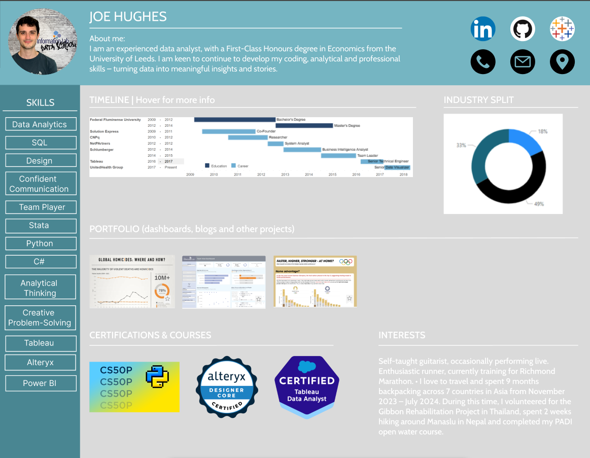
The idea here was that you could select a skill on the right and it would either highlight or filter to the relevant work experience on the timeline. Equally, I wanted each of the dashboards in my portfolio to be linked to the actual dashboards on my Tableau Public.
The emphasis this week for our cohort was on design, so I decided to opt for less charts and interactivity so that I could spend more time tweaking formatting.
Report in Power BI
Concluding thoughts and takeaways
For the most part today went well - I managed to execute my plan and didn't feel too much time pressure. In hindsight, I think the donut chart was a poor choice - too many industries/colours and perhaps a bar chart would have served better. This being said, on the whole I was reasonably happy with the design. Whilst timing today was fine I think that moving forward I should place more emphasis on drawing up a schedule once I've read through and digested the brief at the start of the day. Especially given the lack of data prep today. One of four down!