


Brief:
Scenario: The London City Council and GDS have opened a new bid for accessible data visualisation services. You’re submitting a pitch using real-world public data to showcase how you meet WCAG 2.2 and GDS accessibility standards. They’ve asked for a real dashboard built using infrastructure or social inclusion data — so you’ve chosen the London Accessibility dataset as your example.
Data: Attractions & Tube Stations
Output:
Upload to Tableau Public or Power BI Service. Demonstrate conformance to:- Colour contrast rules (for colour-blind safety)- Keyboard and screen-reader navigation- Descriptive headings and ALT text- Clear language, no abbreviations without explanation
Key Requirement:
Show how your dashboard meets WCAG + GDS guidelines in terms of design, interaction, and publishing
Today I started by researching and coming up with a list of requirements to try and meet on my dashboard based on the WCAG and GDS guidelines mentioned above.
Here's what I came up with:
1. Perceivable
Colour & Visual Design
- Do not rely on colour alone to convey meaning—use patterns, labels, icons, or text.
- Provide colour-blind-safe palettes (e.g., avoiding red/green combinations).
Text & Labels
- Clear, simple English; avoid jargon; expand any abbreviations on first use.
- Descriptive titles and chart headings (“Average step-free access by borough”, not “Chart 1”).
- Provide ALT text or chart summaries for all non-text elements.
2. Operable
Keyboard Navigation
- Entire dashboard must be fully keyboard operable (Tab, Shift+Tab, Arrow keys).
- Logical tab order that mirrors visual reading order.
Interaction
- Interactive elements must have:
- Descriptive button labels, no “Click here”
- Accessible filters/slicers with labels and instructions
- No timed interactions
Avoid Barriers
- No hover-only actions; ensure click or keyboard alternatives exist.
- Avoid auto-playing or moving elements.
3. Understandable
Structure
- Use GDS-style layout hierarchy:
- Page title → section headings → charts → supporting text.
- Consistent placement of filters and navigation.
Language & Help
- Use plain language; explain the dataset context.
- Provide tooltips with meaningful explanations, not raw field names.
Error Prevention
- Avoid interactions that can produce errors or “blank states”; provide guidance when filters hide data.
4. Robust
Screen Readers & Semantics
- Ensure screen readers can access:
- Chart titles
- Axis labels
- Data point summaries
- Filter labels
- Provide text alternatives such as “Data summary” sections below charts.
Compatibility
- Publish using Tableau Public / Power BI Service accessibility settings:
- Enable screen reader mode
- Export formats (PDF/PNG) should remain accessible where possible
5. GDS-Specific Additions
- Follow GDS Design System conventions for spacing, heading levels, and plain English.
- Do not use decorative elements or dense layouts—prioritise white space and clarity.
- Mobile responsiveness: ensure dashboards scale without clipping.
- Include a short Accessibility Statement explaining how the dashboard meets WCAG 2.2 AA.
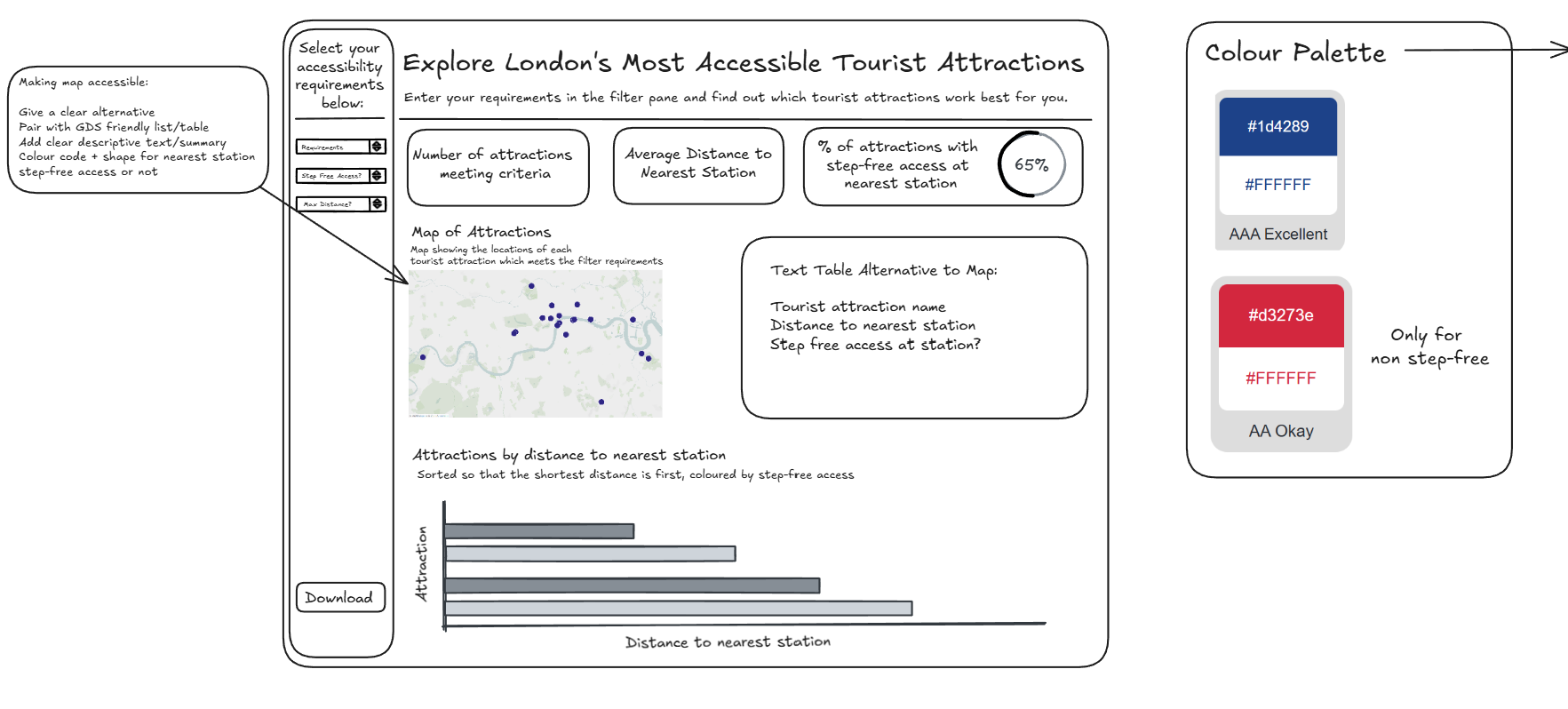
Keeping these in mind I produced the following sketch for my dashboard:
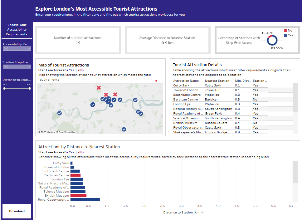
Here's what I managed in the time:
Takeaways
I think due to the breadth of the brief I struggled to tackle all of the aspects I outlined above. I also think I was overly ambitious on the charts that I produced. In hindsight, I would have been better off focusing on less elements and delivering a more polished product, ensuring that the formatting was up to scratch and that all aspects of the brief were met.