


Brief:
Today DS53 will take on The Data Lab Data Visualisation Competition 2025 challenge. Your goal: communicate the co-benefits of climate action using the dataset from the UK Co-Benefits Atlas.
You will create a polished, compelling visual story showing the positive impacts of climate action — focused on convincing a specific audience.
You may use Tableau OR Power BI, and data prep method of your choice.
Overview
You will:
- Explore the UK Co-Benefits Atlas dataset (climate action benefits to health, economy, environment, communities)
- Choose one or more co-benefit categories
- Select a specific audience to persuade (e.g. councils, businesses, a local community, climate skeptics)
- Tell a clear story using data
- Build a polished infographic-style dashboard (static or interactive)
- Publish your work and write a short blog
This challenge focuses on persuasion, clarity, and insight, not just charts.
Same rules apply as day 1.
Good luck — let's see who can persuade the nation to go green! 🍃⚡
Time Plan:
9:00 - 10:00 AM: Research, look at data, brainstorm
10:00 - 11:00 AM: Sketch
11:00 - 12:00 PM: Data Prep
12:00 - 12:30: Start Building
LUNCH
12:30 onwards: Build
Key info:
What are co-benefits? Climate actions lower greenhouse gas (GHG) emissions but the gains for society reach further. The CO-BENS project models 11 additional benefits based on actions recommended by the Climate Change Committee (CCC) in its Seventh Carbon Budget (2025) across 45,000 communities and regions within the UK.
What is the Atlas (data set)? The Atlas is a resource that reveals how, when, and for whom benefits emerge, uncovering connections across social, economic, and environmental priorities to guide more informed and effective decision
The data covers 46426 small areas in the UK over the period 2025 to 2050.
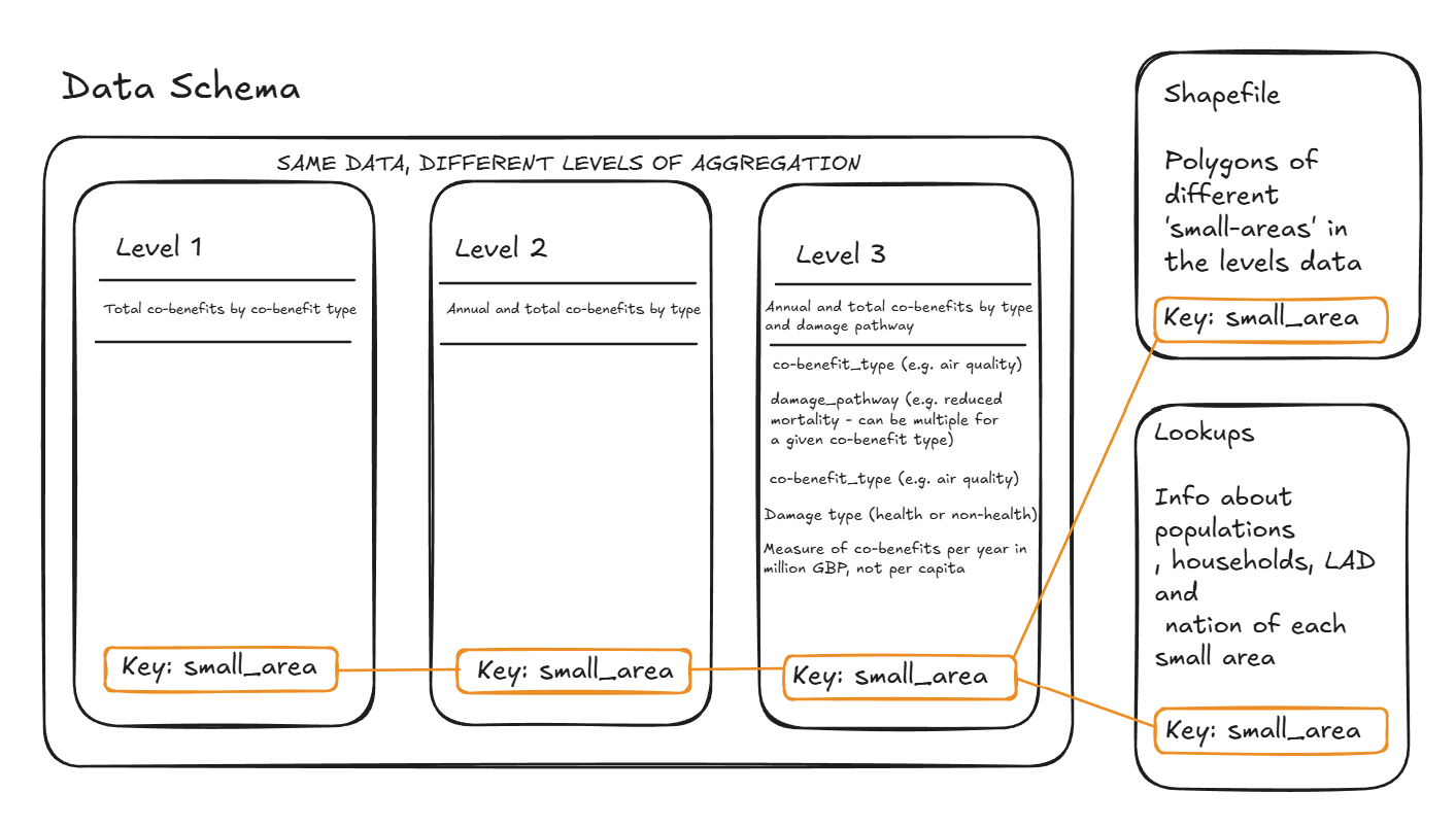
To better understand the data I was working with I produced this schema:
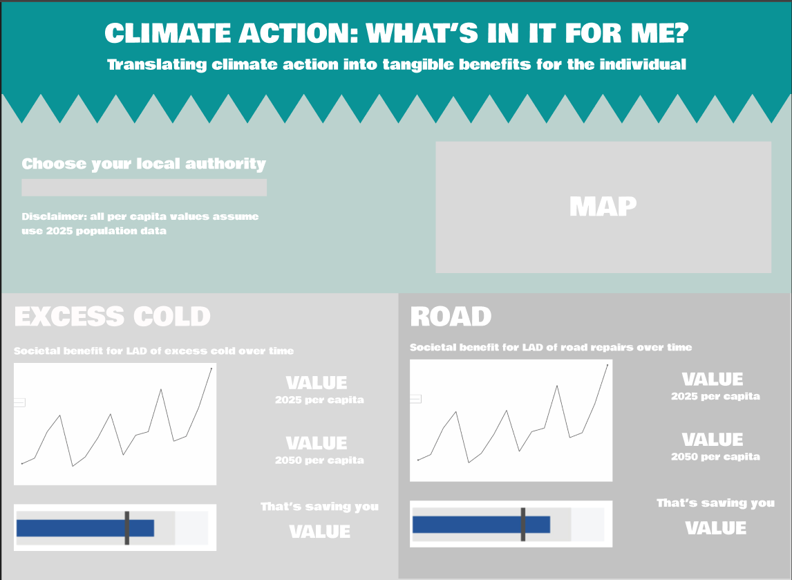
My thinking was that skeptics are tired of existential, life threatening rhetoric with regard to global warming - target them more where it will hit home (their wallets). I decided to focus on excess cold specifically with regard to societal monetary value per capita and road repair costs per capita. How much will this action save YOU.
Infographic Inspiration:

Plan:
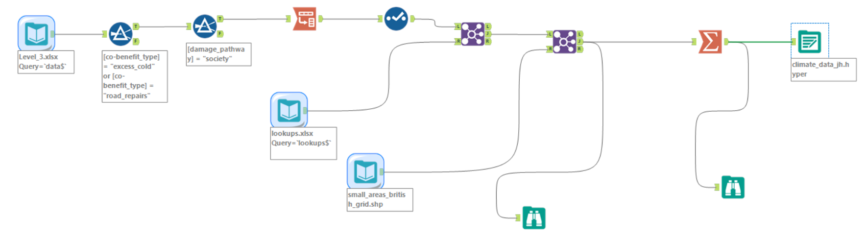
Data Prep Workflow (based on above plan):
Issues During Building
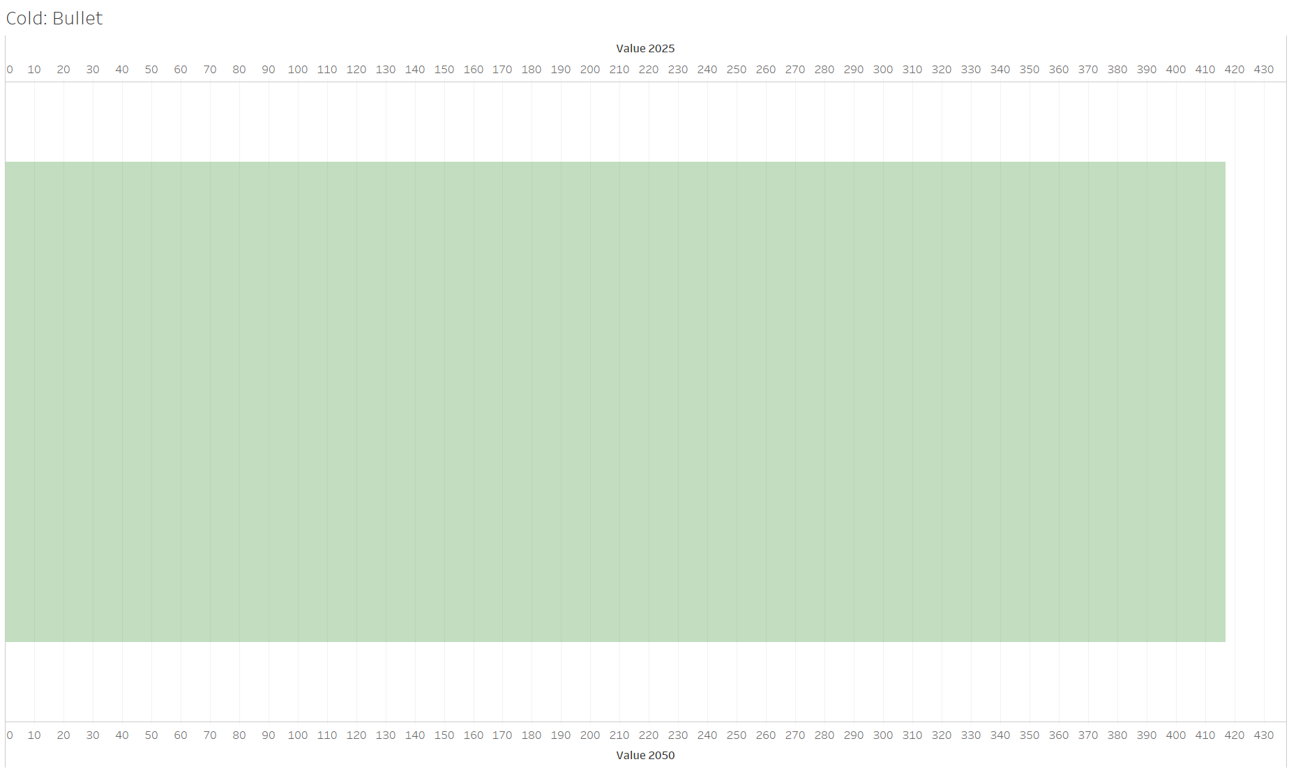
Bullet chart didn’t end up working (2025 value comparatively too small):
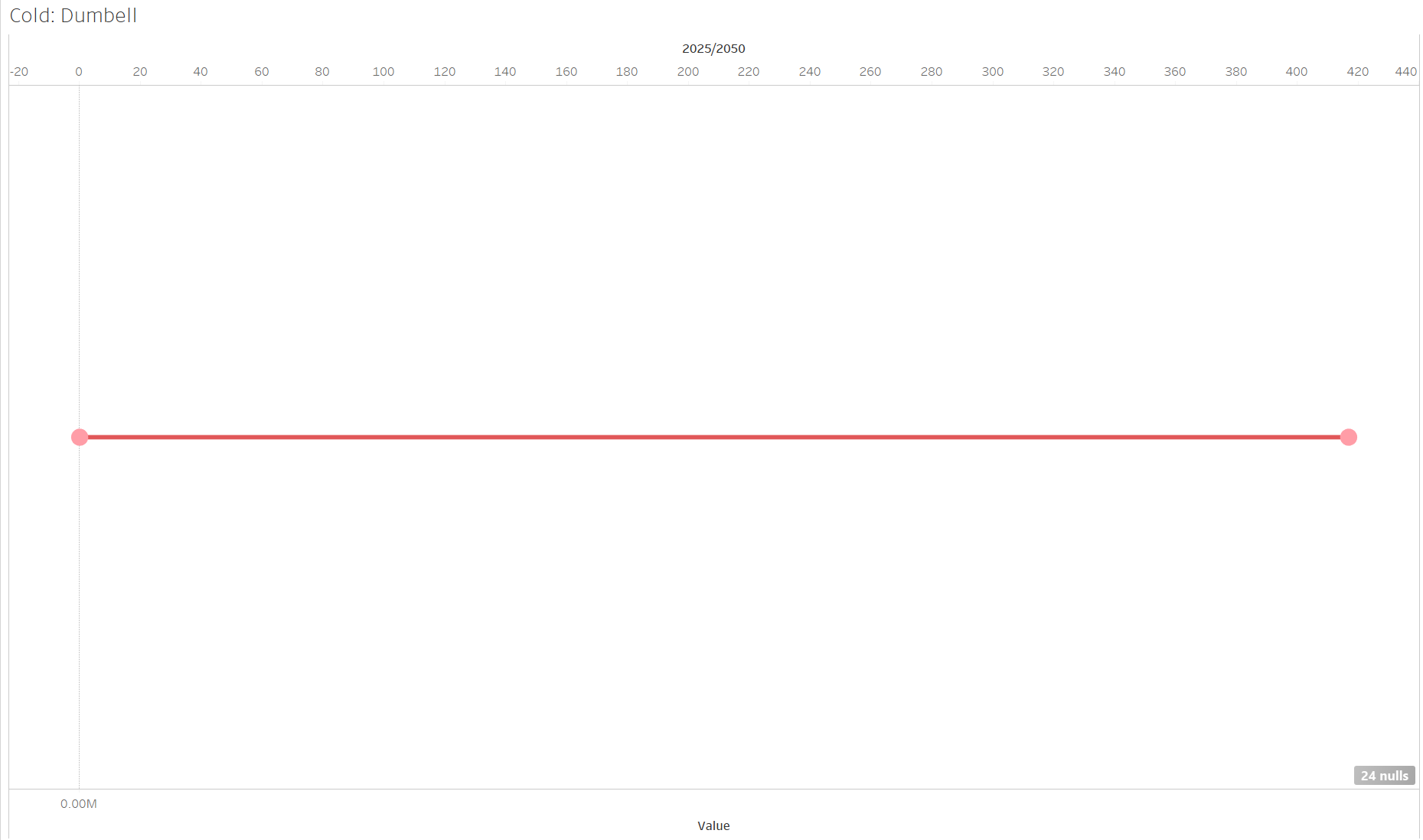
Considered dumbbell, but ultimately doing same thing as the line chart:
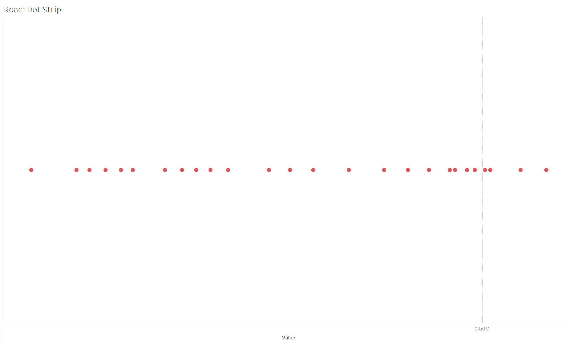
Considered dot strip, but bit confusing because years can be out of order:
The Dashboard:
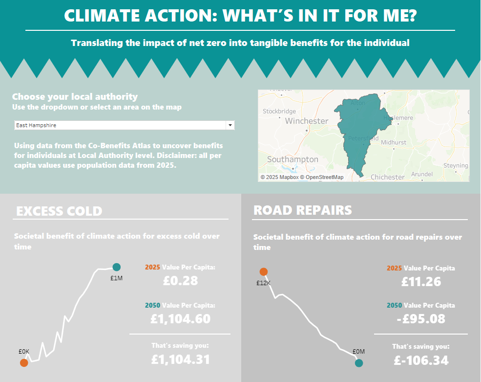
It turned out there was a problem with road repairs: not actually a co-benefit, rather a cost. I had erroneously assumed that if climate is being targeted, less extreme weather events and hence less potholes and road repairs (not the case).
Conclusion
On the whole I’m happy with what I accomplished today. I feel I scoped well, budgeted my time and I’m reasonably happy with the end result. It’s a shame that the road repairs didn’t show what I was hoping, but I made the call to cut my losses and spend time formatting, which was the right call.