What are control charts and why do we use them?
Standard deviation is a measure of the spread of a data set from its mean. Control charts display standard deviations above and below the mean in the form of a reference band to clearly highlight any anomalous records.
Let's take a look at an example:
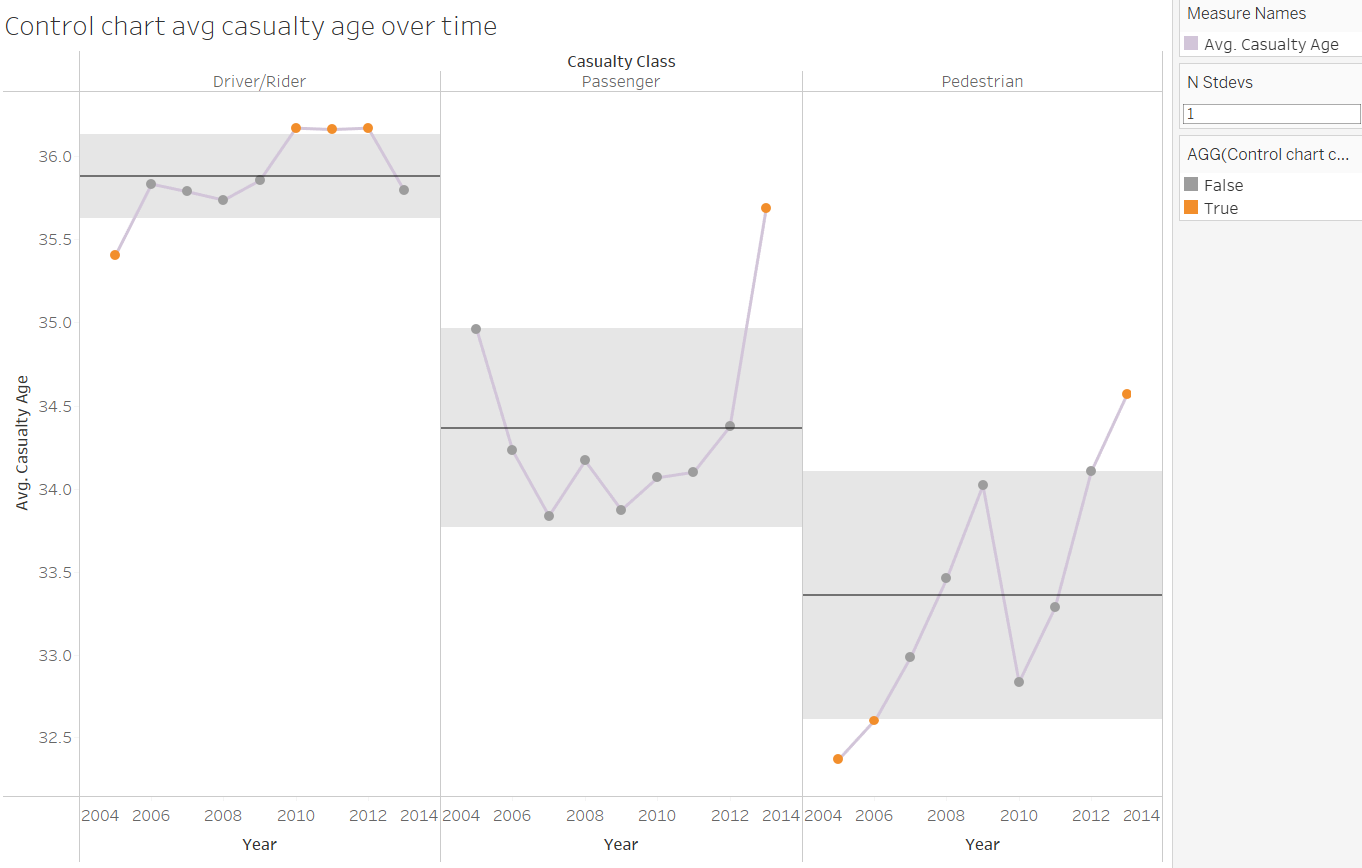
Here we can see how the average age of road-related casualties changes over time for drivers, passengers and pedestrians. Crucially, we can easily spot the years for which the ages lie more than one standard deviation above or below the respective means for each category (circles highlighted in orange).
Now that we know what a control chart looks like, let's make one!
For the purposes of this example, I will be using the Sample - Superstore data set.
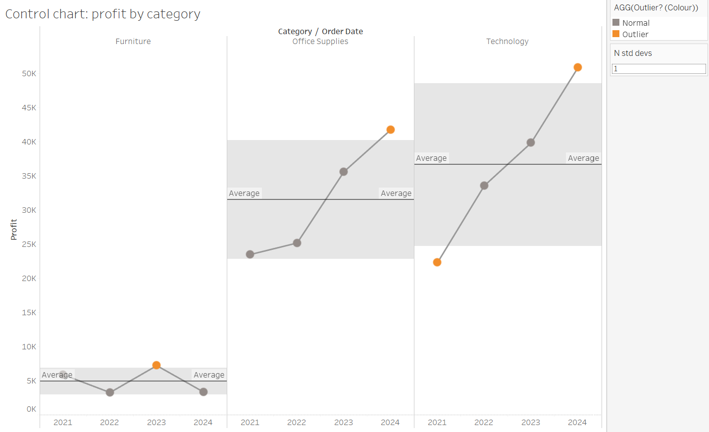
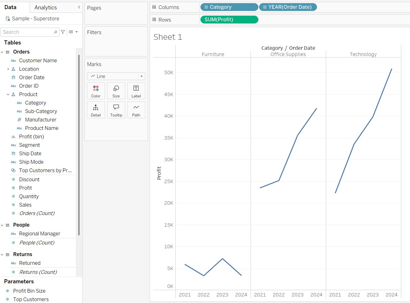
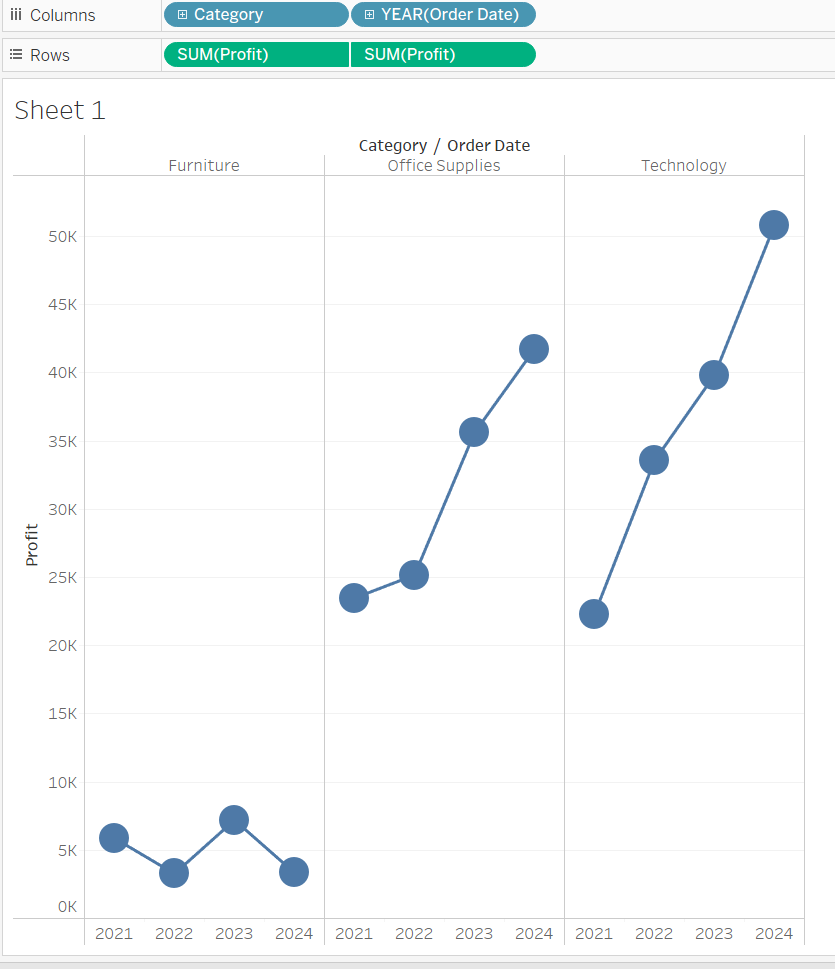
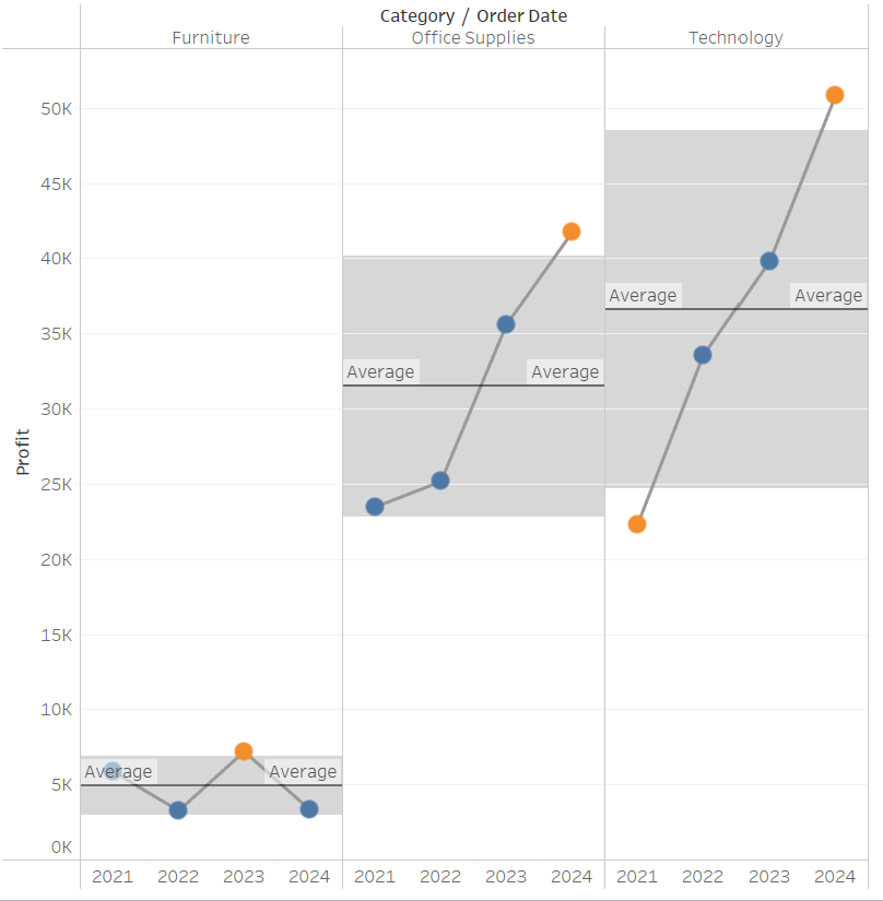
Step 1: Let's start by making a line graph showing profit over time for each category.
Step 2: Next let's layer the same data over the current chart, only this time using 'circle' instead of line.
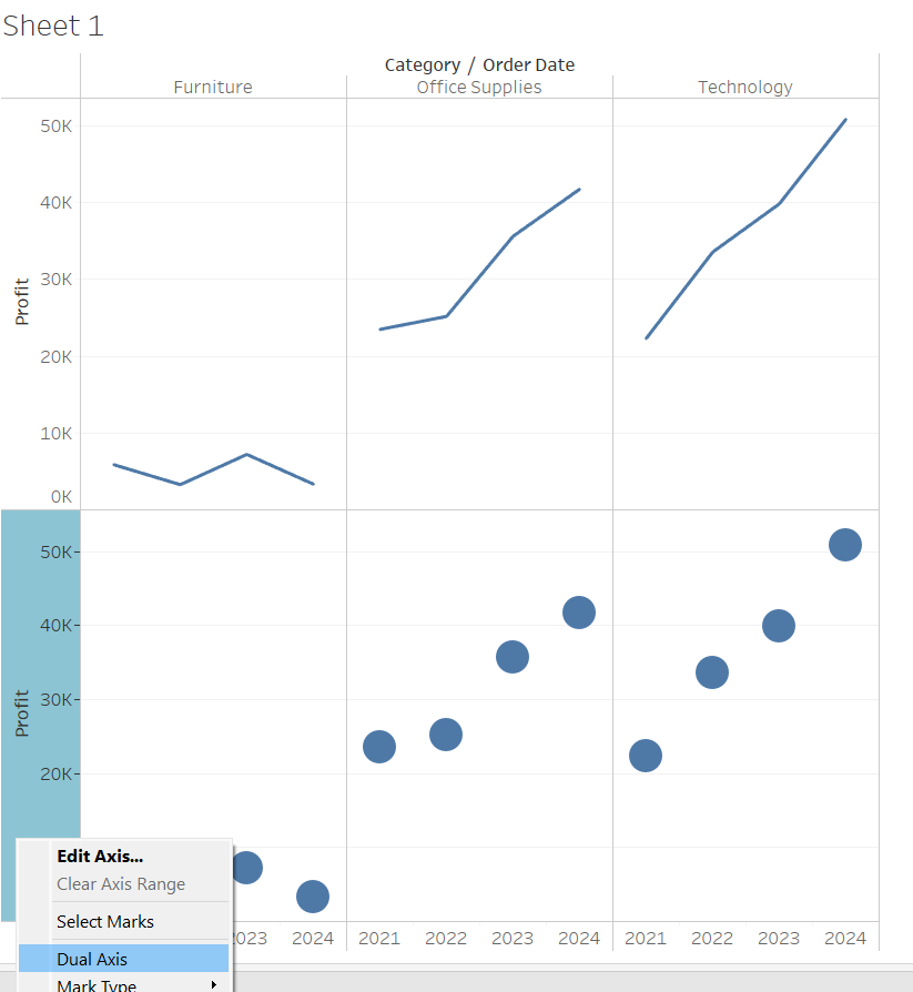
Once you've selected dual axis, synchronised the axis and hidden the right header, you should be left with this:
(feel free to adjust the size of the circles).
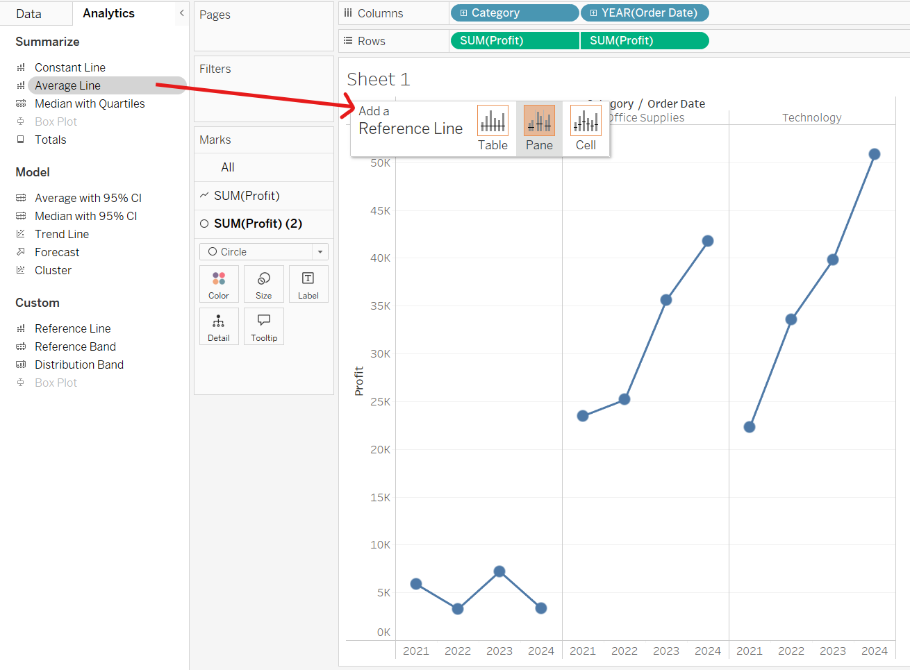
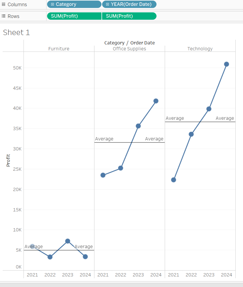
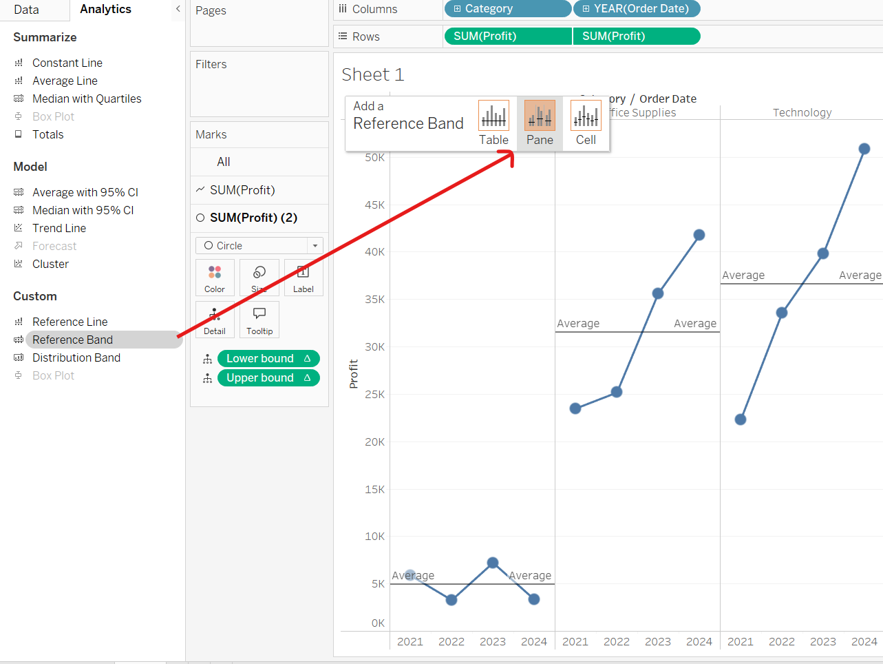
Step 3: Drag the average line from the analytics pane, selecting 'Pane' so that we get a separate average line for each category.
Step 4: Create a control parameter which will allow us to control the size of our reference band (how many standard deviations away from the mean we want it to be).
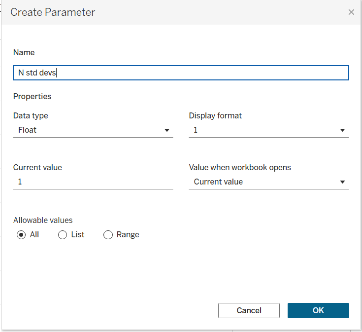
(remember to select 'show parameter ' so that this appears and can be altered under the chart legend).
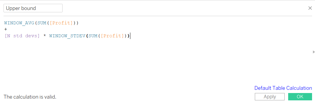
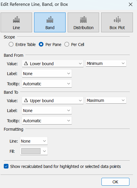
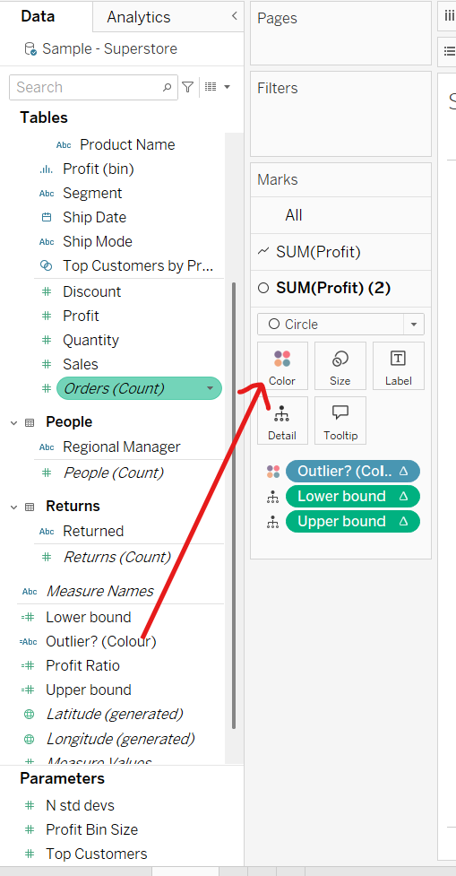
Step 5: Create calculated fields for the upper and lower bounds of reference band. Note: we use window functions here because we want these to be calculated for each category in the view.

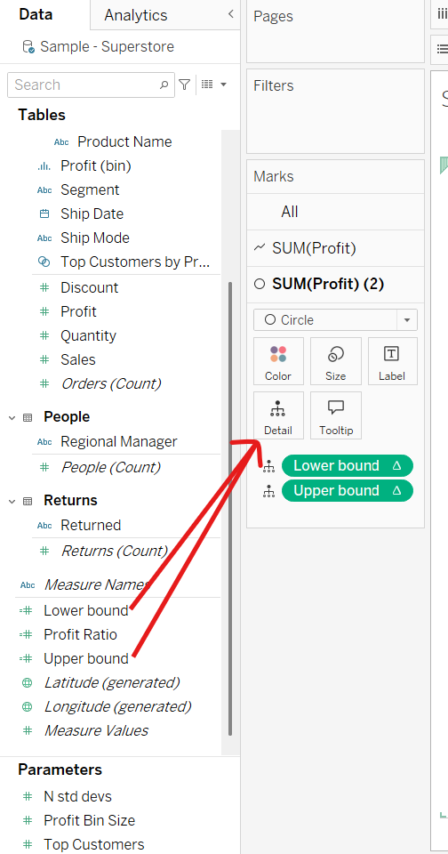
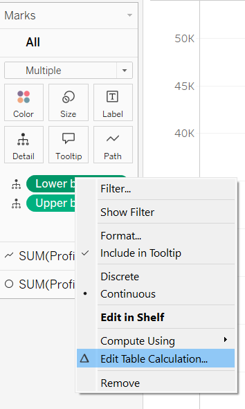
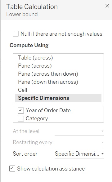
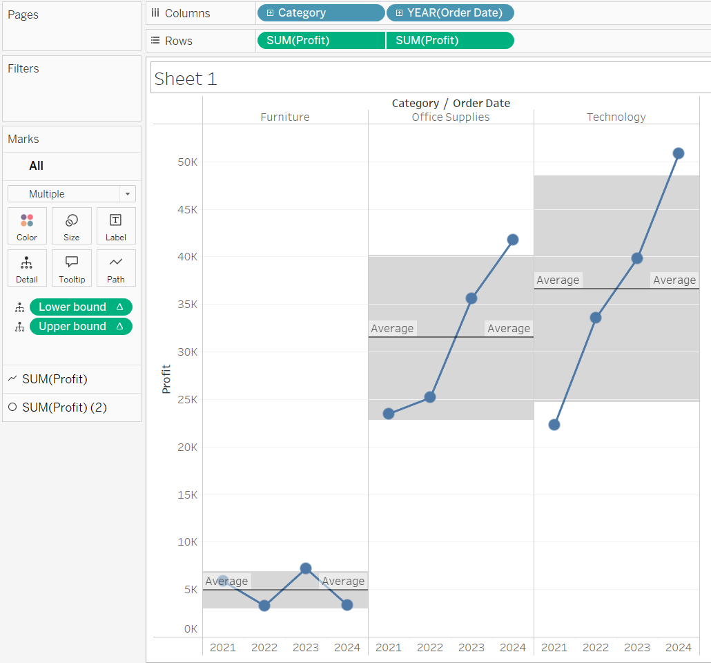
Step 6: Drag your upper and lower bound fields to the details shelf, change both of the table calculations to be computed using year of order date and then add your reference bands.
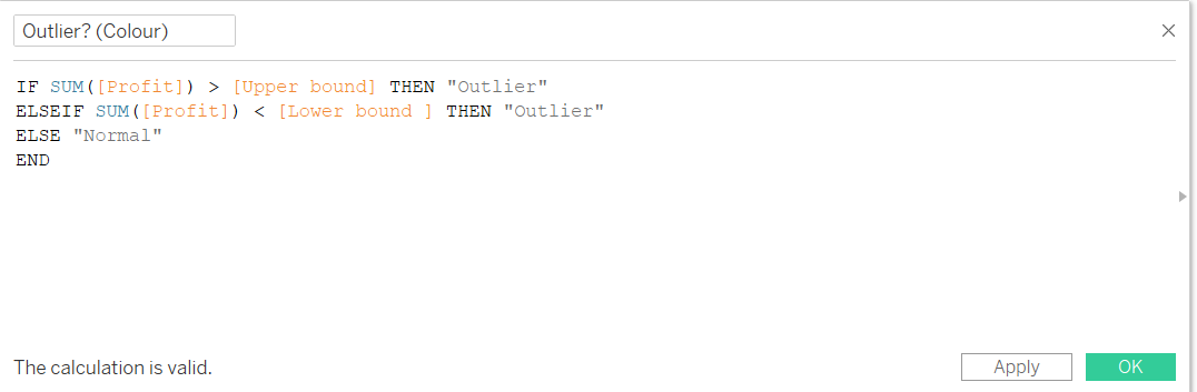
Step 7: Almost there! Next we'll colour the circles which fall outside of our range of standard deviations. Create a calculated field which will determine whether the point lies within our reference band or not and then drag it onto the colours shelf.
Step 8: Make any formatting alterations you wish!