


In day two of DS46 we have been looking at how to make a piece of work more user focused by putting ourselves in the user's shoes!
I looked at the following dashboard showing NFL Combine results from 1987 to 2018 and tried to imagine what insights a scout at an NFL team may like to derive from a dashboard such as this:
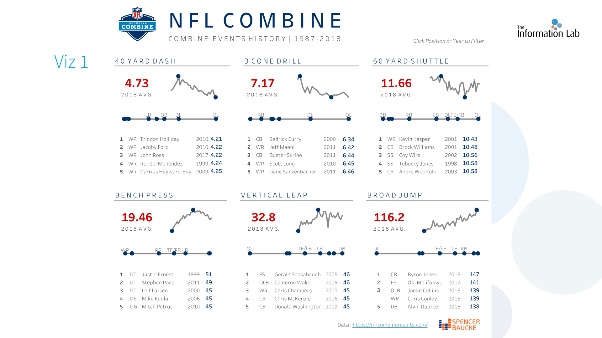
Using this dashboard I tried to imagine which questions it was initially designed to answer, coming up with the following:
- How has the average score in each combine event changed from 1987 - 2018?
- What are the maximum and minimum average yearly scores?
- Who are the top five performers in each combine event over the dataset?
- How does performance in each event differ on average for each position?
Having thought about this, I then asked myself what insights would an NFL scout need to derive from such a dashboard to help their decision making when picking prospective new players?
- Who are the best performers in this year's combine by position?
- Who should I pick for my team this year in the draft?
- How do combine results reflect future performance in the NFL? (Further data would be needed to support this)
From a scout's perspective there does not appear to be much value in comparing players in different positions, as their performance in each event will largely be influenced by their body type, and certain events are more important depending on position. For example a DB will likely be a much faster runner than an OL, however the OL can probably lift much more weight. As a result I would give the user a filter option based on position so that comparisons can be made on a like-for-like basis.
I have rearranged the dashboard into the following layout:
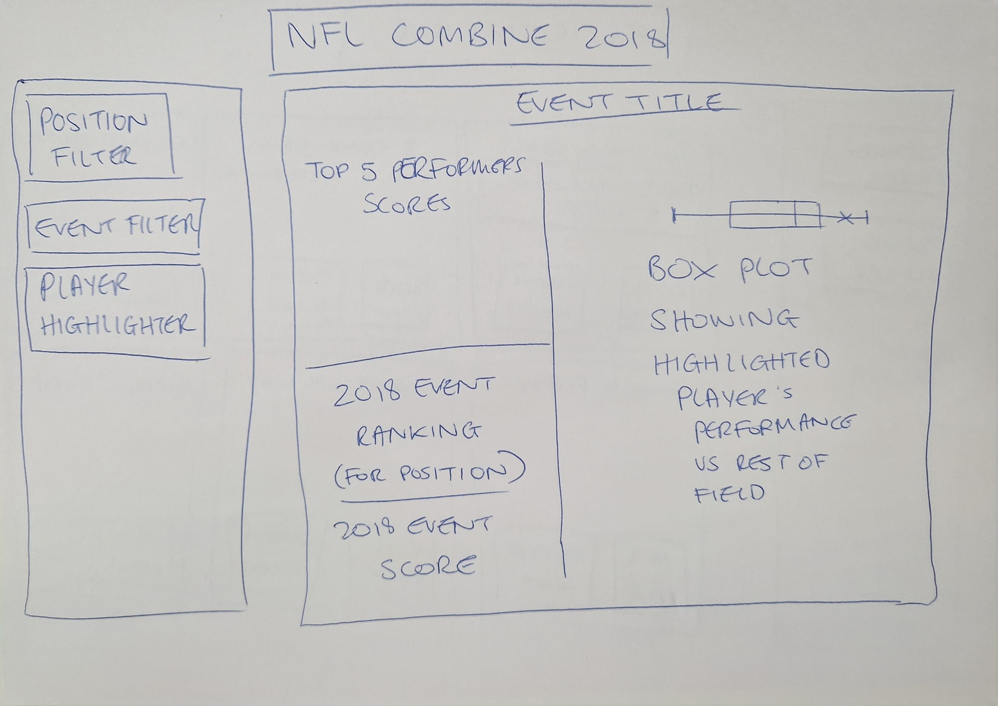
This would allow the user to filter by player position and select an event to look at, as well as seeing how a highlighted player performed against the rest of the group. That player's ranking for the event could be shown as well as their score which could easily be compared to the top five performers in that group. A visual representation of that player's positioning within the group could be shown as well via a box plot on the side of the dashboard.