


I didn’t publish a blog for the final day of dashboard week, which I think is because as soon as I finished my presentation on the last day, I felt like the week was complete and I mentally checked out. However, in the future its likely I’ll look back on these blogs, and so I think it’ll be useful to have a full week of blogs for dashboard week.
THE FINAL DAY
I think its safe to say as a cohort we were all particularly worried about the final day. Was Andy going to treat it like the final boss in a Super Mario game, or would he be kind knowing what he’d put us through in the previous four days? For me, my main worry was that the data would involve web scraping. Having had limited experience with it, I think I would much rather learn at my own pace than try and learn and implement it within the space of a morning.
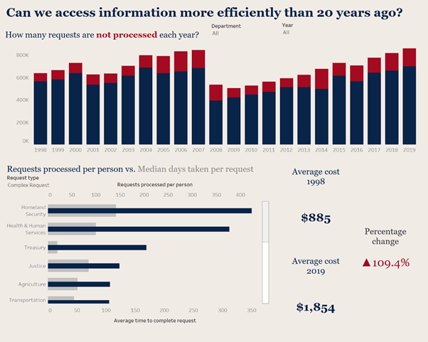
For the final day we were going to be looking at data on Freedom of Information Act requests from 1975 through to 2019.
THE DATA
No web scraping, no complaints. The data prep was minimal, but it took a while to simply understand the data. A lot of different columns across three tables where the data collection differed over the years. Once I had a good understanding of the data, the prep was just some header renaming and unioning. Although my process of renaming was slightly manual, it did the job for what I needed. I decided to not include one of the tables which was data collected before 1998. The supplementary documentation mentioned that the accuracy of this data was questionable, which gave me a good reason to focus on a smaller time period and conveniently leave the table with the most messy and incomplete data.
As the data prep came to an end, I decided to focus on analyzing efficiency of requests across departments. At this point I knew I should’ve made this decision much earlier into my data prep to save time.
My final dashboard was probably the quickest dashboard I made during dashboard week. For that reason, it was simple in design, but I think it effectively showed the analysis I was trying to make. I liked the bar in bar chart that easily showed two measures for efficiency across departments. I didn’t like the BANs layout, but this is a minor issue that can be fixed easily.
Thanks for reading and here’s the final dashboard 👍
https://public.tableau.com/profile/joseph.phillpott.clark#!/vizhome/Book1_15888660336820/Dashboard1