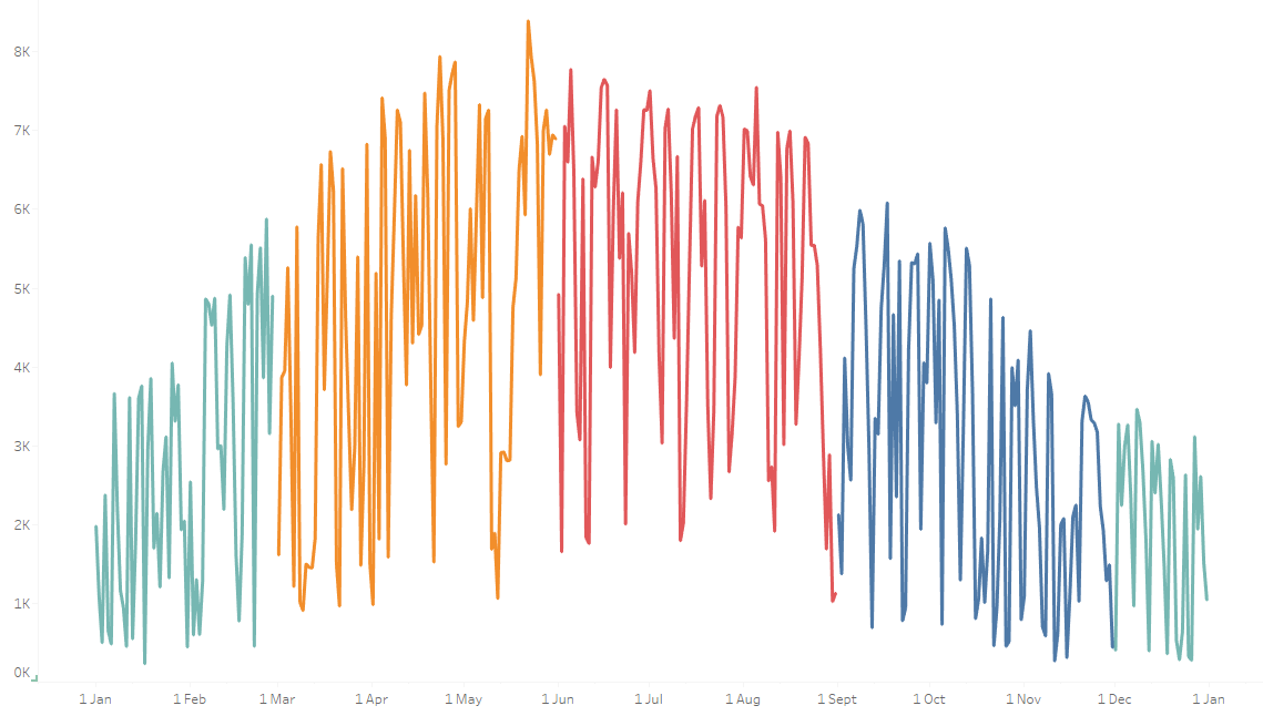
In the pictured line chart, I needed the Date field to be continuous so that I could add a Set Action for the user to select a range of Dates - (see step by step guide on this: https://www.youtube.com/watch?v=ScZrHKq-vIs).
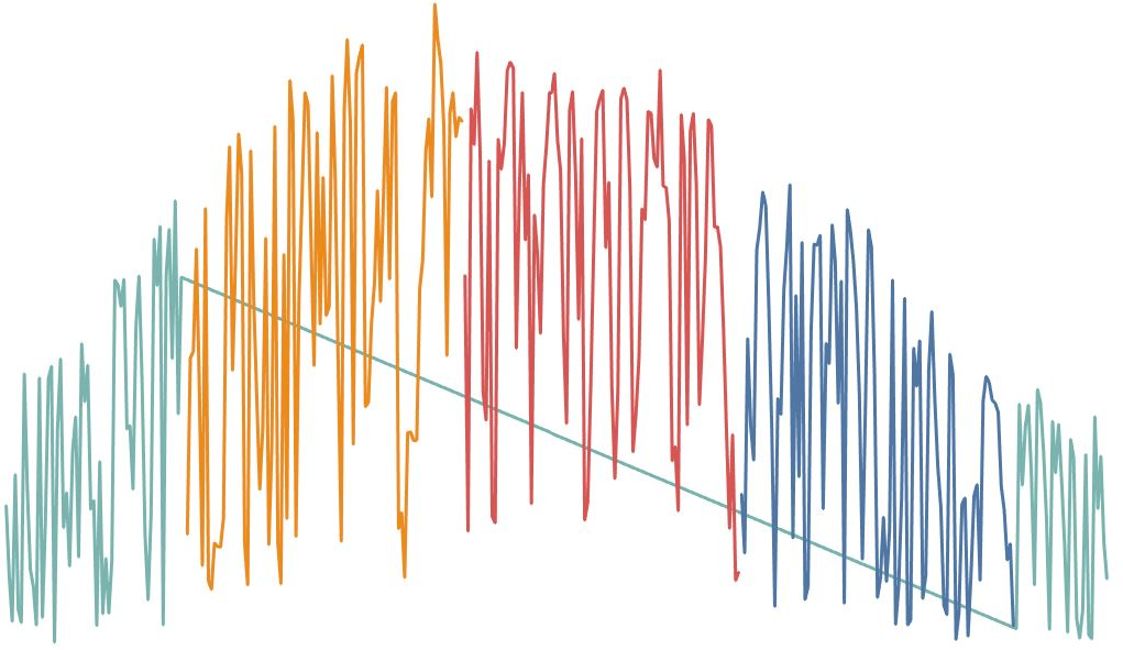
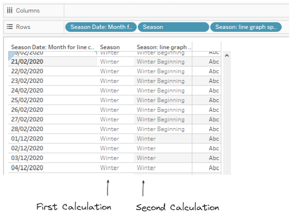
As the Season was on the Color Marks card, a line connected the end of February with the start of December as they are both categorized as 'Winter'.
All that was needed to solve this issue was a new Calculated Field splitting out the January and February months to be a different category of 'Winter' to the month of December.
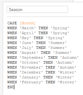
The original Season Calculation in use:
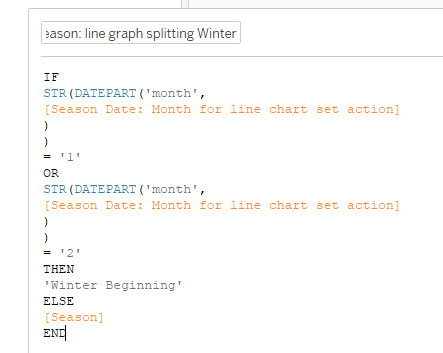
Then to split out 'Winter' ('Season Date: Month for line chart set action' would be the relevant Date field for the chart):
If we look at this new calculation on a table and we can see how it will split the naming of January and February from December:
Now we need to add our new Season Calculation onto Color in place of the old one:
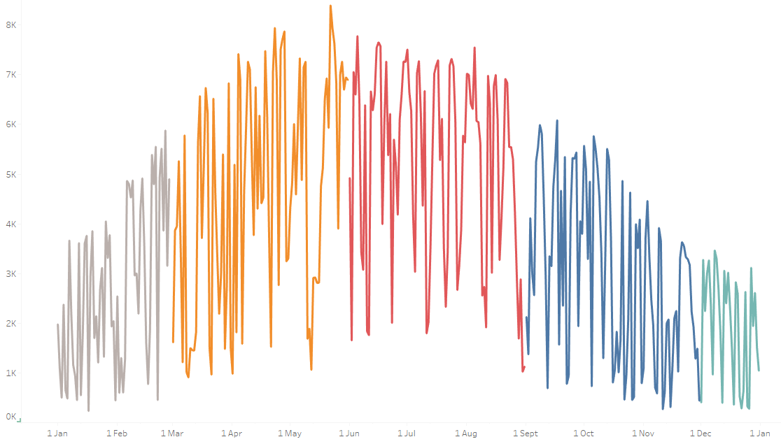
'Winter Beginning' and 'Winter' are automatically assigned different colors, so for the final step, we need to update the coloring to be the same: