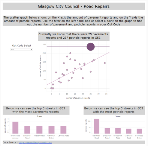
Using data from FixMyStreet.com, for today's task we were required to create a Dashboard that made the data visualization experience open to as many people as possible.
A screenshot of my final Dashboard is shown at the bottom of this post. In this blog I will go through all the design elements that I considered when creating this Dashboard and why.
Limit the size of the Dashboard - some people are not able to use a mouse so are unable to scroll. This means that it is good practice to keep your Dashboard to a single page that requires no scrolling.
Use Color backgrounds on your Titles - This helps those that are visually impaired to clearly make out the Titles from the other sections.
Include key information and insights in you Titles - When using a screen reader (if someone is blind for example) the screen reader only reads the text in the Titles. This means that key information and insights within each graph should also be included in the Titles. Using dynamic Titles is also a great way of doing this.
Use blank space - If you Dashboard is very full it can be overpowering to those that are visually impaired. Instead use blank space to separate graphs and other sections of your Dashboard.
Do not complicate your graphs - If there are a lot of data points or trend lines on your graphs it can be overpowering for the user. Instead keep things simple and consistent. If you are using bar graphs it is also good practice to ensure there is enough space between each bar.
Use Dropdown Filters - If the user does not have access or the ability to use a mouse they will need to use the keyboard. If you create a dropdown the user is still able to use the filter via the tab button on the keyboard.
Select a readable font - Some fonts are easier to read than others. For my Dashboard I used Verdana as it is clear and does not confuse 'I' (uppercase 'i') with 'l' (lowercase 'l').
Order your graphs to be read by a screen reader - If you graphs are positioned in an unusual order it will confuse the user if they are using the screen reader. Turn the screen reader on and check this before you publish your Dashboard.