


Brief
Scrape travel cost data from the Backpacker Index site to help travellers find the best-value destinations. You’ll collect both summary and detailed information from each city’s page and build a dashboard to support planning an unforgettable budget-friendly adventure.
What you need to do:
- Scrape the main Backpacker Index page
- Scrape each city’s detail page (hint: focus on the tables)
- Build your dashboard in Power BI
- Prepare for your Presentation (10 mins max)
- Write your blog post, include your plan, challenges, key finding and surprises and a link (embed your public Power BI report in your blog).
The Plan
Looking through each of the city links with the inspect element tool, I noticed a number of tables where data could be taken from. From these tables I decided on four tables that would be make up their own sections on the dashboard. These sections would cover general info, food costs, accommodation costs, and travel to city centre costs (this last one unfortunately did not make the dashboard). The use case for this dashboard was the user to be able to compare the cheapest cities to travel to and quickly navigate to cities of interest and their relevant information.
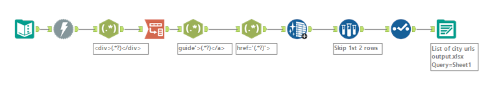
As the brief involved using Power BI, I attempted to use Power Query for the first html link containing all the cities, their backpacker index, and their respective html links. The index table was pulled through but the html links were being returned as strings. At this point, I changed tact and switched to Alteryx where I proceeded to test my regex and batch macro skills.
This process involved three workflows, one being a batch macro, with the first one producing an excel sheet with a list of urls for each city.
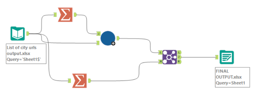
Each url from this sheet will then be run through a batch macro to produce a final dataset as shown in the workflow below.
As for the batch macro workflow it involves a number of regex formula and filters to discern between the different tables on the page. For example, the general info table was structured without headers and so the tags to identify the content of the table were quite different.
Some values were given as a range so I decided to split these out to a min and max column for each value. A multifield formula tool worked well when there were multiple fields that had to undergo this process but when there was a single field it cause more issues. To fix this, a text-to-column tool was used.
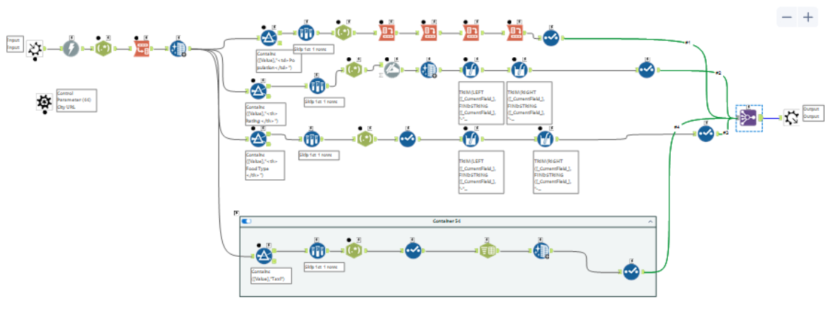
When using the regex tools I decided to tokenise the data into columns and then cross tab the data. This resulted in a wide dataset with 23 fields per city url, although this made it easier to track where the datapoints were going this proved to be an issue later on when creating the graphs I had in mind.
Additionally, I thought the use of a batch macro would speed things up but proved more difficult than anticipated resulting in less time available for making the final dashboard. Below is a sketch of said dashboard and as mentioned previously due to the data structure the accommodation section would have to be split by city not hotel stars.
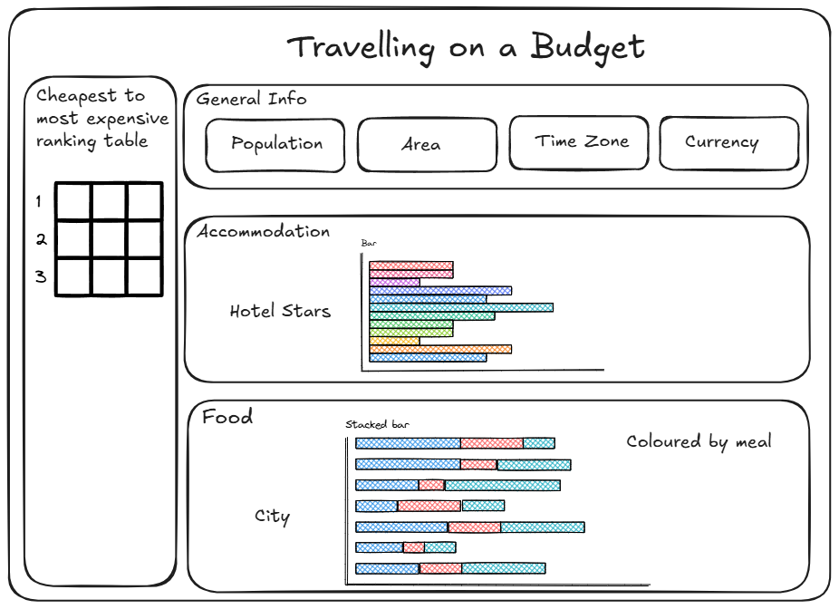
To get the table on the left-hand side of the dashboard I just used the initial url link and used Power Query's web scraping feature to pull in the backpacker index table. I connected this query with the output from the Alteryx workflow on city, country to enable interactions on the dashboard. With more consideration on the structure of the data I would be able to compare min and max values for each category, possible with a dumbbell chart.
Consequently, for the accommodation section I focused on the min and max of 1 star hotels and for the food section I focused on the min values for breakfast, lunch, and dinner.