


Brief
NASA (National Aeronautics and Space Administration) has a plethora of free API’s available to pull some amazing data from. For instance, you can find the orbits of satellites around the earth, get up to date weather reports from Mars or pull in all the Astronomy Picture of the Day’s.
https://api.nasa.gov/index.html?search=#main-content
Today’s challenge for DS52 is to pick one (or multiple) API’s of your choice to pull your data from and use to build a Tableau, Power BI workbook or Alteryx App that outputs interactive charts and reports.
Everyone should pick a different API, exceptions are allowed if your projects are focussing on different aspects of the API but this has to be approved by myself. Astronomy Picture of the day API is not allowed as they’ve built on this during training.

Phase I
There were a lot of different APIs to choose from and it took me a large part of an hour to do some research on the APIs and figure out which one makes the most sense to me. In the end, the Space Weather Database Of Notifications, Knowledge, Information (DONKI) caught my eye.
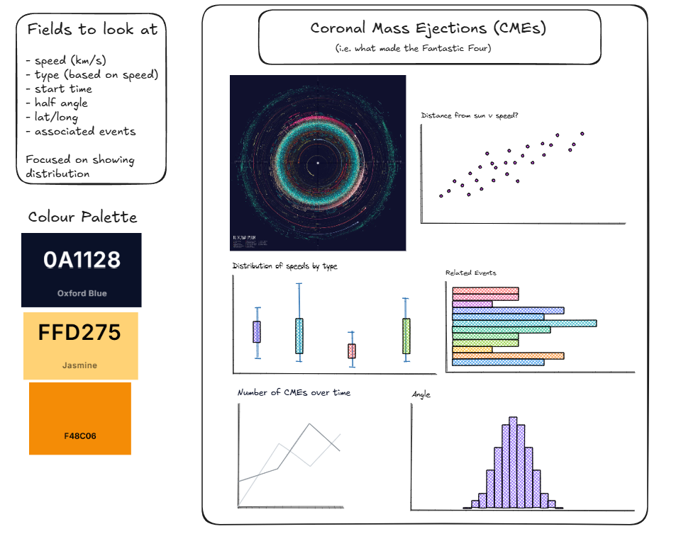
Within this database, I came across coronal mass ejections (CMEs), which turns out is the phenomena that causes events such as solar radiation storms and geomagnetic storms (like the one in Fantastic Four). These events can disturb the earths magnetic fields creating beautiful auroras but also causing power outages and disrupt communications. So I thought it would be interesting to see how many of these CMEs cause such events.
Turns out speed is a key method of classification for these CMEs and categorised as below using the SCORE scale:
- S-type: < 500 km/s
- C-type (Common): 500-999 km/s
- O-type (Occasional): 1,000-1,999 km/s
- R-type (Rare): 2,000-2,999 km/s
- ER-type (Extremely Rare): > 3,000 km/s
I also saw the data had latitude and longitude based on HEEQ coordinates and thought it would be cool to chart the events in relation to the Sun, which is the origin point. This ended up being the focal point of my dashboard which I have made a rough sketch of:
Phase II
Using the below example API with an API key:
https://api.nasa.gov/DONKI/CMEAnalysis?startDate=2016-09-01&endDate=2016-09-30&mostAccurateOnly=true&catalog=ALL&api_key=(Registered API Key)
I began downloading the API data and using the JSON parse to extract the data which included a link to a webtool that contained information on related space events.
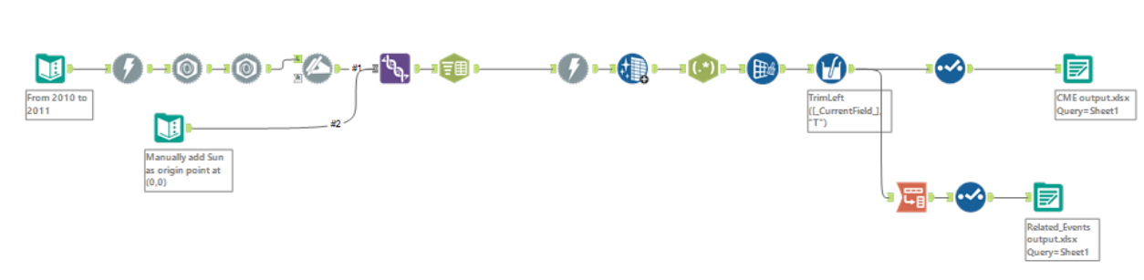
The initial API contained all the data surrounding the CME but also contained links to related events. In future, it would be interesting to pull in the information from those links but for this project I stuck with using the links to identify what the related event was. This required the use of regex to tokenise the href html tags and was tokenised to three columns meaning only a maximum of three related events would be captured.
In the end, two outputs were produced from this workflow that were connected in a relationship in Tableau on CME ID. One output for the CME Analysis data and one output of all the related events.
I was overall quite happy with the aesthetic of the dashboard but would like to revisit and improve its usability. Possibly after doing some more research on space weather.