


Friday Project number 4 involved taking a previous consultants sketches and creating them in Power BI. The dataset itself covers fire safety incidents in Atlanta from 2021-2022 which is to be reported to the Fire Marshall. Four main questions were determined by a previous consultant and the dashboard sketches were designed to answer these questions.
- Where are the fire safety incidents happening?
- What is the nature of these incidents?
- When are these incidents occurring?
- How effective are the fire stations' responses?
It was decided that to answer these questions three dashboards would be created as shown in the sketches below. The final dashboards created were more or less what was outlined in the above sketches with some minor changes.
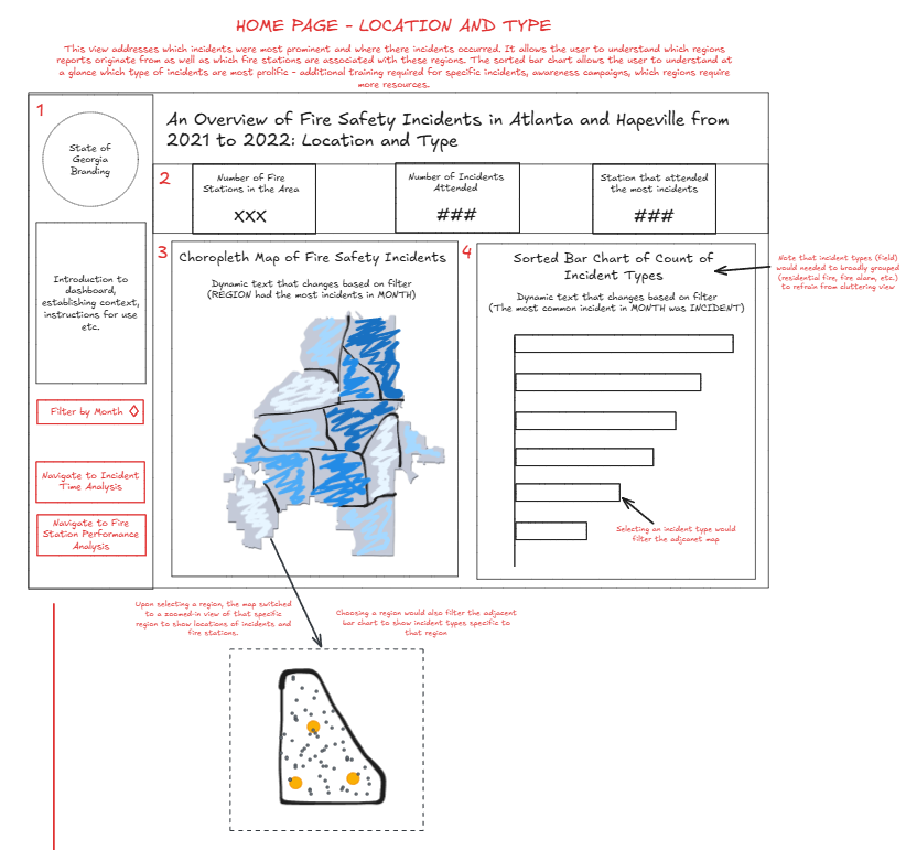
The first sketch was fairly straight forward to create in Power BI. However, one thing that was not included was the drilldown feature on the choropleth map due to the time constraints and the spatial limitations of map chart types in Power BI. I also decided to shorten the title and place the navigation pane in the top right.
For the incident types, there were a large number of different categories that were difficult to group together in a short time. I decided to filter incident types out of the dataset by only keeping incident types that contained the word 'fire' in them. I then filtered the incident type bar chart to only show the top 10 to reduce the need for scrolling.
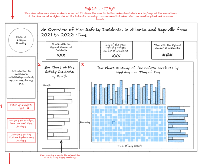
The next dashboard required three column calculations to parse the datetime in the dataset. One to show the time of day in hours (DateTime.Time), one to show the day of the week (Date.DayOfWeekName), and one with the day of the week number to sort the day of the week names (Date.DayOfWeek). The layout was also changed to be able to fit all the charts.
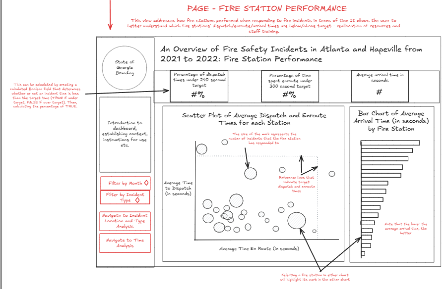
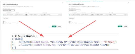
For the final dashboard, the highlight feature was not possible in Power BI as these are not built in for scatter plots. Like with the first dashboard I filtered the bar chart to show the top 10 fire stations with the fastest arrival times. Once again a few calculations were required, with a key one being a measure calculation required to create the % KPIs. Two conditional columns to show whether an incident went above or below the targets were used in this measure calculation as shown below:
Final Dashboard
Client Feedback
One of the main feedbacks from the client was the realisation that 3 separate dashboards made it difficult to drilldown into more detail for each incident to provide insights.
Additionally, the dataset included some outliers which heavily skews the average calculations. It might be best to use the median value to better reflect overall fire station performances.
The client mentioned they would like to be given the option to see all fire type incidents and stations. Excluding the filters to allow the client to scroll or adding a parameter action to switch between top n and all would be a good option.
With the choropleth map, an ARCGIS map would have been the better option as it has more potential for drilldowns. However, this is beyond what time allowed for on the day.
Personal Reflections
- Worked on my column and measure calculations
- Learnt about the strengths and limitations of PowerBI chart types
- Thought more about whether filtering or highlighting would provide better insights
- Able to create dashboards very similarly to the sketches
- Demo of the dashboard was structured and highlighted the user interactivity while attempting to generate potential insights
- Some time management issues with rehearsing and asking the client questions