


X and Y coordinates
For the purpose of this project, I want the user to be able to select a location on the pitch where a shot is taken and for the xG to be calculated using the x and y coordinate of this point. Therefore, I am going to need to create a dataset containing all the coordinates that are going to fit onto a diagram of a football pitch.
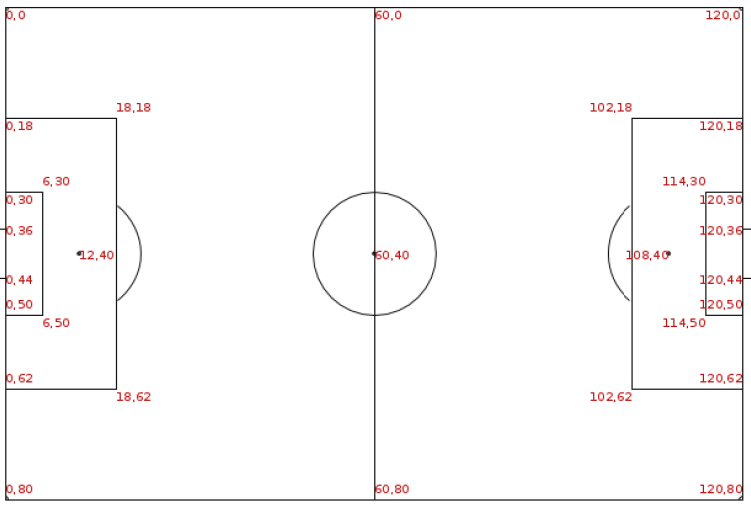
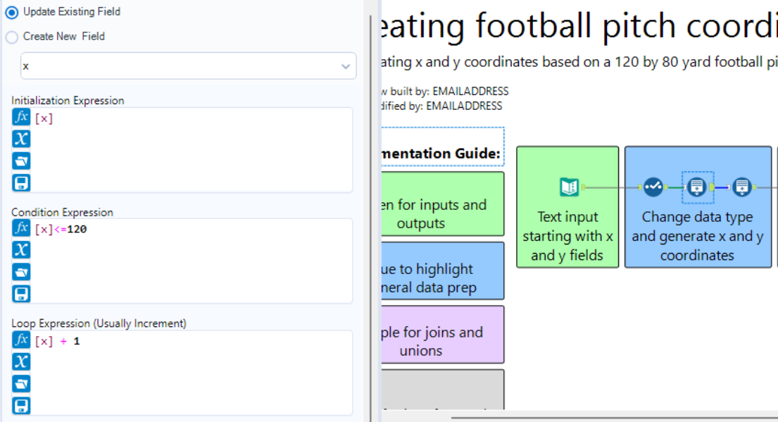
Using the above diagram, we can start with defining the ranges of our dataset. x values are between zero and 120 and our y values are between zero and 80. Hopping into Alteryx, we can generate this dataset starting with a text input tool consisting of two fields; x and y, both containing zero. Add a select tool to make sure the zeroes are being read as numeric values and we can get started in generating our coordinates. With the generate rows tool we can start by creating all the x coordinates up to 120 and all the y coordinates up to 80.
To provide more clarity, we will also add a record ID tool to make it easier to differentiate between individual points. So far, we have all our points on the pitch but there is currently no way to relate any of these points to each other. As mentioned in my initial blog, one the of main parameters when calculating is distance to the goal and the angle of the shot. The distance can be calculated using what we have now with calculated fields in Tableau. However, visualising these distances using lines requires the start and end points of each line to be related to one another.
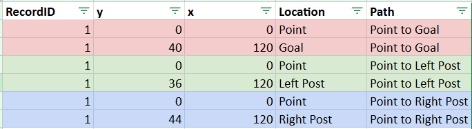
As shown in the table below, for each point on the pitch (RecordID), we want three pairs of rows. Each pair equates to the coordinates of the start and end points of a line we want to chart. With the above, we have our point to goal line, point to left post line, and point to right post line. To create this in Alteryx, we will need a number of formula tools to create our location and path combinations. The results of these tools will then be unioned back together as shown below.
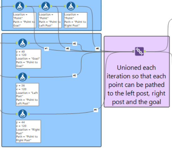
Note that within these formula tools the x and y coordinates used to determine the location of the goal (centre of the goal), left post, and right post are from a diagram provided by Statsbomb. This workflow is now ready to be outputted and used in Tableau to begin visualising expected goals!