In the sports industry, the combination of fine margins is what separates the winners from losers. These fine margins are calculated using a variety of different statistical methods ranging from simple approaches such as averages and ratios to complex predictive models. A large focus in performance analysis is what determines better performance.
For example, if a striker has the highest shot to goal ratio in a league, how does that compare to a player with a lower shot to goal ratio that plays on the wing? In this instance, we might want to take into consideration how much better players are from their peers playing in the same position. Z-scores are a way to standardise data and allow fairer comparisons between groups.
What is a Z-score?
A Z-score describes how far, in terms of standard deviations, a data point is from the mean.
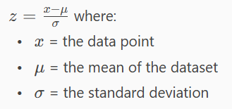
The higher the absolute value the further the data point is from the mean with positive showing it is above the mean and negative showing it is below the mean. Below is a common use case example in the form of a radar chart
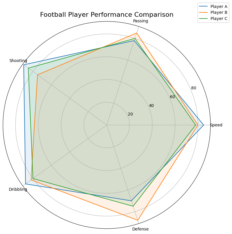
Radar charts look nice but can get quite messy if there are a lot of individual data points are categories. Z-scores can also be visualised using boxplots and I will show you how to quickly make one in Tableau.
Z-score Boxplots
To make our z-score boxplots create the following calculations using your metric in place of the value.
- Mean = WINDOW_AVG(AVG([Value]))
- Standard Deviation = WINDOW_STDEV(AVG([Value]))
- Z-Score = (AVG([Value])-[Mean]) / [Standard Deviation]
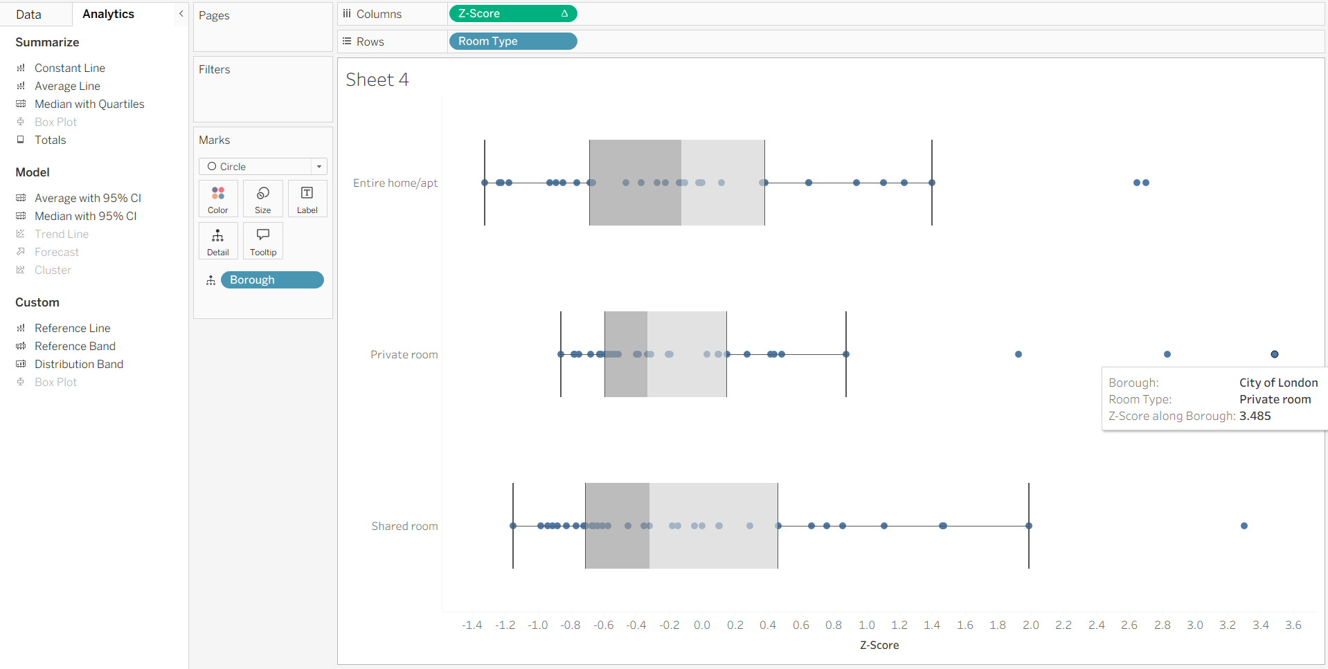
For this demo, the values are the average price of Airbnb listings in different London boroughs with the view being split by room type.
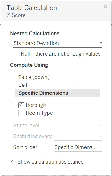
As the Z-Score is using table calculations, it is worth checking the table calculation to make sure its being calculated at the correct level by right clicking the green pill and selecting edit calculation. As we are comparing Boroughs for each room type we want to make sure Borough is selected in specific dimensions for both the Standard Deviation and Mean calculations.
Then to add the boxplot, simply drag box plot from the analytics pane onto the sheet. The chart below shows us that a private room in the City of London is significantly higher compared to the mean of all private rooms.