


For today's dashboard week task, we were tasked with creating an entry for The Data Lab's 2025 data visualisation challenge. This is based around drawing insights from the UK co-benefits atlas, which is a resource that allows users to see indirect advantages from reaching net-zero in the UK.
Here are the precise requirements from Lorna:
- Explore the UK Co-Benefits Atlas dataset (climate action benefits to health, economy, environment, communities)
- Choose one or more co-benefit categories
- Select a specific audience to persuade (e.g. councils, businesses, a local community, climate skeptics)
- Tell a clear story using data
- Build a polished infographic-style dashboard (static or interactive)
- Publish your work and write a short blog
TL;DR - Key Requirement:
Focus on persuasion, clarity, and insight, not just charts.
Plan
Here's how I plan to budget time for the day:
09:00 - 10:00 - Planning, research and understanding the dataset
10:00-11:30 - Extensive sketching and data prep - the key requirement today is message and design. Not going crazy on charts.
11:30 - 12:00 - Early Lunch at St. Paul's
12:00 - 15:00 - Dashboard building time 🛠️
15:00 - 15:30 - Tweaks and presentation prep
I started by researching the topic and understanding the dataset, as well as deciding that I will equip myself with Tableau against this challenge.
A good place to start is with the readme from the data set - which sets out the following useful information:
Overview
This data package provides modelled estimates of the projected socio-economic co-benefits associated with the net-zero actions recommended by the Climate Change Committee (CCC) in the UK's Seventh Carbon Budget. The data cover 46,426 small areas across the UK and are disaggregated by co-benefit type and, where applicable, co-benefit damage pathway, for the period 2025 to 2050.
Dataset Structure
The dataset is provided at three levels of complexity:
Level 1: Total modelled co-benefits across all 46,426 small areas, disaggregated by 11 co-benefit types for 2025 to 2050.
Level 2: Annual and total co-benefits across small areas, disaggregated by 11 co-benefit types for 2025 to 2050.
Level 3: Annual and total co-benefits across small areas, disaggregated by 11 co-benefit types and associated co-benefit damage pathways for 2025 to 2050.
Interpretation and Units
- All monetary values are given in million GBP.
- Base year: 2025.
- All values are discounted using rates set by UK Green Book guidance (separate health and non-health rates).
- Values are net present values. Negative values represent net costs.
- Data are provided at the small area level (datazone or lower super output area). Lookups are included to aggregate to local authority, regional, and national scales.
- Some variance is present in annual values, and smoothing may be required for time-series analysis.
- Some small areas have undergone administrative boundary changes between 2011 and 2021. Lookup tables are provided to support consistent aggregation.
Glossary of Co-Benefit Types
small_area: Geographical areas - high-resolution administrative boundaries (datazones in Northern Ireland, Scotland, lower-super output areas in England, Wales).
- air_quality: Benefits of reduced air pollution due to lower use of carbon-intensive heating and transport, valued in improved health and reduced building damages.
- congestion: Impacts of reduced or increased traffic congestion resulting from changes in road use.
- dampness: Benefits from reductions in damp housing, reflected in improved health and wellbeing.
- diet_change: Health improvements from increased plant-based dietary shifts.
excess_cold: Benefits of warmer homes through insulation and efficient heating systems, valued through avoided health and wellbeing damages. - excess_heat: Benefits of improved ventilation and cooling reducing overheating risk in homes.
- hassle_costs: Costs associated with increased journey durations where shifts away from private vehicle use occur. Referred to as 'longer travel times' in UK Co-Benefits Atlas.
- noise: Benefits of reduced noise pollution from modal shift or quieter vehicles.
- physical_activity: Health and longevity benefits from increased active travel (walking and cycling).
- road_repairs: Impacts on road maintenance requirements due to changes in road usage.
- road_safety: Impacts on collision incidence and risk associated with changes in vehicle travel.
Damage Type (Level 3 Only)
- health: Benefits associated with health improvements
- non-health: Benefits not associated with health improvements
Damage Pathways (Level 3 Only)
- reduced_mortality: Direct health benefits reflected in reduced premature deaths.
- society: Wider non-health impacts accruing to society.
- time_saved: Benefits from reduced travel times or costs associated with increased travel times.
- NHS: Health care cost savings to the National Health Service.
QALY: Gains in quality-adjusted life expectancy due to improved health outcomes.
With this information about the data in hand, I started to think about the brief, what messages I could convey and how to focus down. I could look into a single co-benefit, creating understanding about how a charge to net-zero could improve people's lives in an unexpected way - rather than by overwhelming them with charts/numbers.
User Story/Ideas
I want to try create a view based on the impact of net-zero on physical health and how it can make Healthier, Cleaner Britain but have this be filterable by council region so that different councils could see the benefits to their local communities. I want to focus on improved Physical Activity and Air Quality as these not only the two biggest benefits from the switch to net zero but align with the message I'm planning.
I will barely mention climate change in this infographic, outside of a subheading. The key information is in the added co-benefits.
Some inspiration I gathered online:
Air Quality Methodology:
The air quality co-benefit measures the reduction in air pollution, primarily as a result of decreased fossil fuel combustion, and quantifies the benefit to individuals and society.
Air quality improvements are quantified by modelling the delta of energy consumption between the low-carbon intervention (e.g. heat pumps) and the counterfactual (e.g. gas boilers), before estimating the tonnes of pollutants mitigated by type. The reduction in pollutants (PM2.5, PM10, SO2, NOx) from fossil fuel combustion are valued according to UK Green Book valuations (developed by Ricardo4).
These avoided damages are allocated according to beneficiary type (health/non-health, productivity, etc.), and distributed to households indirectly according to population density bands. The sum of air quality co-benefits from the buildings and transport sectors represent the total air quality co-benefit estimations.
These benefits are discounted according to HM Treasury’s Green Book appraisal guidance for social (1.5% p.a.) and central discount rates (3.5%)5.
Buildings – We first calculate the baseline emissions of damaging pollutants by multiplying the deployment of the counterfactual by fuel type (e.g. gas boilers, combi boilers, oil boilers (according to EPC data of the local area)) by energy usage per unit. We multiply the energy usage in kwh/mwh by factors developed by Ricardo1 according to fuel type to calculate tonnes of emitted pollutant. These estimates are multiplied by damage costs1 to calculate the total valuation of mitigated air pollution.
Transport – We model the baseline scenario for vehicles driven in a given area, based on per capita assumptions from national and regional travel patterns, estimating travel by vehicle type, road type, and fuel type67. This is multiplied by average fuel consumption by vehicle type and per kilometre travelled, which is then multiplied by air pollutant emissions factors to estimate total emitted pollutants (PM2.5, SO2, NOx) from travel in an area from tailpipe emissions. Non-exhaust emissions (PM2.5) from wear on tyres, brakes and roads are estimated from distance travelled, using emissions factors from the Air Quality Expert Group8. Damage factors are applied on a per-tonne of pollutant basis, according to pollutant type and rurality bands.
Sketching time
1st Draft:
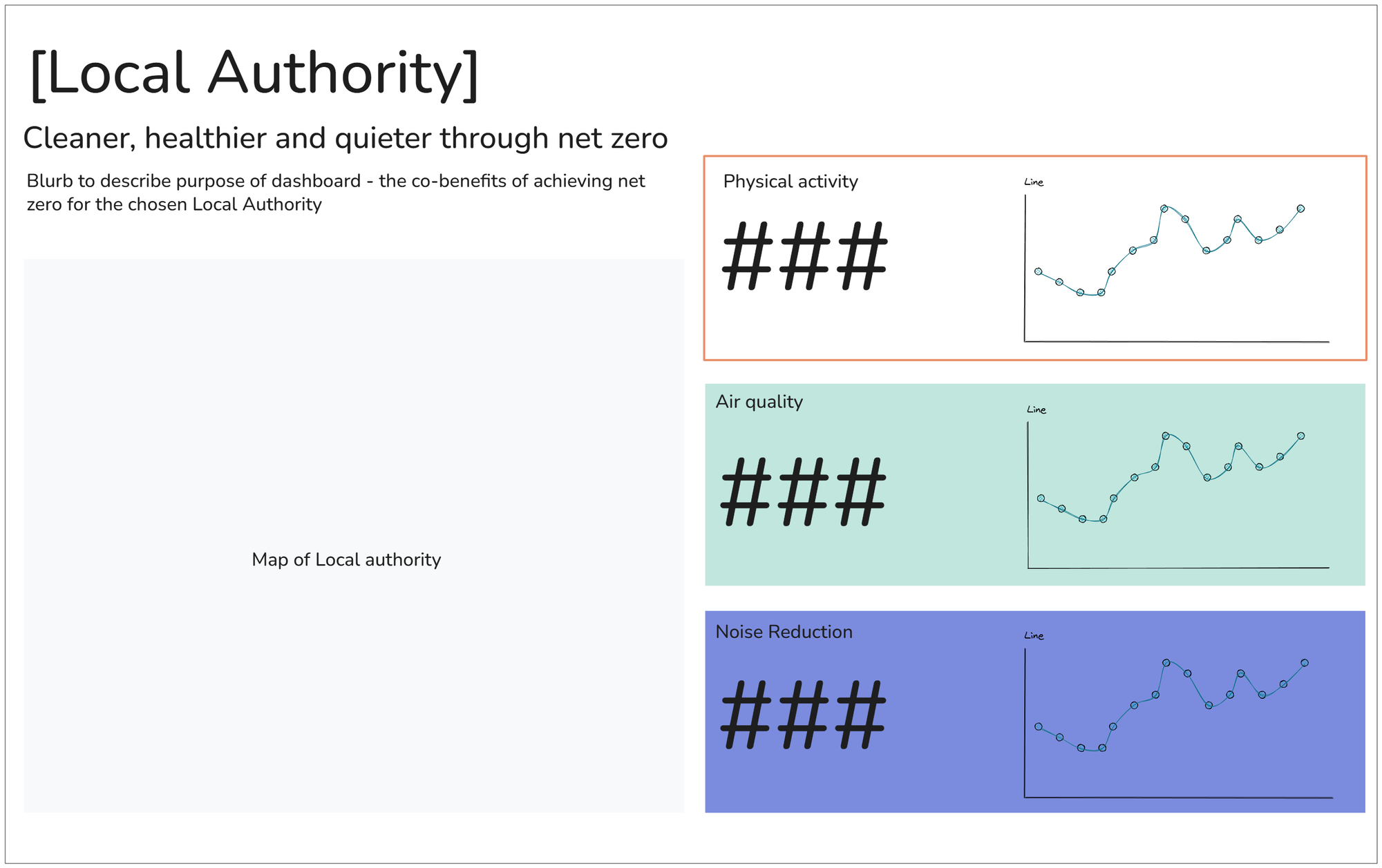
View the final result here! https://public.tableau.com/app/profile/joss.lazenby/viz/CouncilViewerco-benefitsofnetzero/Infographic-CouncilView#1
