


Interactivity is a great way to increase engagement and allow users to explore data. In PowerBI, we can use interactivity to highlight and filter charts, usually through clicking on points/bars.
Unlike Tableau, controlling basic interactivity in PowerBI is quite simple and can be achieved in just a few clicks.
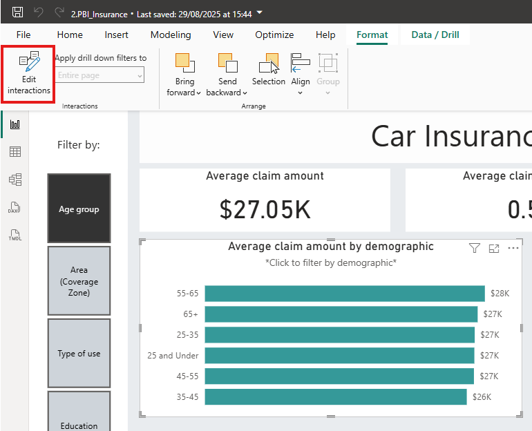
First, select a visualisation and click ‘Format’ at the top of the screen. Then hit the “Edit interactions” button.
From here, you can see and change how click on visuals impact the rest of the report, such as in the example below.
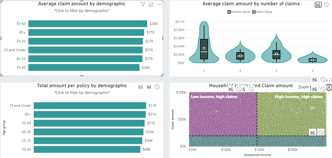
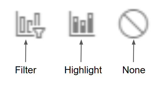
We can see the top lefthand chart filters the visuals on the right, whilst highlighting the bars on the plot below. This can be changed by clicking on the tiles in the top right corner of the visual.
Navigation:
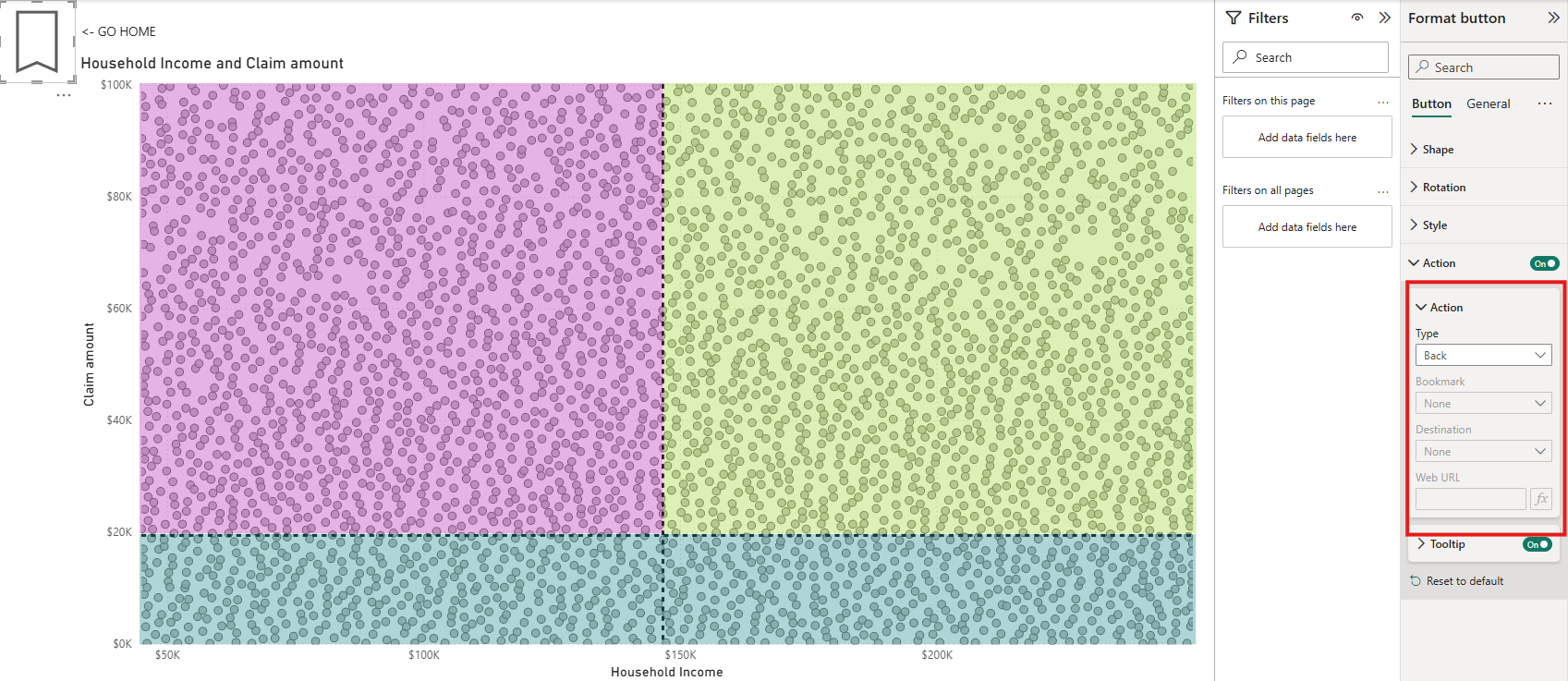
Interactivity can also be used to transport the user between different pages of a report. This is achieved using a button which can be assigned a “navigation” function.
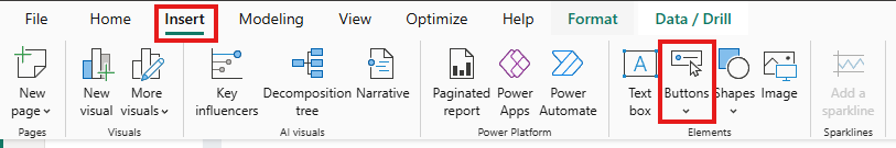
First add a button using the “Insert” tab at the top of the screen.
Once you have a button, you can activate navigation using the “Format button” pane on the right hand of the screen
Then if you click your button (ctrl+click if you’re still building the dashboard) it will take you to the sheet of your choice, voila! You can also add “back” to a button which will transport you to the page that you started from.
Thanks for reading! I hope this demystified interactivity in PowerBI for you. If you’d like to view the report used as an example in this blog, you can see it below.