


The first time you sat down to play around with a dashboard in Tableau, you may have encountered difficulties with containers. Whilst there is temptation to load all your charts as floating objects, containers can be super useful! Here is a breakdown of what containers are, what they can do and how you can use them.
Containers can either be horizontal or vertical which determines how elements are stacked within them. To drag in a container, go to the objects pane at the bottom of the screen.
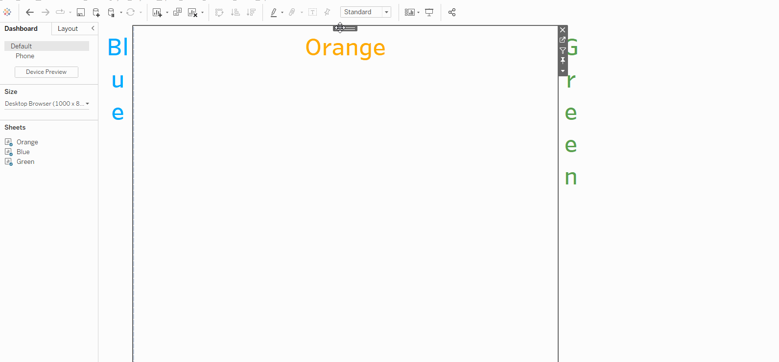
After dragging in your container you can drag in objects to fill them such as in the example below.
TIP: Before you've dragged anything into a container, they can swap between vertical and horizontal if you drop things near the edges. It can be useful to fill containers with a blank or two to prevent this sometimes confusing behaviour.
When inserting items into containers, make sure to release them when you have a slim grey highlight showing. If you pull the item to the edge of the container, you may create a highlight that covers half the dashboard - this would add the container to the tiled element at the base of the dashboard.
Containers can become very useful if you want symmetrical layouts. You can achieve within a container using the "distribute objects evenly" button from the dropdown menu.
TIP: double click the tab at the top of a sheet to select the container it is within.
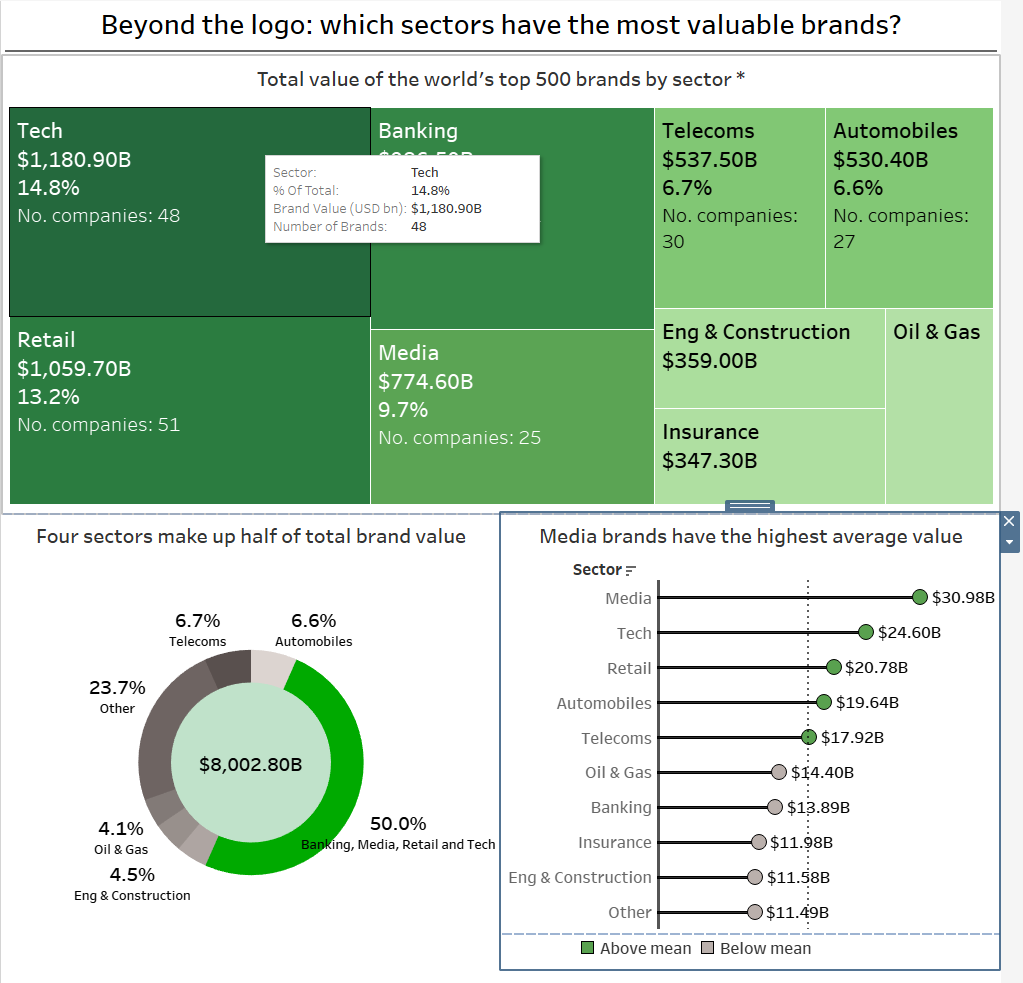
Now that we've explore what containers are, lets show how they can be used to quickly create a dashboard layout. We will use my Makeover Monday submission as an example.
TIP: These challenges are a great way to practise your Tableau skills!
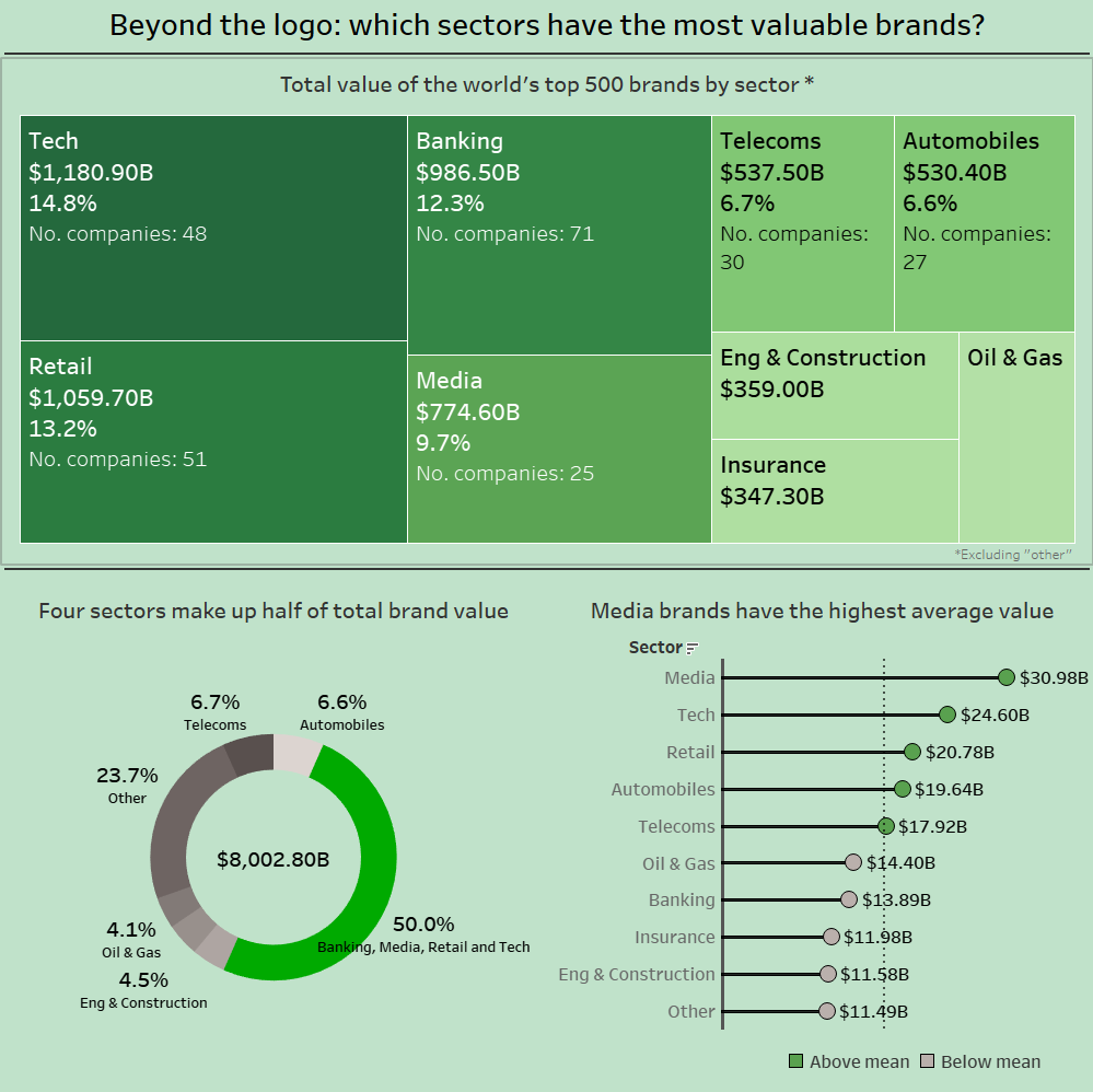
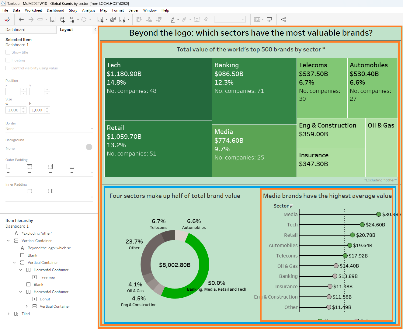
Here is the final chart layout - but how did we get here?
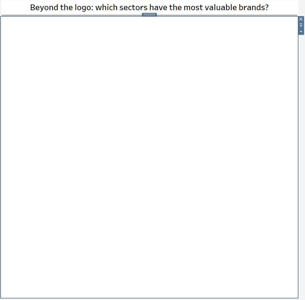
First, we start with a (drag in whilst holding shift) floating vertical container which will act as our canvas. Resize the container to the size that we want the dashboard to be (1000 x 1000 in this case) and set the x and y to zero.
Hot Tip: starting with a floating container the size of the dashboard is often helpful when organising complex dashboards and is something I would recommend!
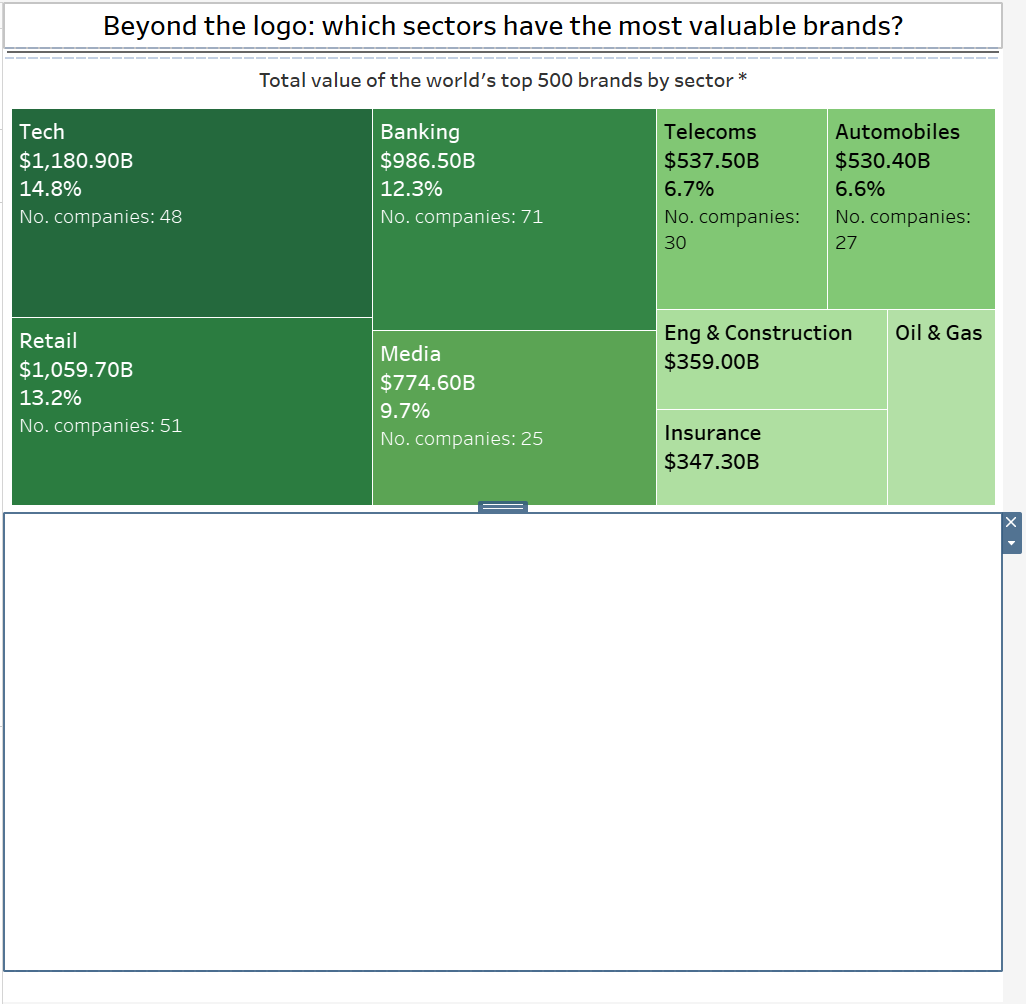
Then, our title and a grey-filled blank (which is the dividing line under the title) are added. Below these we can add another vertical container which will contain the treemap and a horizontal container.
After tidying up the title and resizing the height of the blank, we can add the treemap and a horizontal container for the next two charts.
Within the horizontal container we can add in the donut chart and a final vertical container which holds the lollipop chart and a legend.
Have a go remaking this yourself! You can download this workbook from Tableau public using the download button.