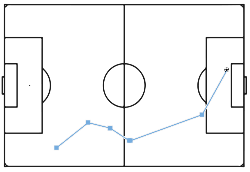
For this example I pulled data specifically from the 2022 World Cup Final (match_id: 3869685, Argentina vs France).
StatsBomb make a subset of their event data freely available through a public GitHub repository (github.com/statsbomb/open-data), covering selected competitions like recent men's and women's World Cups.
Data is provided under their open data user agreement for personal, educational, and research use and unlike their commercial API, it needs no login or credentials. Each match sits as a plain JSON file you can pull straight by URL.
Alteryx Steps
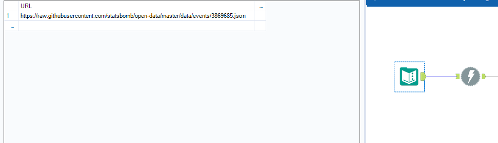
- Text Input with the following URL:
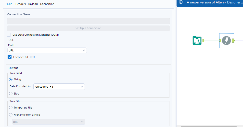
https://raw.githubusercontent.com/statsbomb/open-data/master/data/events/3869685.json, followed by a Download tool to pull the file's contents into the workflow.
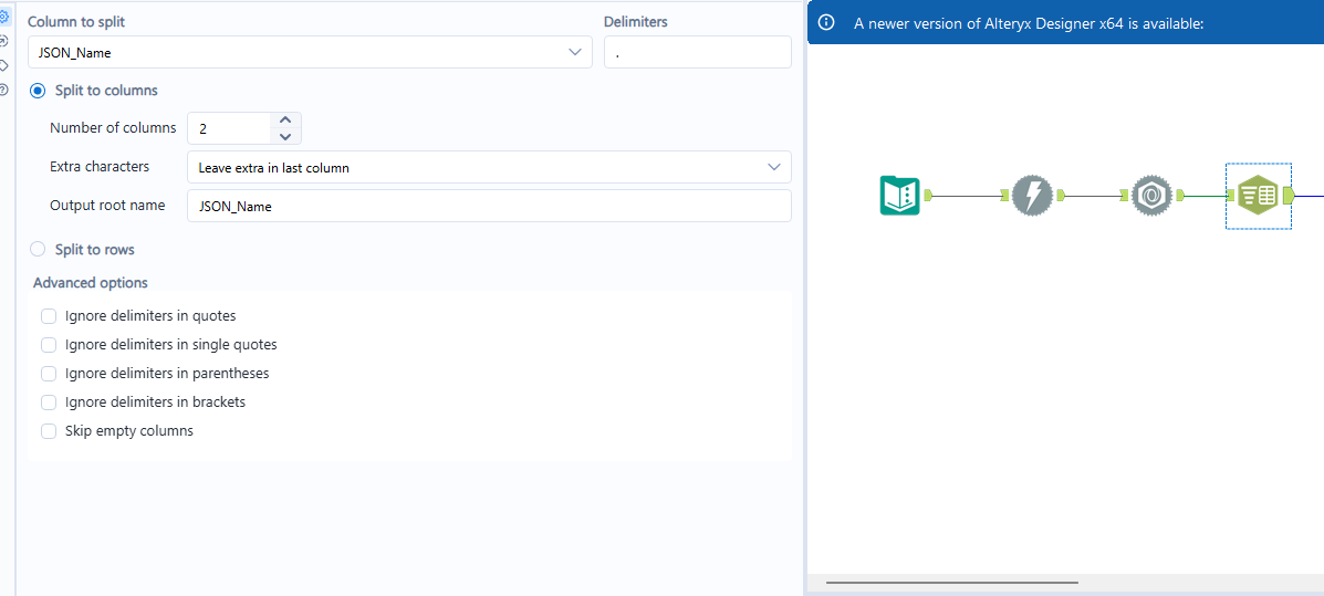
- JSON Parse, then Text to Columns. JSON Parse explodes StatsBomb's event structure into flat
JSON_Name/JSON_ValueStringpairs, with each field's full path collapsed into one string (e.g.21.pass.recipient.name). Text to Columns then splits that path on the first '.' which separates the number (which becomes the row identifier) from the rest of the field path (which becomes the column name in the future Cross Tab step).
- Removing freeze frames. Shot events carry a
freeze_frameblock recording the position of every nearby player at the moment of the shot, useful for 360° analysis. A filter was used to remove these as it was not required for me visual, but this is definitely something you could keep in for extra context.
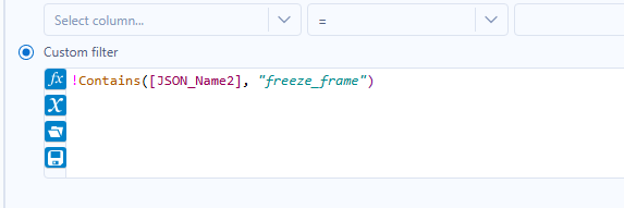
- A Cross Tab toll which pivots the data into one row per event, with each field as its own column.
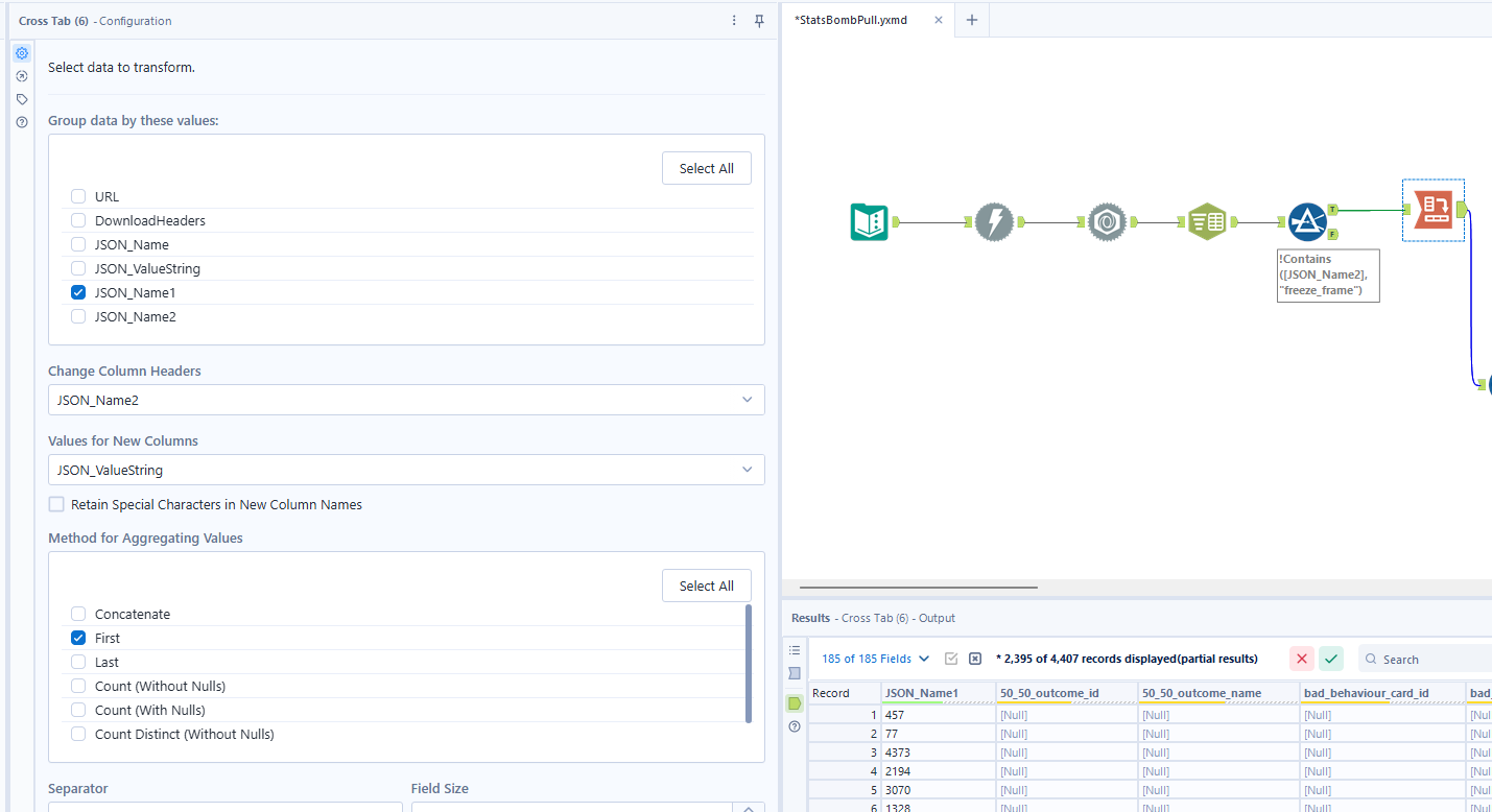
- Select tool to rename and assign data types to key fields:
Location_0→ Location X,Location_1→ Location Y (both Double data type);Minute→ Double data type ;Pass End Location 0→ Pass End Location X,Pass End Location 1→ Pass End Location Y (both Double data type);Period→ Double. - From here the workflow splits into two parallel streams, which recombine at a join. This is essentially identifying the goals and then re-joining that data back to the original data.
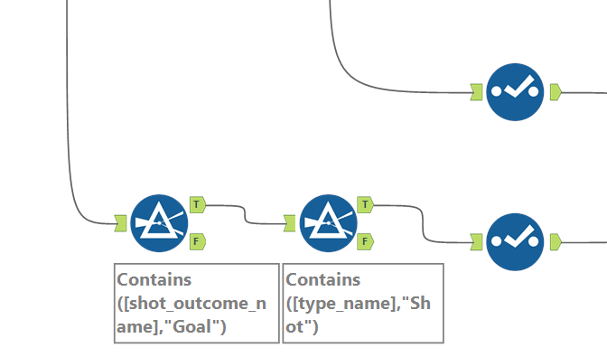
Stream A - identifying the goals:
Two Filter tools, filtering first to type.name = Shot, then to shot.outcome.name = Goal.
Select tool: keep index, minute, player name, possession, and team name.Rename team name → Scoring Team and index → Goal Index.
Stream B - the full event set:
Select tool to keep an unfiltered event stream (every event type, not just shots) as the other side of the join. Below is how it looked in Alteryx:
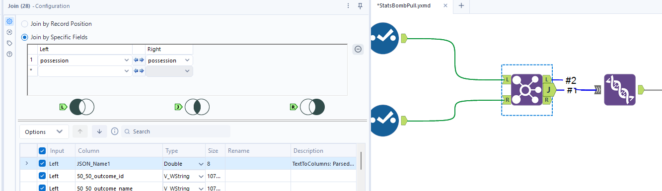
Join stream A and stream B:
Join the two streams together on possession. Every event that shares a possession number with one of the goals i.e. the whole passage of play leading up to it.
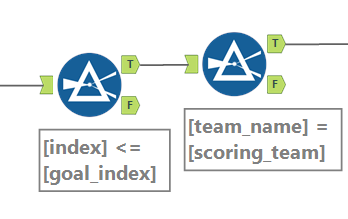
- Filter where
Index <= Goal Index. This trims off anything that happened after the goal itself but still shares the same possession number. - Filter where
Team Name = Scoring Team. This drops the opposition's actions that can fall inside the same possession phase around the moment the ball was won back, leaving only the scoring team's own build-up. This is personal preference that this data was dropped. An expansion could be to include this data within the visualisation.
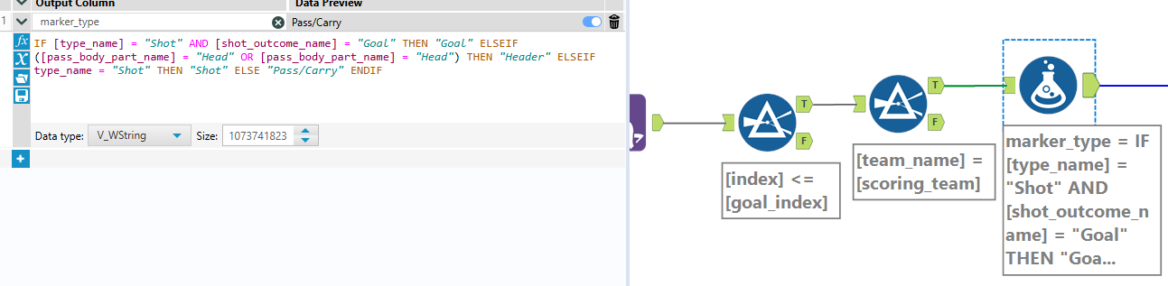
- Formula tool to identify and rename Marker Type for the visualisation (e.g. Pass/Carry, Shot, Header, Goal), based on event type and body part.
- Multi Sort by Possession ascending, then Index ascending, to put each sequence's actions back in the order they happened.
- I then filtered out Ball Receipt actions (this doesn't have to be done).
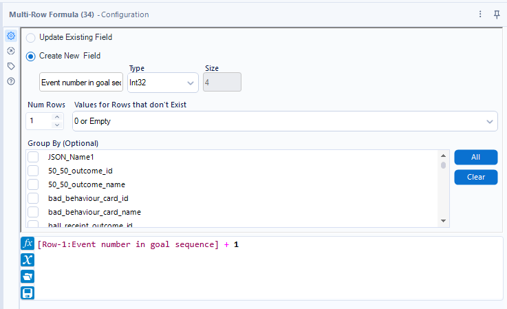
- Multi-Row Formula to calculate the event number within each particular goal sequence. This becomes the Path field in Tableau.
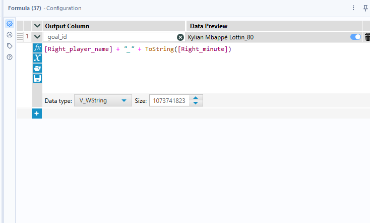
- Created a Goal ID for the visual, combining the scorer's name and the minute.
- Select tool to keep just the fields required for the visual.
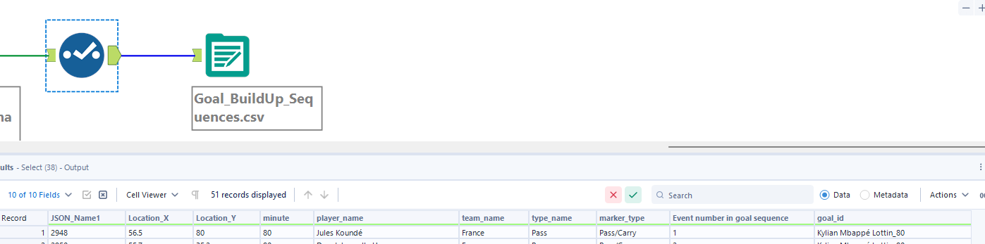
Tableau Steps
Credit to Tom Gould's blog on visualising pass data in Tableau, which was a big help in figuring out how to draw the goal sequences.
- Location X on Columns, Location Y on Rows. Set them both to Dimension rather than the default Measure, so each event plots as its own point.
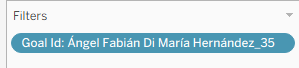
- Goal ID on Detail, so each sequence draws as its own separate line rather than connecting across different goals.
- I then filtered to a single goal to build and test the visual before replicating it across the rest.
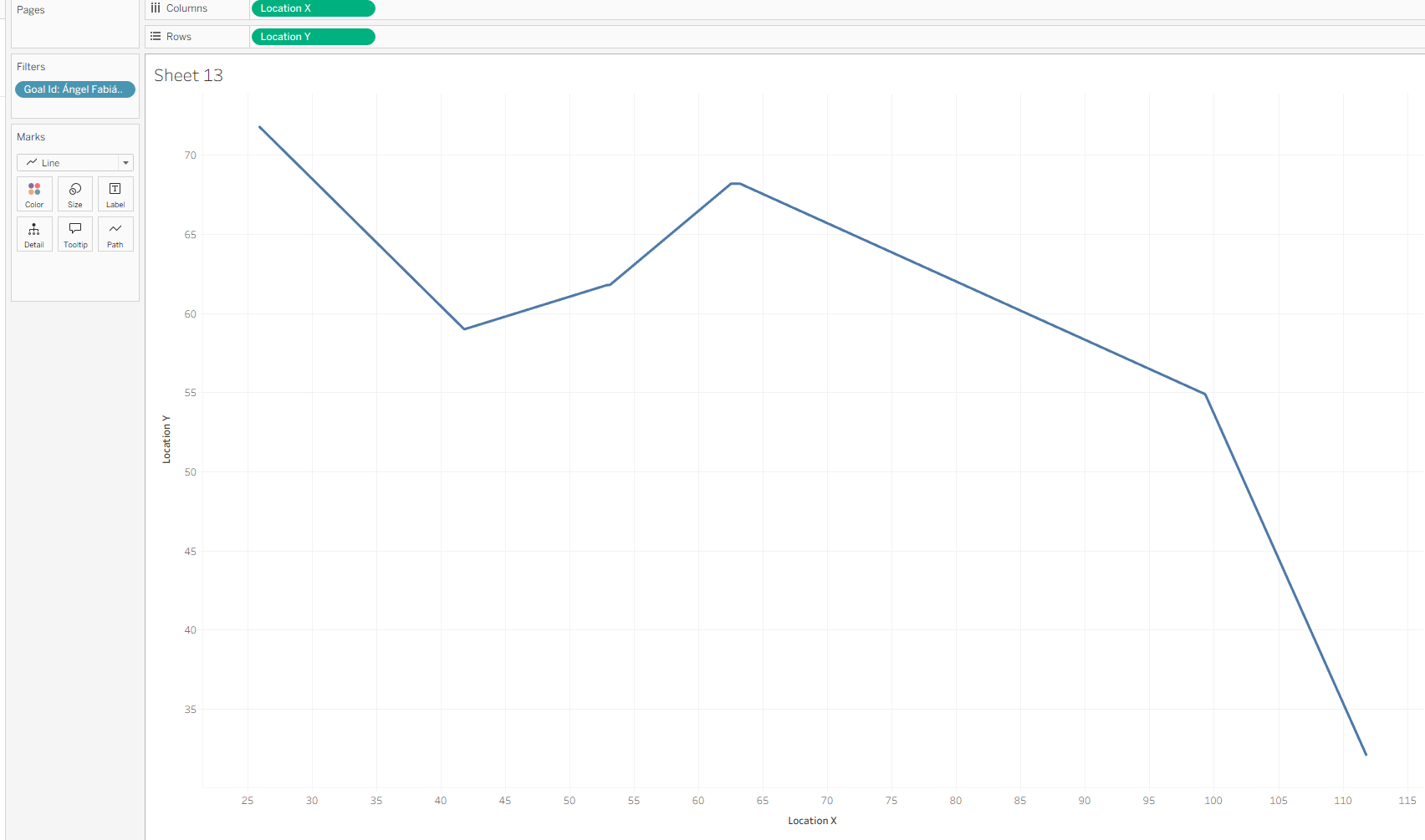
- Changed the chart type to Line, and put Event Number in Goal Sequence on Path so the events connect in chronological order.
- Go to Map > Background Images and select the pitch image (here). Set the dimensions to: X Field — Left −7 to Right 127; Y Field — Bottom −7 to Top 87.
- Added a second axis: dragged Location Y onto Rows a second time, set it to Dual Axis, and Synchronised the two axes. Changed this second Marks layer to Shape to show individual points.
- Put Marker Type on Shape to distinguish the different event types (circle for Pass/Carry, square for Shot, diamond for Header, custom ball icon for Goal).
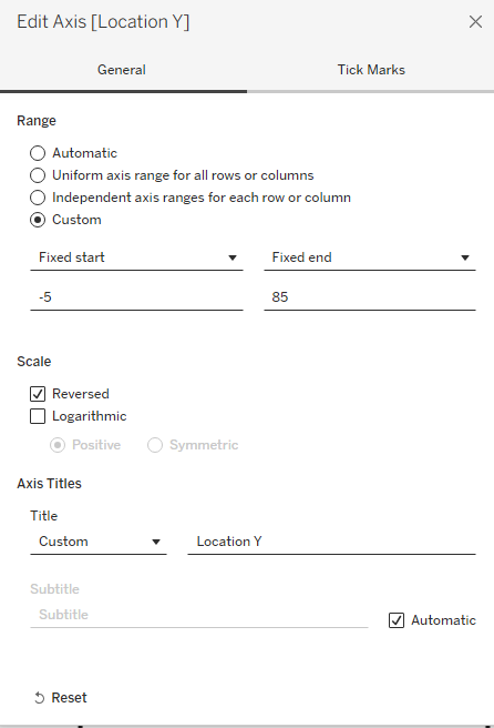
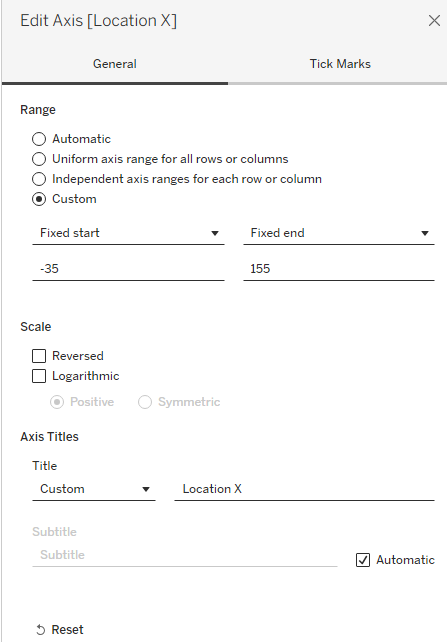
- Finally, edit the X and Y axis. For the Y axis make sure the scale is reversed.
The final outcome is a mapped out goal sequence. As you can see throughout the steps (particularly in Alteryx) there's lots of room to add additional data to these sequences to provide more context to the goals. But this is a good starting point for now!