


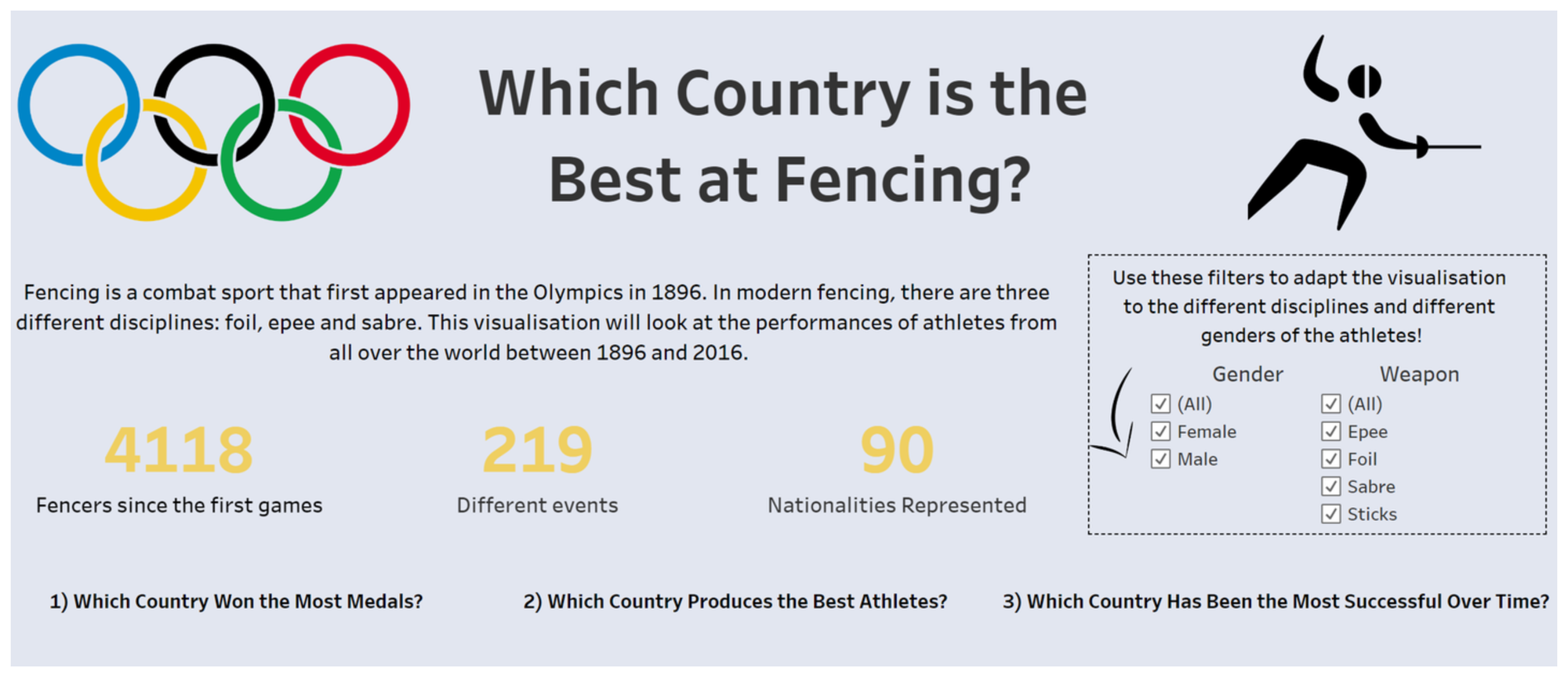
This week's task was to recreate our original application dashboard in PowerBI. In all honesty, at first, just the idea of it sounded incredibly hard. For some part it was, how were we supposed to rebuild a dashboard which took many hours to build in half a day? Well here is my attempt at doing so:
The first step was recreating my KPIs and filters
I therefore needed to create three different cards on my PowerBI dashboard as well as two slicers (The equivalent of tableau's 'show filter' on PowerBI). For the cards it was pretty straight forward, the three fields already existing I just had to create a card with a distinct count of the right measure. For the slicers, while gender existed in the original data, the weapon field needed to be recreated. For this purpose I used PowerQuery to simply extract the weapon from the event name using the create column from example function (a trully wonderful invention). Here are the results:
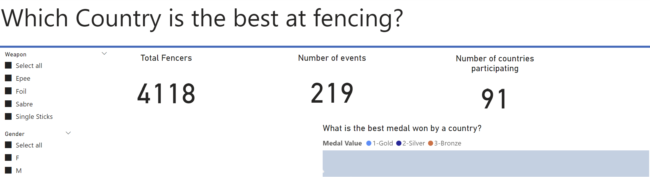
While the formatting isn't great I am happy with the result in terms of content. On to the next part of the dashboard.
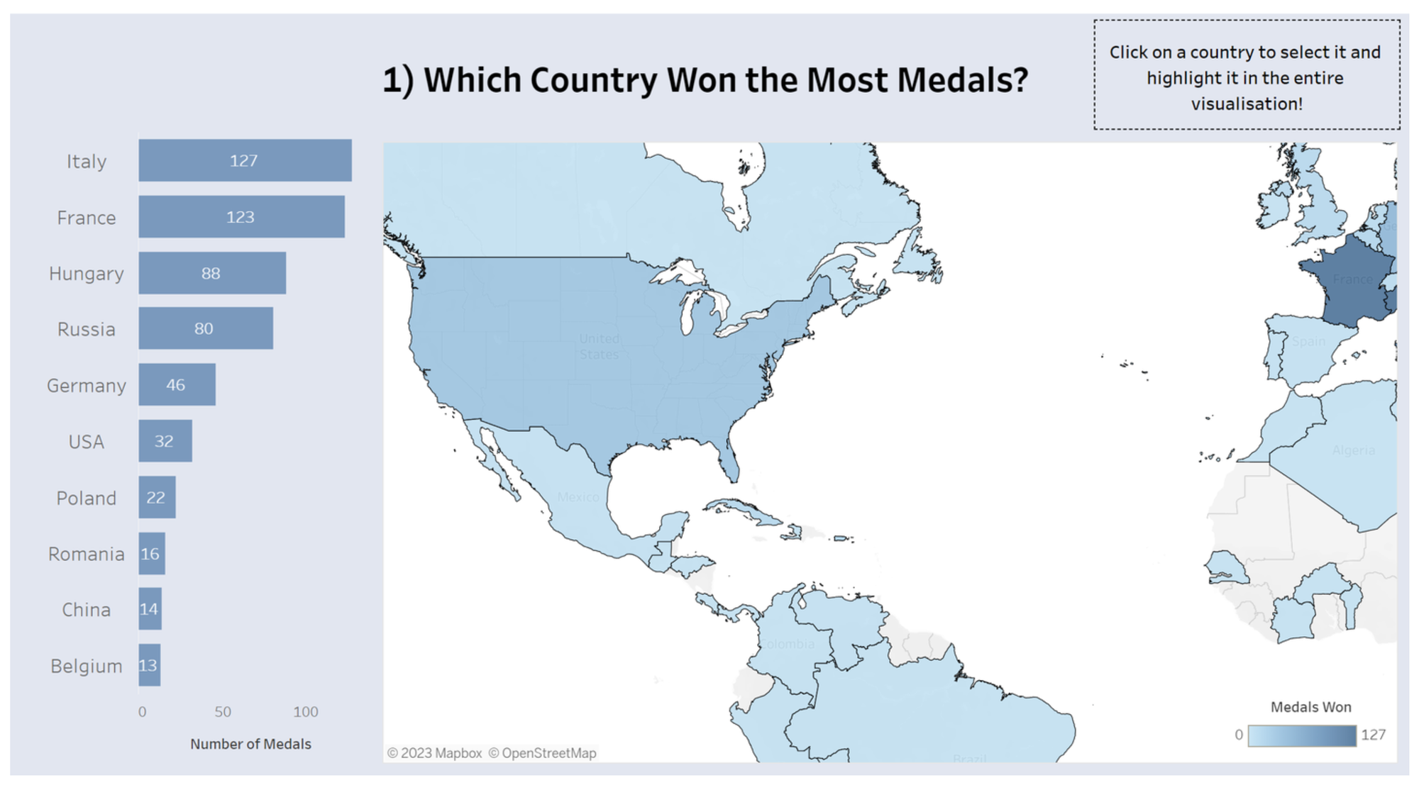
Here is where it gets complicated. To recreate the calculation of total number of medals, I needed to recreate my original calculated field. Sadly, PowerBI required me to recreate it first as a Field in PowerQuery and then a measure in PowerBI desktop to obtain the result I wanted. As I had to later recreate the same field but for gold, silver and bronze medals, this felt very tedious. For the map, I just wanted to build something new which would look at the best medal won by a country instead of the rank. This was fairly easy except I could not re-order the medals in the order I wanted. I therefore had to rename the fields to 1-Gold 2-Silver and 3-Bronze so they would show in the right order. In terms of the country highlight action I was unable to recreate it sadly. According to google it seems I'd have to create a highlight field with a lot of DAX code that I know nothing about :). Anyway here is the result:
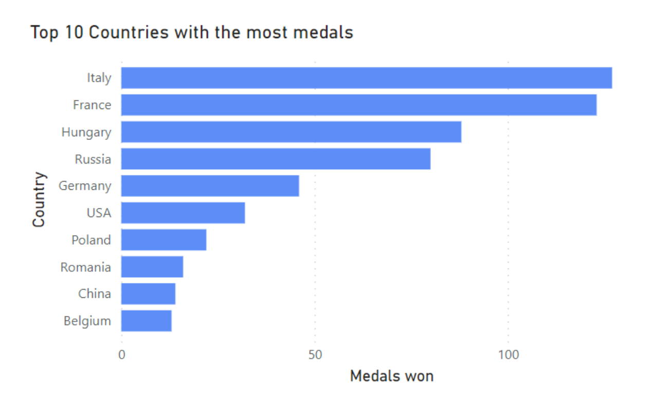
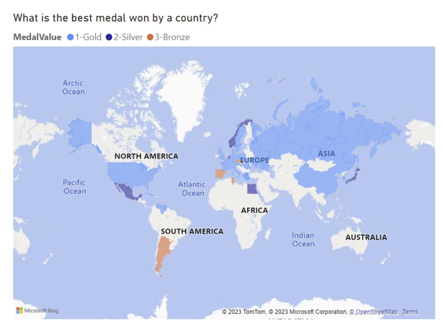
Overall, I am satisfied by the recreation of these two charts, PowerBI does pose a similar problem to tableau in which the map loads fairly slowly, I do think it also looks less nice than the tableau map format, but I am sure that can be improved with some work on my side! Onto some more bar charts:
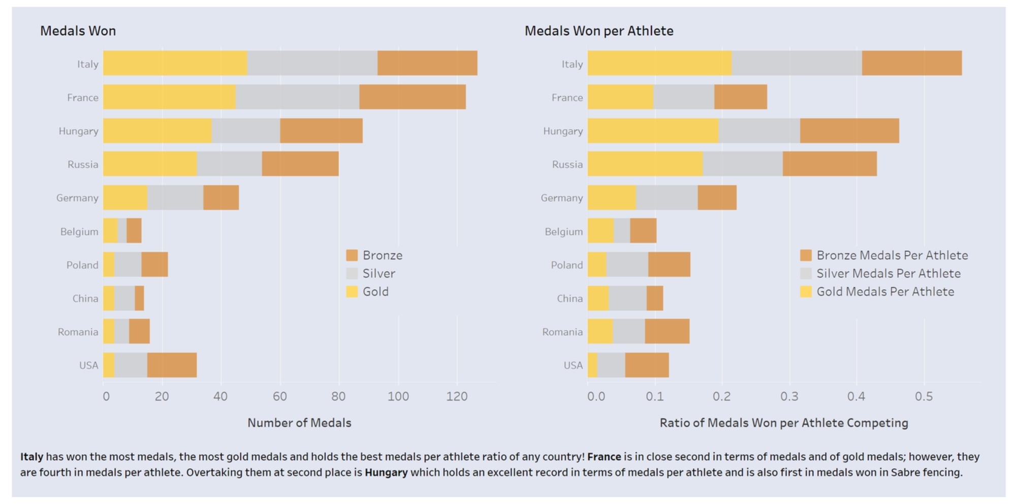
Here I reused the previously created measure to create two bar charts. The first one was directly using the measure, the second one I just had to divide the first measure by the distinct country of athletes. This worked out fairly well, once again I just need to adapt the formatting.
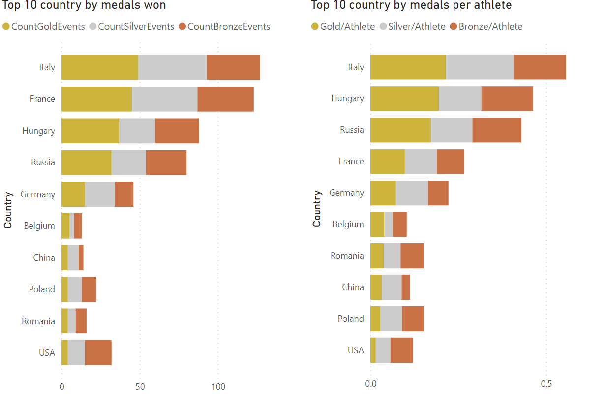
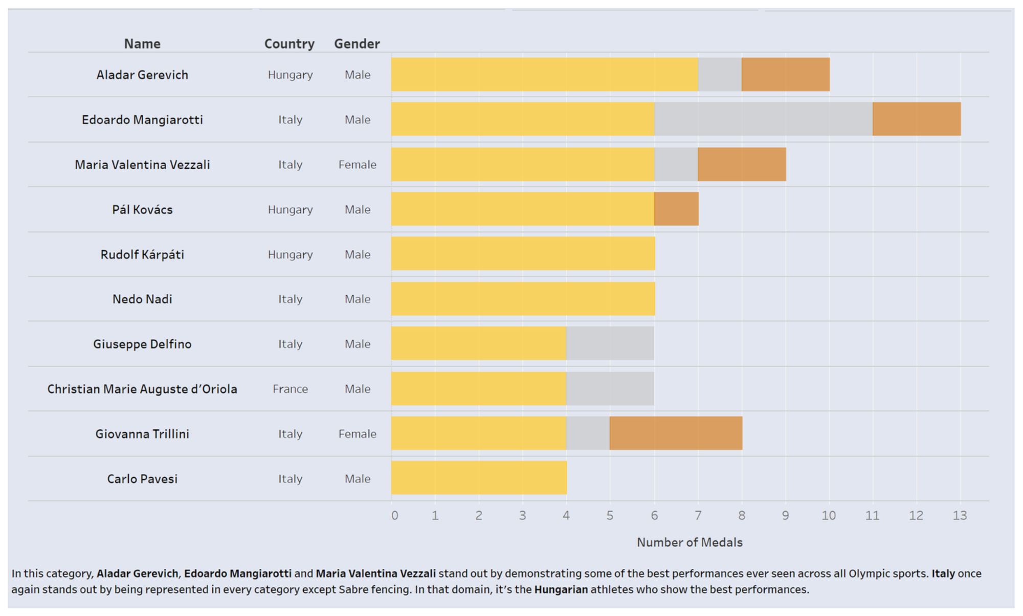
Next up we have this chart showing the results for athletes instead of countries, I like having a bar chart in a table. I thought this would be easy with powerBI matrix, however sadly, it was no so easy. Whenever I'd add a name it would group the names per country or per gender. Therefore, I had to just do another bar chart...
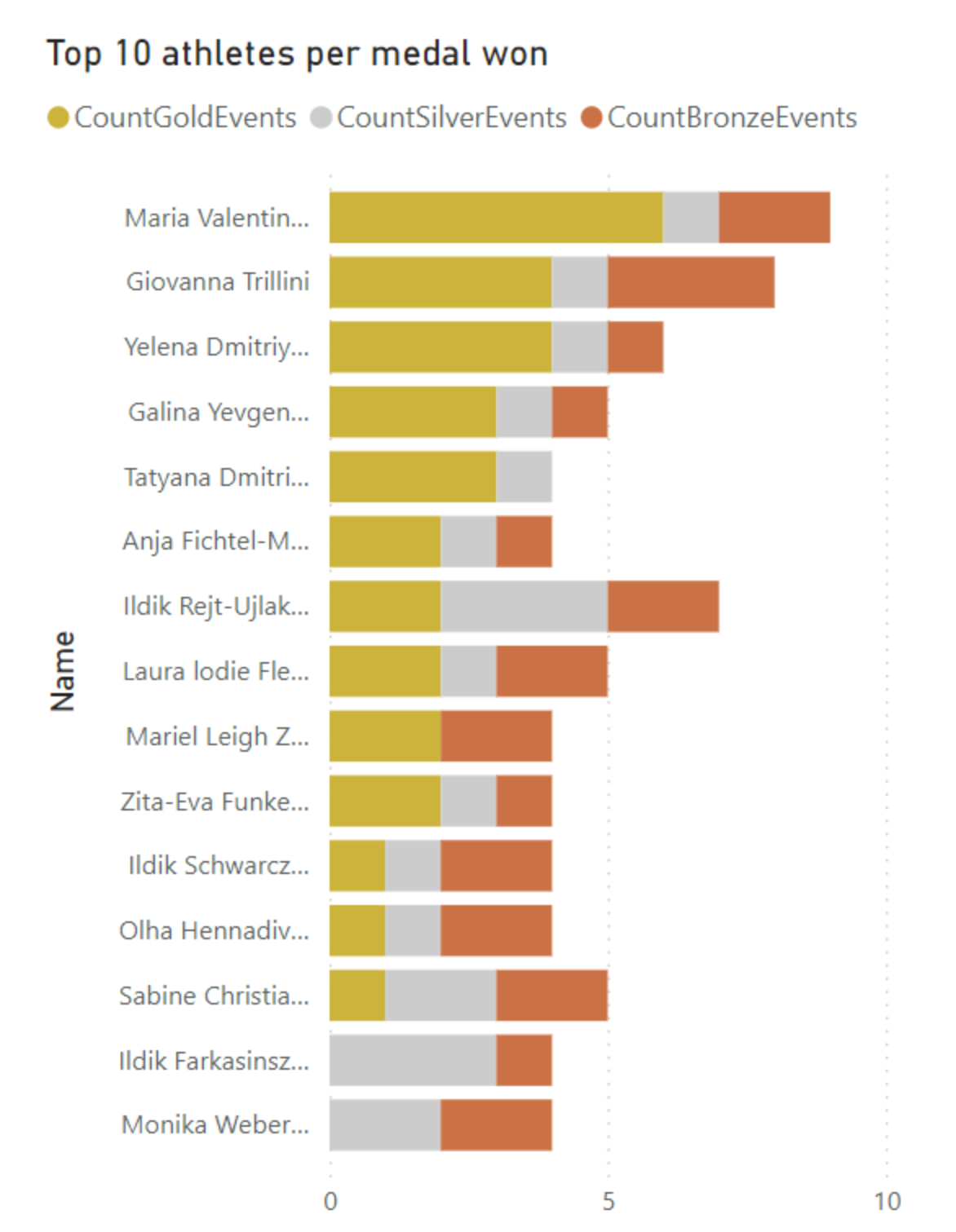
Maybe with more time I would have figured out how to get the matrix to work.
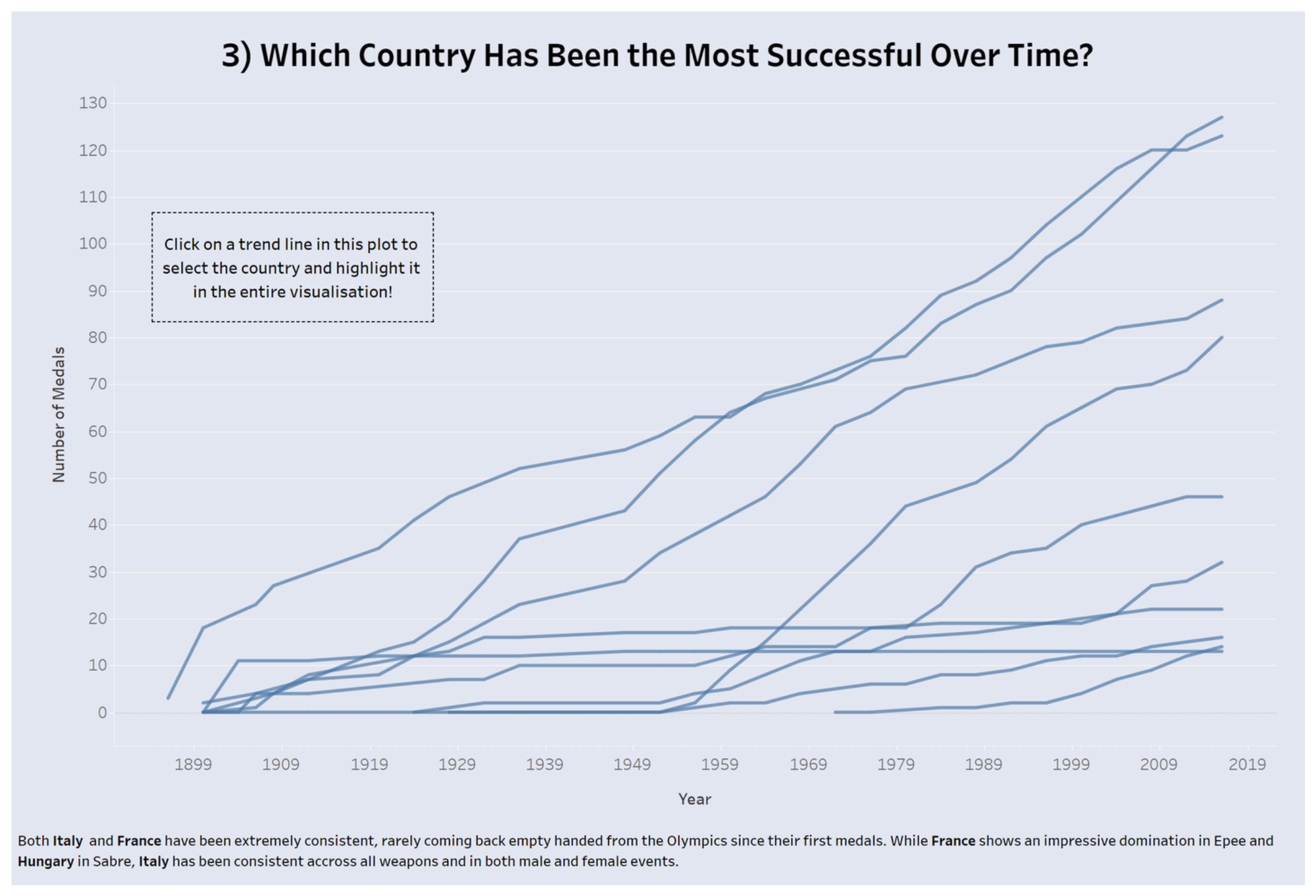
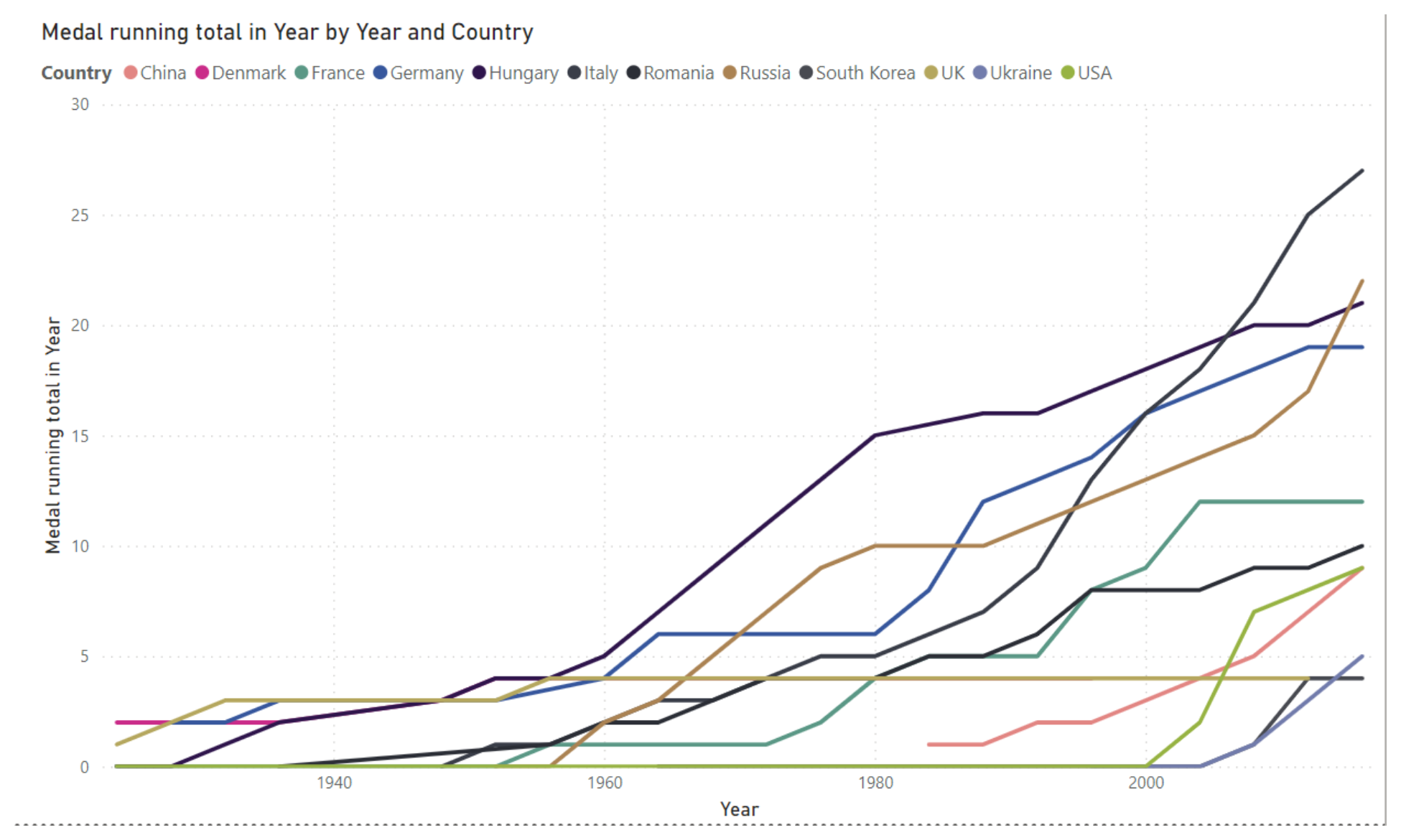
Next we had this line graph of the running total. As I could not figure out the highlight tool earlier, I still could not here. It was really easy to create the running totals as that is a 'quick measure', which means you can create it just by dragging medals and date. However somehow these running totals have negative values, when obviously it's impossible to loose a medal....
While this was very annoying and I need to look into it more to understand why this happened, using parameters I was able to make the chart interactive by offering the user the possibility to choose between running total of all medals or specific medals (bronze silver gold). Here is the result:
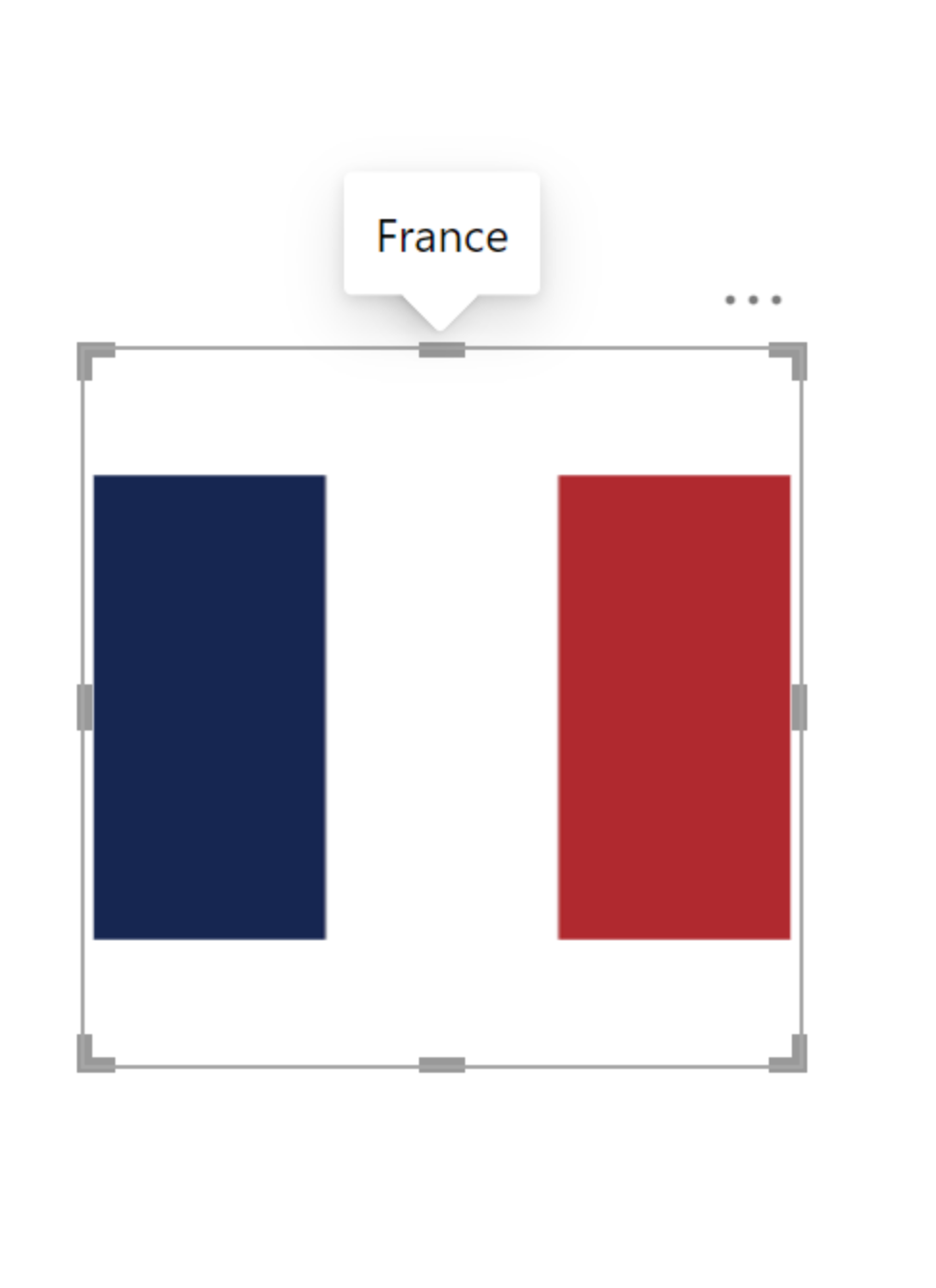
Finally at the end of my dashboard, I used flags for a conclusion, showing the three best countries and how they rank in different categories as part of their tooltip.
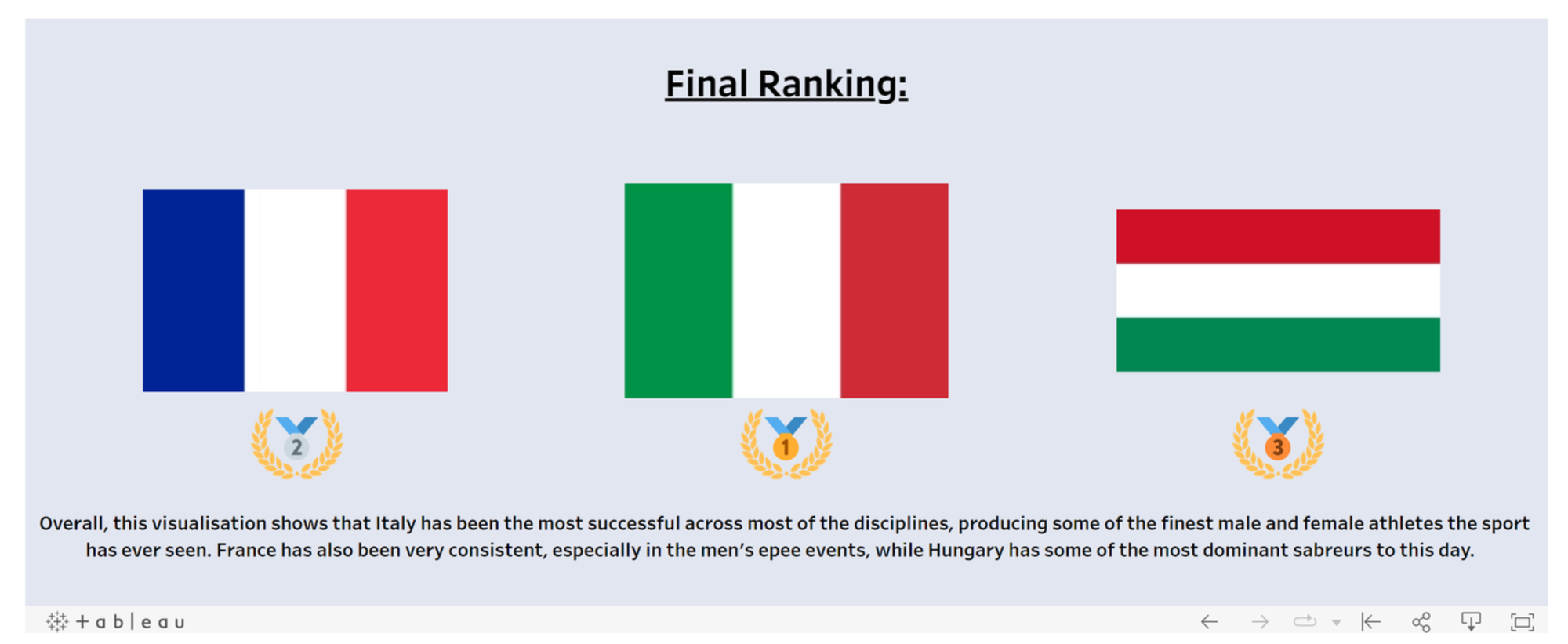
On one hand it is really cool that PowerBI has a direct setting allowing you to add a tooltip to an image. However, you can only add a single dimension as tooltip. I would therefore not be able to reproduce what I've done except if I create a table with all the information I want and used that viz as a tooltip.
Overall this experience was very beneficial as it taught me how to use PowerBI more. I personally still prefer tableau due to the freedom it brings to create special visualisation. On the other hand to build simple bar charts and KPIs, PowerBI permits to be extremely quick and efficient.
Here is the link to the original dashboard: https://public.tableau.com/app/profile/jules.claeys/viz/WhichCountryistheBestatFencing/Dashboard1