


One of our first client projects at The Data School was for the US charity, Connect2Help 211 (click here to read Andy’s blog post on the project).
Essentially, someone with a problem (or need) can ring Connect2Help’s phone line to receive help with their problem/need. If successful, their need is deemed as having been “met”. If not, their need is deemed as having been “unmet”.
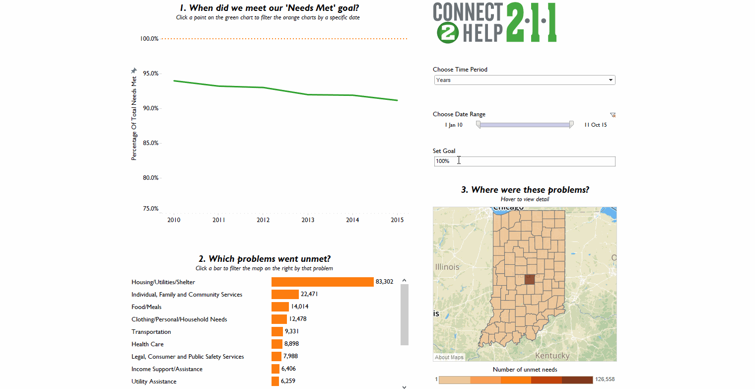
My role was to create a dashboard to visualise Connect2Help’s performance in meeting people’s needs.
The top left of the dashboard displays Connect2Help’s performance in meeting people’s needs over time.
The filter to the right of this allows the user to change the time period view from “Years” to “Months” or “Days” for an ultra in depth view.
I also included a parameter which controls the orange dotted reference line on the chart, so that the user can set a “percentage needs met” target. This enables them to see any point in time in which performance drops below this target. At the “Year” level, we can see that Connect2Help consistently met over 90% of people’s needs in the time period; impressive!
When you filter down to the day level, you can see that on some days, performance dropped below the 90% level. Clicking on one of the data points on the green chart filters the bottom left chart, which allows the user to find out in which problem categories needs were going unmet, ranked by highest first.
If you explore the viz by clicking on the screenshot below, you may notice that the map on the bottom right also updates as you filter the green chart. On clicking on a particular problem category on the orange bar chart, the map updates to show the user the location of where problem needs were going unmet on that date.
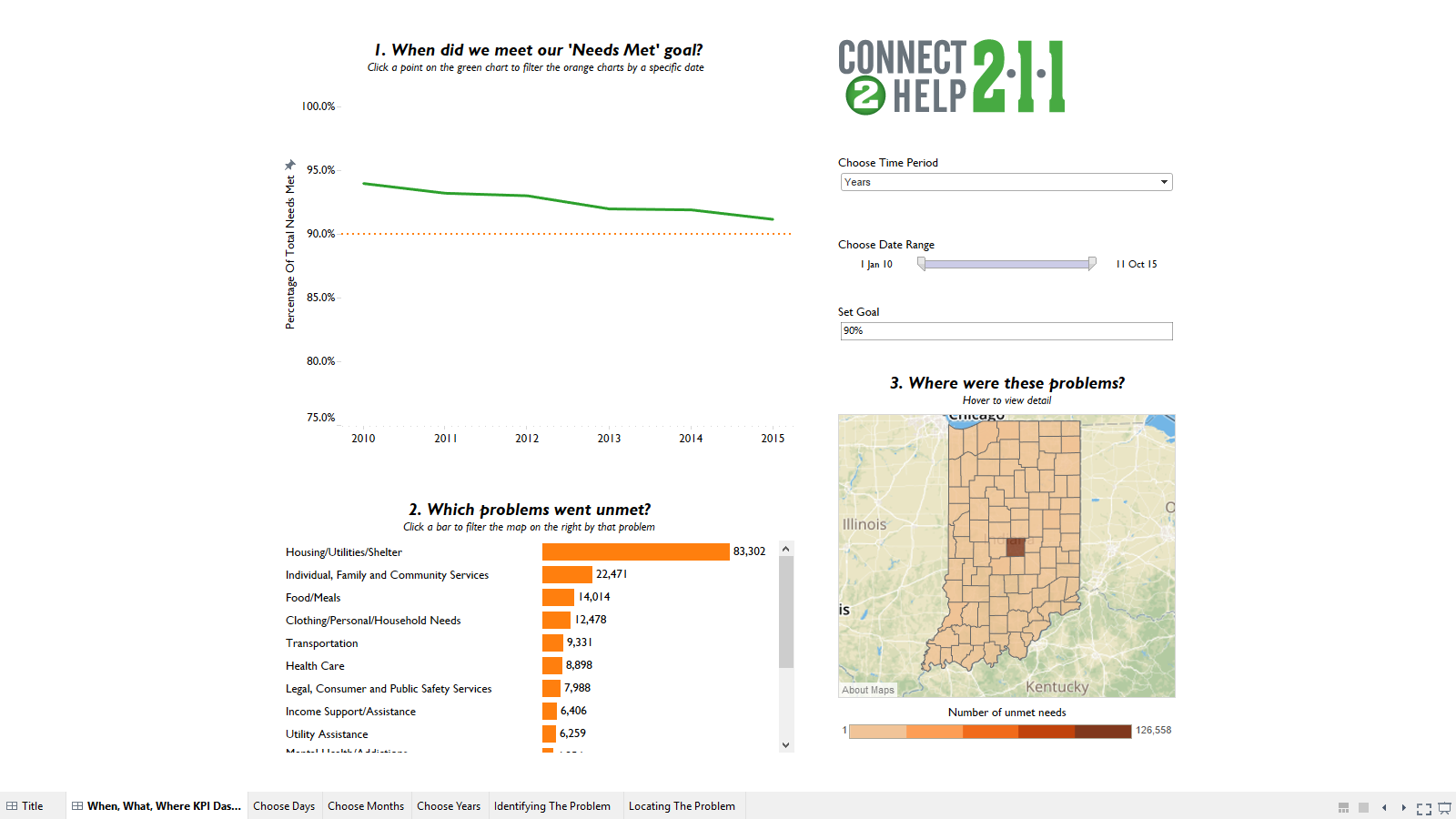
This allows the user to find out “when” problem needs went unmet, “what” problem needs went unmet, and “where” problem needs went unmet. This gives them a focus to ask the obvious remaining question; why did these needs go unmet during these specific points in time? This was covered in another dashboard which you can find via Andy’s original blog post.